Register
Process Type
Graphical expression
Mind Type
Structured expression
Note Type
Efficient expression

Nightingale Rose Diagram Online Drawing Tool

Free to use
Nightingale Rose Diagram Online Drawing Tool
What is Nightingale Rose Chart

The Nightingale Rose Diagram is a type of chart based on polar coordinates, representing data size through the radial length of the sector area (rather than the angle), enhancing visual contrast through area differences. Its core logic is that radius and area have a square relationship, meaning even slight data differences will be significantly amplified in area changes.
ProcessOn supports online creation of Nightingale Rose Diagrams and offers a vast number of templates and examples for easy replication, allowing you to effortlessly draw professional and aesthetically pleasing Nightingale Rose Diagrams.

Free to use

ProcessOn Nightingale Rose Chart Key Features

Online Collaboration

Supports real-time multi-user co-creation with shareable links for instant information transfer

Online Collaboration
One-Click AI Generation

Automatically generates graphics from text input and applies style enhancements

One-Click AI Generation
Personalized Style Customization

Prebuilt themes with full customization for personalized designs

Personalized Style Customization
Multiple Component Types

Supports icons, images, labels, LaTeX formulas, code blocks, links, attachments and more

Multiple Component Types
Multi-Format Compatibility

Export: PNG, VISIO, PDF, SVG | Import: VISIO, Mermaid

Multi-Format Compatibility
Cross-Device Sync

Real-time cloud storage, multi-device sync, version history, and secure data protection

Cross-Device Sync
History of the Nightingale Rose Chart

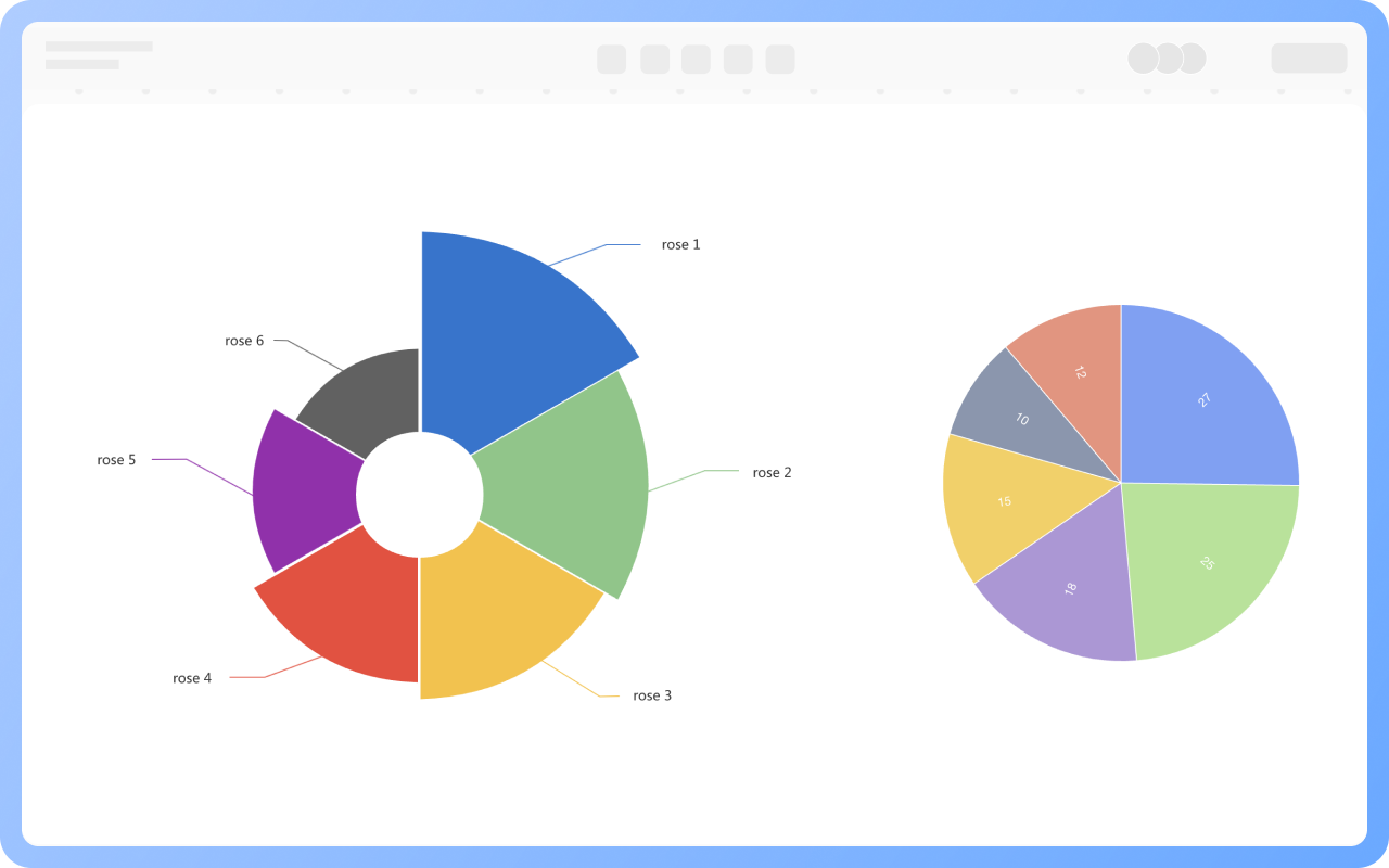
The Nightingale Rose Chart was first created by British nurse and statistician Florence Nightingale during the Crimean War of 1854-1856. At the time, field hospitals suffered from poor sanitary conditions, resulting in a soldier mortality rate as high as 42%, with most deaths attributed to infectious diseases rather than combat injuries. To visually demonstrate seasonal causes of mortality and persuade the government to improve medical care, Nightingale transformed the traditional histogram into a circular chart with a polar coordinate layout. Twelve sectors represented the months, with the length of the sector radius mapping the number of deaths, amplifying differences by the square of the area and radius. Blue, red, and black were used to distinguish between illness, combat injuries, and other causes of death.

Create Charts Online
History
Features of the Nightingale Rose Chart

1. Cyclical Adaptation
The circular structure naturally fits monthly, quarterly, and other cyclical data.
2. Difference Exaggeration Effect
The square relationship between radius and area makes the contrast between similar data more vivid.
3. Multi-Dimensional Encoding
Using color, radius, and sector-shaped subdivisions, it can simultaneously display information: category (e.g., cause of death), time (month), and number (number of deaths).
4. Balance of Aesthetics and Functionality
The "cockscomb"-like visual form is more appealing than traditional charts.

Create Charts Online
Features
Nightingale Rose Chart vs. Pie Chart

The Nightingale Rose chart is a type of pie chart. Traditional pie charts use the angles of the sectors to directly reflect the proportion of the parts to the whole, making them suitable for displaying static categorical relationships. The Nightingale Rose chart improves on the traditional pie chart by mapping values ​​to the length of the sector's radius. This uses the squared relationship between area and radius to amplify small differences, emphasizing the dynamic comparison of cyclical data (such as monthly fluctuations).

Create Charts Online
Nightingale
Applications of the Nightingale Rose Chart

Public Health: During the Crimean War, Florence Nightingale used it to demonstrate monthly changes in soldier deaths from illness, combat injuries, and other causes, promoting healthcare reform. In modern epidemics, it can be used to compare the distribution of case types across different regions or time periods.
Business Analytics: Manufacturing uses quarterly fan radiuses to compare production capacity fluctuations, while the retail industry uses it to analyze holiday sales trends and assist in inventory decisions.
Customer Service: Displays the percentage of inquiries by type during daily peak hours. For example, if the "Account Issues" fan is prominent between 3:00 PM and 5:00 PM, targeted staffing can be deployed.

Create Charts Online
Applications

Nightingale Rose Chart How to Draw?

Nightingale Rose ChartHow to Draw?
1
Search for 'Nightingale Rose Chart' in the template community and select a suitable template to clone.
2
Double-click the text part of the chart to fill in category labels (such as months, product types) and corresponding values (such as sales, visits).
3
Select the sector, and use different colors to mark it in the top toolbar.
4
Check whether the data values in the Nightingale Rose Chart are filled in accurately. In this way, a Nightingale Rose Chart is completed.
5
After the Nightingale Rose Chart is completed, it can be downloaded or shared with others.
Free to use

Nightingale Rose Chart Drawing Guide

  • What is a pie chart and how to draw one?

    What is a pie chart and how to draw one?

    In the era of data-driven decision-making, charts have become the "universal language" in business analysis, academic research, and project management. As a basic and powerful tool in the field of data visualization, pie charts have become a powerful assistant for people to process and interpret data with their concise and clear presentation. This article will help you systematically master the concept, classification and practical skills of pie charts, helping you easily master this classic chart form.
    Skye
    2025-05-19
    1422
  • How to create a comparison chart? Types, tutorials, templates

    How to create a comparison chart? Types, tutorials, templates

    Comparison charts are used to graphically display the differences, similarities, or trends between two or more data sets. This article will explore the concepts, types, and drawing tutorials of comparison charts , and share multiple comparison chart templates, hoping to help readers master this tool.
    Skye
    2025-01-10
    1688
  • Comprehensive Guide to Radar Charts - Concepts, Examples, Templates

    Comprehensive Guide to Radar Charts - Concepts, Examples, Templates

    Radar chart, also known as spider chart or polar chart, is a type of chart used to display multivariate data , helping us understand and analyze complex data . It is widely used in business decision-making, financial investment, human resources and other fields. This article will give a comprehensive introduction to radar chart, including its definition, application scenarios, drawing tools, drawing methods , etc.
    Skye
    2025-02-17
    1144

Nightingale Rose Chart Template Recommendations

More Templates

Nightingale Rose Chart Frequently asked questions

What is the difference between a Nightingale rose chart and a regular pie chart?

The rose chart uses sector radius to map values, amplifying differences; the pie chart uses angles to represent proportions.

What data is suitable for display with a Nightingale rose chart?

Periodic data (such as monthly sales) or categorical data that needs to compare differences.

Can a Nightingale rose chart display multiple data sets?

Yes, different colors can distinguish multiple sets, but it is recommended not to exceed four types.

Is a Nightingale rose chart suitable for negative value data?

Not suitable, the rose chart only supports positive numbers, negative values need to be converted or discarded.

How to highlight the highest/lowest values in a Nightingale rose chart?

Add data labels or annotations, or use contrasting colors to mark.

How to export a Nightingale rose chart as an image or PDF format?

Click the 'Download' button in the upper right corner to export the Nightingale rose chart as PNG, JPG, PDF, etc.

Related Diagrams