Register
Process Type
Graphical expression
Mind Type
Structured expression
Note Type
Efficient expression

Blog

Provides drawing tutorials from entry to advanced level
Work plans always seem to fall through? Try managing your goals using six charts.

Work plans always seem to fall through? Try managing your goals using six charts.

Plans fail to materialize not because you're not working hard enough, but because you're using the wrong tools. Text is suitable for recording ideas, tables for organizing data, but combining different charts is suitable for managing the entire lifecycle of goals . This article will present a powerful combination of six chart types: fishbone diagrams, mind maps, flowcharts, Gantt charts, Kanban charts, and decision tree diagrams, taking goal management to new heights.
Say Goodbye to Overtime and Report Writing: Helping You Quickly Complete Weekly and Monthly Work Reports

Say Goodbye to Overtime and Report Writing: Helping You Quickly Complete Weekly and Monthly Work Reports

Writing weekly and monthly reports is essentially a process of organizing structured information. Once you master a systematic approach—using structured frameworks to organize content, using data to highlight achievements, using visual charts to present information, and using AI tools to help generate drafts—you'll find that writing weekly and monthly reports is not only not painful, but rather a deep review and reflection on your work.
2026-07-03
How to plan your summer vacation? Keep this time management guide handy.

How to plan your summer vacation? Keep this time management guide handy.

Whether your summer vacation is fulfilling or not never depends on how "busy" you are, but on how you spend your time. When you break down your goals into mind maps, draw your schedule into Gantt charts, and create review diagrams of your learning, your summer vacation transforms from a vague "two months" into a clear, actionable, and trackable battle map.
Say Goodbye to Ineffective Meetings and Information Silos: Reshaping Team Collaboration Efficiency with AI

Say Goodbye to Ineffective Meetings and Information Silos: Reshaping Team Collaboration Efficiency with AI

The pain point of team collaboration is the low efficiency of information flow. The value of AI is not to replace humans, but to liberate teams from repetitive tasks, allowing everyone to focus on matters that truly require human judgment. For roles such as product managers, operations, project managers, and HR who frequently use mind maps and flowcharts, a truly collaborative AI charting tool is compressing the traditional workflow of meeting-organizing-aligning into a real-time collaborative experience of "generating while meeting, discussing while implementing."
2026-06-26
Four essential professional charts for lawyers - helping you efficiently organize your case.

Four essential professional charts for lawyers - helping you efficiently organize your case.

Competition in the legal services industry is increasingly fierce. A lawyer's professional competence is reflected not only in their familiarity with legal provisions, but also in their ability to clearly and efficiently convey complex case facts and logical relationships to judges, clients, and colleagues. In legal practice, the most commonly used visualizations include case timelines, legal relationship diagrams, case flowcharts, and equity structure diagrams. These four types of charts cover the entire case-handling chain, from fact-finding to legal analysis, and from procedural progression to business structure.
2026-06-24
A Must-Have Guide for University Graduates : Helping You Navigate Your Graduation Thesis and Job Interviews

A Must-Have Guide for University Graduates : Helping You Navigate Your Graduation Thesis and Job Interviews

Graduation season is a time of both anticipation and hectic activity. The thesis isn't finalized, the resume hasn't been submitted, and interviews are already piling up… How can you manage everything in a limited amount of time? The answer might lie hidden in a series of charts. This article provides a "Visualized Graduation Survival Guide," using 5 core charts to help you navigate every step from your thesis to your career.
2026-06-17
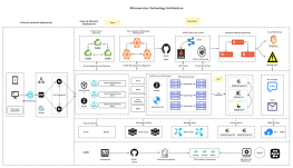
How to draw a high-quality data architecture diagram?

How to draw a high-quality data architecture diagram?

A data architecture diagram is a visual model describing the source, storage, flow, transformation, consumption, and governance rules of an enterprise's data assets. It's not just a technical document, but also a "common language" for reaching consensus between business and technology. This article will systematically introduce the definition, function , and drawing methods of data architecture diagrams , helping you to use this tool efficiently in your work.
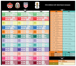
Five charts to unlock the 2026 World Cup: Decoding history, rules, schedule, and venues.

Five charts to unlock the 2026 World Cup: Decoding history, rules, schedule, and venues.

World Cup in the United States , Canada, and Mexico will be the first time in history to be jointly hosted by three countries, and the first time to feature 48 teams competing in 104 matches across 16 cities in North America. For football fans who want to understand this World Cup, the more information there is, the more they need a concise and intuitive "cognitive map." Below, we use five diagrams to guide you through a complete overview of this World Cup.
A Comprehensive Analysis of Domain-Driven Design (DDD) Architecture

A Comprehensive Analysis of Domain-Driven Design (DDD) Architecture

Domain-Driven Design ( DDD ) aims to build software models highly aligned with business needs by using business domain knowledge as the core driving force for system design. It simplifies complex business domains through boundary delineation, helping us design clear domain and application boundaries. This article will systematically explain the core concepts, strategic and tactical design, and layered architecture of DDD .
How to use Sankey diagrams to clearly illustrate resource flow relationships? Templates and examples are included.

How to use Sankey diagrams to clearly illustrate resource flow relationships? Templates and examples are included.

In the field of data analysis and visualization, we often need to show "flow" relationships—for example, from which channel do funds originate, through which links do they go, and where do they ultimately flow; or how energy is transformed from primary energy into end-consumer energy; or the behavioral path of users from entering a website to the final conversion . In these cases, Sankey diagrams are needed. This article will systematically explain the definition, origin, core characteristics, application scenarios , and drawing steps of Sankey diagrams.
1 2 3 4 5
...
20