Register
Process Type
Graphical expression
Mind Type
Structured expression
Note Type
Efficient expression
Home Page Blog Graph Chart
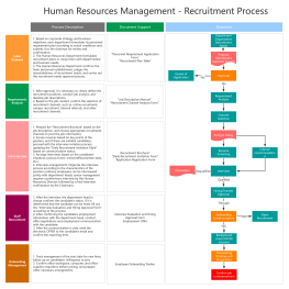
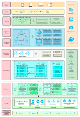
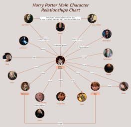
Learn five classic charts to make complex information clear in seconds
In an era of information explosion, efficiently communicating complex concepts has become a critical skill. Scatter plots , funnel plots, quadrant plots, matrix plots, and iceberg plots—five classic visualization tools—help people overcome cognitive limitations by presenting information in a structured manner. They transform abstract logic into intuitive graphics, revealing the inherent laws of a system while streamlining decision-making processes. They are widely used in fields such as business analysis, educational communication, and project management. The following systematically analyzes the core characteristics and application scenarios of each chart.
2025-09-17
What is a column charts and how to draw it?
As a basic and powerful tool in the field of data visualization, column charts have become a powerful assistant for people to process and interpret data with their concise and clear presentation. This article will comprehensively introduce column charts from the perspective of concepts, types, and production tutorials, and will explain them with examples and templates to help you master this tool .
What is a pie chart and how to draw one?
In the era of data-driven decision-making, charts have become the "universal language" in business analysis, academic research, and project management. As a basic and powerful tool in the field of data visualization, pie charts have become a powerful assistant for people to process and interpret data with their concise and clear presentation. This article will help you systematically master the concept, classification and practical skills of pie charts, helping you easily master this classic chart form.
What is a line chart and how to draw it?
In the field of data visualization, line charts, as a classic and practical chart type, have become the preferred tool for displaying data trends due to their simplicity and intuitiveness. This article will explore the definition, applicable scenarios, types, production tools, and creation methods of line charts , and provide specific examples to help you fully master the application of line charts.
What is a bar chart and how to draw it?
In today's data-driven world, how to efficiently and intuitively display data has become the focus of attention of practitioners in various industries. As one of the most basic and commonly used tools in the field of data visualization, bar charts play an irreplaceable role in information transmission with their concise and clear characteristics. This article will take you to an in-depth understanding of the definition, application scenarios, types, production tools and templates of bar charts .
What is a RACI chart ? Definition, how to use it and examples
In project management, clarifying the roles and responsibilities of each participant is the key to ensuring the smooth progress of the project. The RACI chart , as an intuitive responsibility allocation matrix, was born for this purpose. This article will introduce the definition, usage scenarios, and best practices of the RACI model in detail , and share a large number of examples and templates .
1