Process Type
Graphical expression
Mind Type
Structured expression
Note Type
Efficient expression
Treemap
Bracket Diagram
Default Mode
In an era of information explosion, efficiently communicating complex concepts has become a critical skill. Scatter plots , funnel plots, quadrant plots, matrix plots, and iceberg plots—five classic visualization tools—help people overcome cognitive limitations by presenting information in a structured manner. They transform abstract logic into intuitive graphics, revealing the inherent laws of a system while streamlining decision-making processes. They are widely used in fields such as business analysis, educational communication, and project management. The following systematically analyzes the core characteristics and application scenarios of each chart.
Scatter plots display the statistical relationship between two variables using a two-dimensional coordinate system, with each dot representing a data pair. Trend lines, cluster partitions, or bubble size (a third dimension) can be added to enhance information density. Scatter plots are commonly used for regression analysis, anomaly detection, and correlation studies.
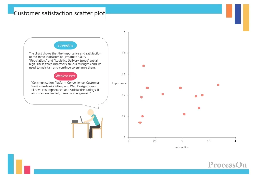
Customer satisfaction scatter plot
Scatter plots, through the distribution of points in a plane coordinate system, intuitively reveal the statistical relationship between two variables. Their core functions are reflected in three aspects: first, exploring correlations, quickly determining whether variables exhibit linear, nonlinear, or uncorrelated patterns; second, identifying data patterns, revealing potential groupings or trends through the clustering or dispersion of points; and third, detecting outliers, locating points that deviate from the mainstream distribution. Furthermore, by combining trend lines, color coding, or bubble size (a third dimension), variable strength, direction, and the interaction of multiple factors can be further analyzed. Compared to tables or single mean indicators, scatter plots preserve the original distribution characteristics of the data, avoiding information loss .
Scatter plots are widely used in scenarios where it's necessary to explore variable relationships and data distributions. In market analysis, the scatter plot distribution of price and sales volume is used to determine the effectiveness of product pricing strategies. In medical research , scatter plots are used to analyze the correlation between drug dosage and efficacy, and between patient age and disease course, to assist in developing personalized treatment plans. Financial risk control uses scatter plot clustering of transaction amounts and frequencies to identify potential fraud or abnormal accounts. Furthermore, in academic research, scatter plots can verify hypothesized relationships between experimental variables (such as the association between environmental factors and species diversity) or, combined with regression analysis, predict trends (such as future models of population growth and resource consumption). Their core value lies in intuitively presenting the raw distribution of multidimensional data, helping to quickly identify patterns, anomalies, and potential causal relationships, providing data support for decision-making.
The onion diagram presents a multi-layered structure in the form of concentric circles, with the outer layer wrapping the inner layer, emphasizing the gradual deepening from appearance to essence.
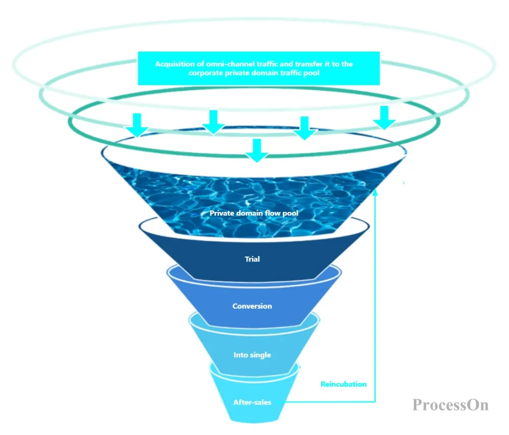
Conversion rate analysis: Identify areas with severe loss (e.g., low conversion rate from add-to-cart to order).
Bottleneck identification: Discover bottlenecks in the process (such as low interview-to-offer conversion rate) through changes in funnel width.
User behavior tracking: Track the user's path from contact with the product to completing the goal (such as the AARRR model).
Marketing conversion: Analyze the conversion path from ad exposure → click → registration → purchase.
Sales management: tracking the entire process of potential customers → demand confirmation → quotation → transaction.
Product optimization: Optimize the churn rate of key paths such as user registration and onboarding.
The objects are divided into four areas by the horizontal and vertical axes, and classified and located according to two dimensions.
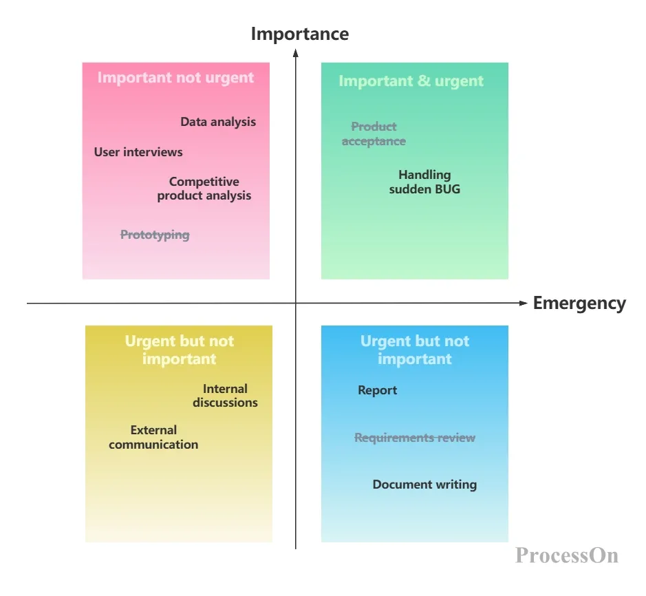
Four Quadrants Work Management Method
The quadrant chart divides the two-dimensional space into horizontal and vertical axes, simplifying complex elements into the intersection of two key dimensions. It can not only intuitively compare the attribute differences of different objects, but also quickly identify priorities, classify groups or discover blank areas. Its core value lies in compressing multi-dimensional information into a visual decision-making framework, helping analysts break through information overload and focus on key contradictions.
The quadrant chart is suitable for scenarios that require classification, evaluation or strategy formulation based on two dimensions, such as resource allocation priority sorting in strategic management, competitor positioning and opportunity identification in market analysis, task urgency and importance judgment in personal time management, precision marketing strategy design in user segmentation, and the trade-off between probability and impact in risk assessment. It helps users quickly form an executable action direction through two-dimensional positioning.
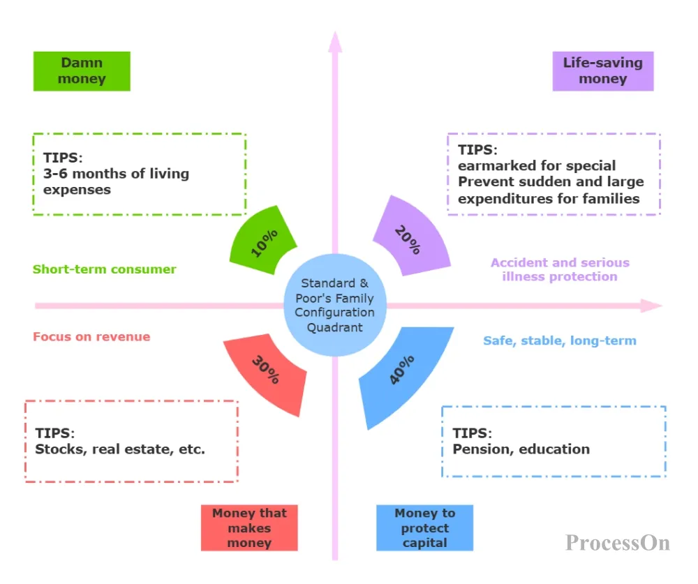
Quadrant Chart (S&P Home Allocation Quadrant Chart)
A matrix diagram displays the interactive relationship of two or more dimensions in a row-column table. Commonly used matrices are L-type, T-type, Y-type, and X-type.
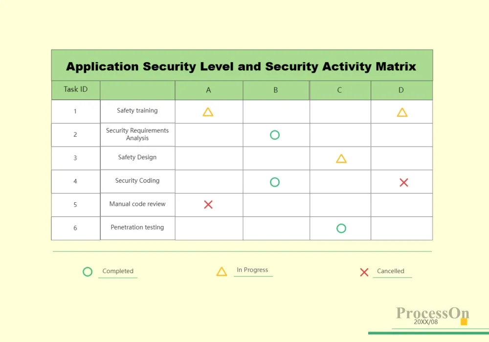
Matrix diagrams visualize the correlation, priority, or matching degree among multiple variables in a complex system by constructing two-dimensional or multi-dimensional cross-tabulations. They can not only reveal the interaction patterns among different elements, but also systematically integrate multi-dimensional information to help analysts identify key combinations, optimize resource allocation, or discover potential conflicts. Their core value lies in converting scattered data into a structured decision-making framework.
Matrix diagrams are suitable for scenarios where it is necessary to analyze the relationships between two or more dimensions simultaneously, such as the matching of task priorities and resource inputs in project management, the trade-off between functional requirements and technical feasibility in product development, the cross-positioning of user portraits and channel strategies in marketing, the comprehensive evaluation of supplier capabilities and cost-effectiveness in supply chain management, and the alignment analysis of job skills and responsibility requirements in organizational structures. It assists users in making more accurate decision-making plans through multi-dimensional cross-analysis.
The iceberg metaphor is used to show the contrast between the visible and hidden parts. The part above water represents the explicit elements, and the part below water represents the implicit elements.
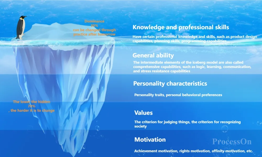
The iceberg diagram uses the metaphor of the structure above and below the water surface to break down complex systems or problems into visible parts and hidden deep parts, helping analysts distinguish between surface phenomena and root causes, short-term performance and long-term impact, thereby breaking through cognitive limitations, identifying overlooked key factors, and providing a structured perspective for systematic problem solving.
Iceberg charts are suitable for scenarios that require exploring hidden dimensions or deep driving forces, such as the correlation analysis between cultural conflicts and behavioral performance in organizational change, the identification of differences between functional usage and emotional needs in user experience design, the trade-off assessment between tangible expenditures and hidden risks in cost management, the balanced decision-making between short-term goals and long-term value in strategic planning, and the matching optimization of skill performance and intrinsic motivation in personal development. It assists users in establishing a comprehensive cognitive framework through layered display.
You can use ProcessOn to create charts online. ProcessOn is a professional charting tool that can create mind maps, flowcharts, and various other charts and models. It also provides a wealth of chart templates for reference or use.
1. Go to ProcessOn's template community, search for chart keywords such as "funnel chart" and "matrix chart", and select the required template to clone.
2. After the template is successfully cloned, you will enter the chart editor. Drag the graphics from the graphics area on the left to the canvas to complete the chart content.
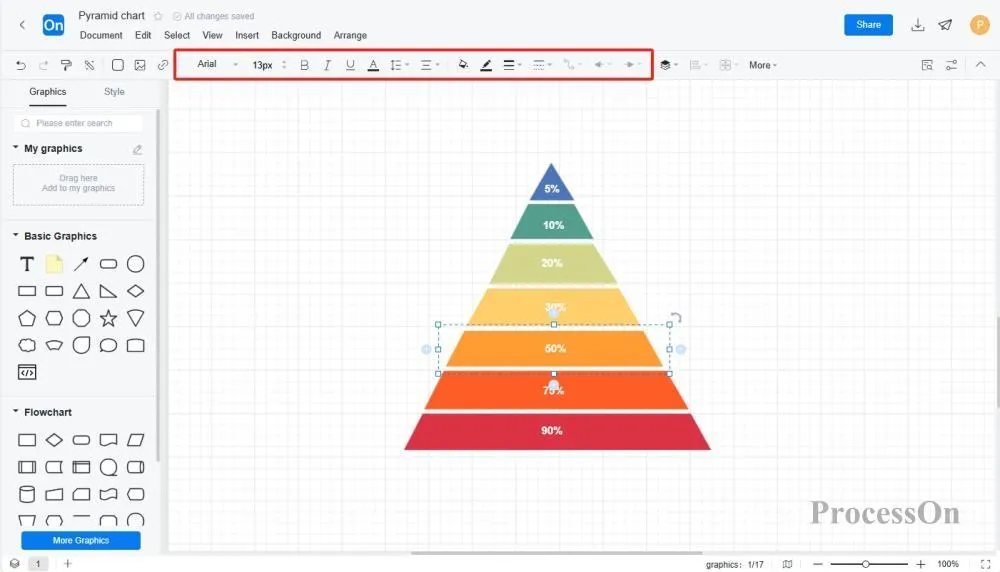
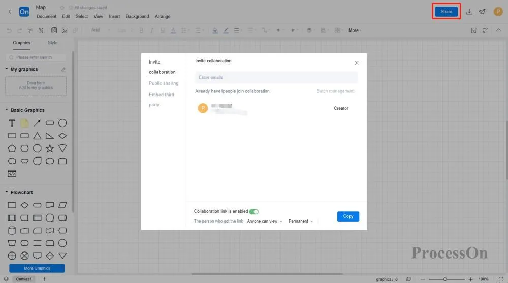
3. After the chart is drawn, you can click on the upper right corner to download and export it to image, PDF and other formats, or click on Share to generate an online link to share with others.
Visualizations are the translators that turn chaotic thinking into clear language, helping us accurately capture key insights amidst a deluge of information . We can start with a single chart, gradually building a personal visualization toolbox, and ultimately achieve the mindset shift to "a picture is worth a thousand words."