Process Type
Graphical expression
Mind Type
Structured expression
Note Type
Efficient expression
Treemap
Bracket Diagram
Default Mode


In today's data-driven world, how to efficiently and intuitively display data has become the focus of attention of practitioners in various industries. As one of the most basic and commonly used tools in the field of data visualization, bar charts play an irreplaceable role in information transmission with their simplicity and clarity. This article will take you to an in-depth understanding of the definition, application scenarios, types, and production tools of bar charts and share multiple bar chart templates .
A bar chart, also known as a column chart, is a type of comparison chart . It is a type of chart that compares the size of data by the length of equal-width bars. Each bar represents a data category, and the height or length of the bar corresponds to the specific value of the category. Bar charts show the comparative relationship between data in an intuitive way, making complex data sets easy to understand and analyze.
Bar charts are useful in a variety of scenarios, especially when you need to:
Compare different categories of data: such as sales of different products, number of employees in each department, etc.
Display the distribution of classified data: such as the distribution of user age groups, sales share in different regions, etc.
Emphasize the differences between data: Quickly attract the audience's attention through obvious contrast in the length of the bars.
Track data that changes over time but in a fixed category (although line charts are more common for this purpose, bar charts can also provide a clear perspective).
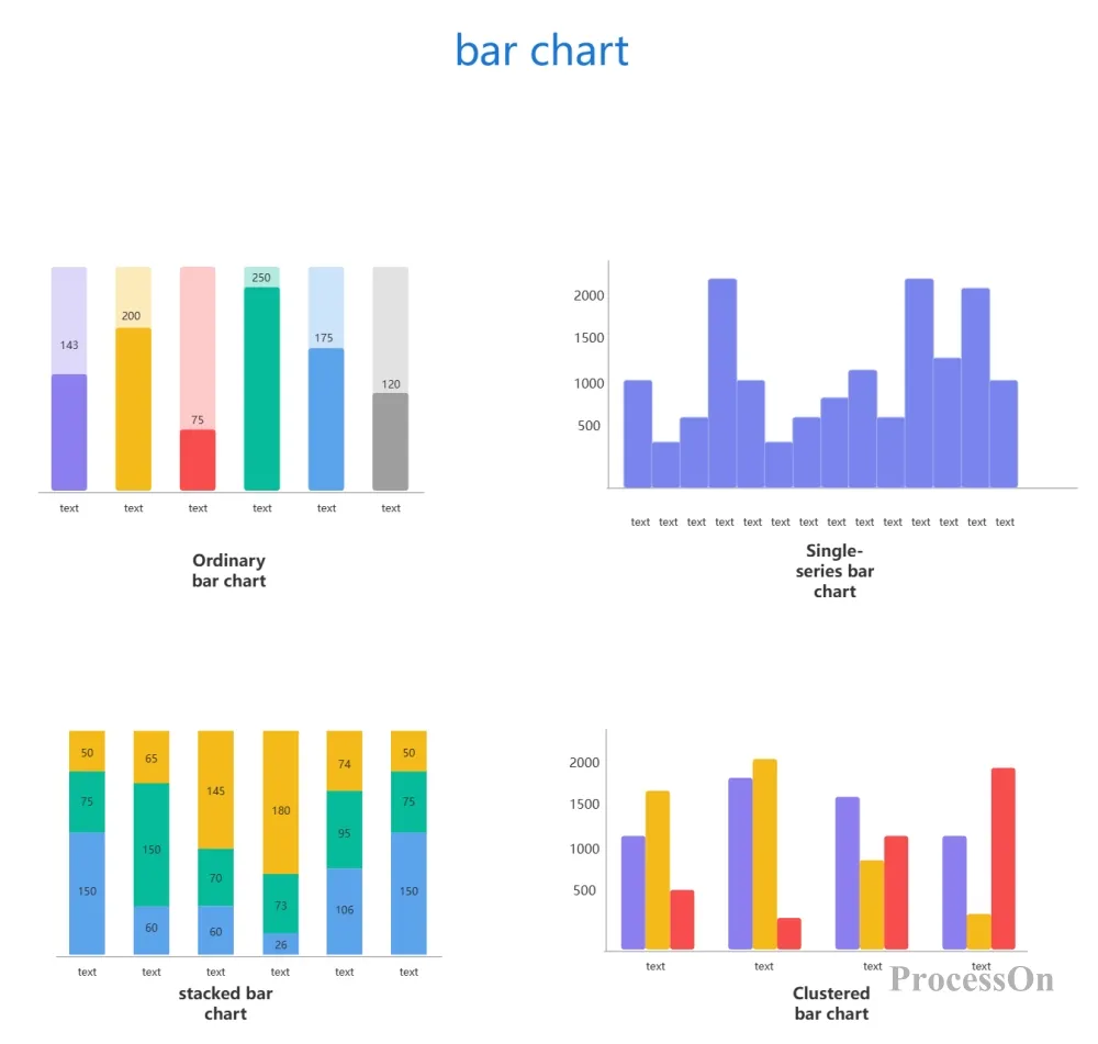
According to data characteristics and presentation requirements, bar charts can be divided into several main types:
Features: The most traditional form , with bars arranged vertically. Each category corresponds to an independent bar, and the length or height of the bar directly represents the value of the category.
Application scenarios: Suitable for comparing single values of different categories, such as sales in different regions, sales of different products, etc.
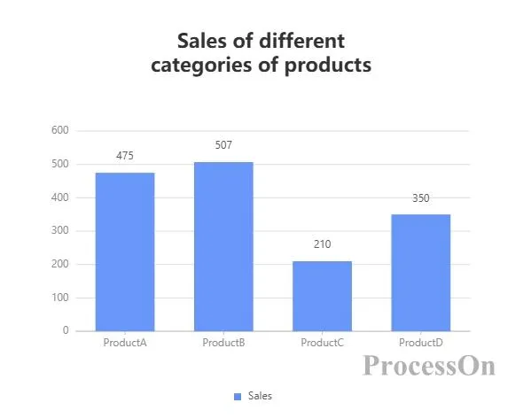
Example:
Statistics on the sales of different products of a company over a period of time. The horizontal axis represents the category (such as product A, product B, product C , product D ), and the vertical axis represents the sales.
There is one bar for each product, and the height of the bar represents its sales.
Features: Displays data of multiple categories in groups, each group contains multiple bars, and each bar represents a value under a subcategory or condition.
Application scenarios: Applicable to comparing the differences of the same category under different conditions, such as data from different years, different regions, or different genders.
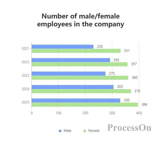
Example:
Compare the number of male and female employees in a company in different years. The horizontal axis represents the year ( 2023 , 2024 , 2025 ), and each group contains two bars (such as male, female).
people for that year and gender .
Features: Each bar consists of multiple parts, each part represents the value of a subcategory, and the parts are stacked together to form a complete bar.
Application scenarios: Suitable for displaying the overall composition and the proportion of each part, such as the total sales of different products and the contribution of each subcategory.
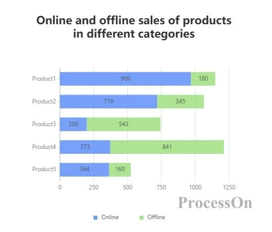
Example:
The horizontal axis represents product categories (such as Product A, Product B, Product C , Product D ), and each bar represents the total sales of that category.
The bars are composed of different colored parts, representing the sales amount of online sales and offline sales respectively.
Features: Similar to a stacked bar chart, but the total height of each bar is fixed at 100%, and each section represents the percentage of the subcategory in the total.
Application scenarios: Suitable for comparing the relative proportions of subcategories in different categories, such as the proportion of the population of different age groups in different regions.
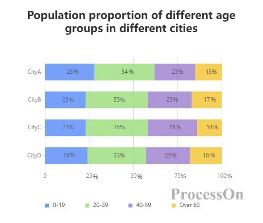
Example:
The horizontal axis represents the region (such as City A, City B), and each bar represents the total population of the region.
The bars are made up of different colored sections, representing the percentage of the population in each age group.
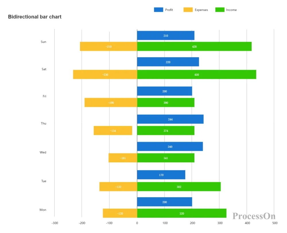
Features: Bars can extend in both positive and negative directions and are often used to represent data with positive and negative values, such as income and expenses, profits and losses.
Application scenarios: Suitable for displaying the increase or decrease or comparison of data, such as the company's annual financial performance.
Example:
The horizontal axis represents the year and the vertical axis represents the amount.
Positive bars represent income and negative bars represent expenses.
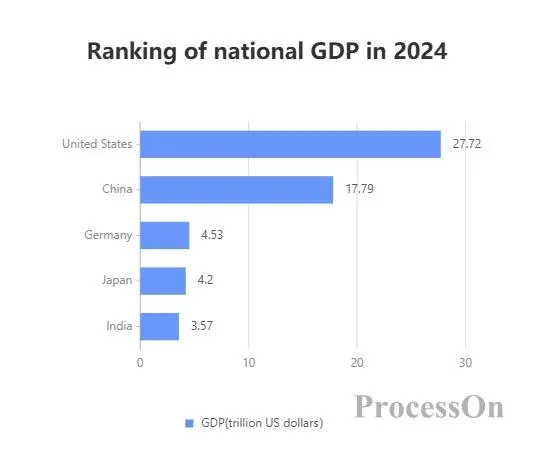
Features: The bars extend horizontally, the horizontal axis represents the value, and the vertical axis represents the category.
Application scenario: Applicable to situations where the category name is long or there are many categories, to avoid overlapping category labels.
Example:
The vertical axis represents the country name and the horizontal axis represents GDP.
Each country corresponds to a horizontal bar, and the length of the bar represents its GDP.
While both bar charts and line charts are important tools for data visualization, they each focus on:
Bar chart: emphasizes the comparison between categories and is suitable for displaying static or categorical data.
Line chart: focuses on showing the changing trend of data over time. It is suitable for situations where continuous data or time series need to be observed.
The type of chart you choose depends on the type of information you want to convey and the needs of your audience .
Microsoft Excel/Google Sheets: Built-in charting capabilities that allow you to quickly create basic bar charts.
Tableau/Power BI: Professional-grade data visualization software that provides rich chart options and advanced analysis capabilities.
Online chart generators: such as Canva, ProcessOn , etc., can create beautiful bar charts through drag and drop operations without programming knowledge.
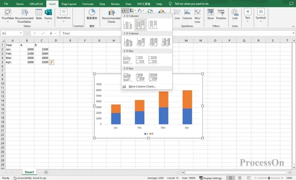
Open the EXCEL chart, select the horizontal and vertical axis data of the table, click [Insert] on the top toolbar to generate a bar chart. Select the bar chart and set the style or change the type of the bar chart.
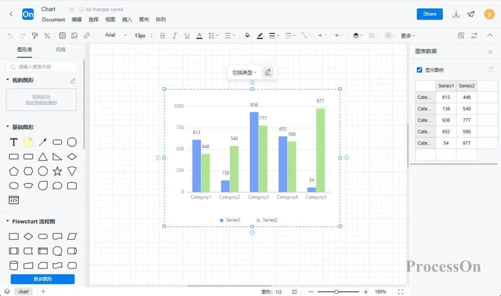
1. Open the ProcessOn official website, enter the personal file page, and click New to create a flowchart .
2. Click More Graphics under the graphics library on the left, select Chart-Bar Chart, drag the bar chart to the canvas, the toolbar above can switch the bar chart type, and click Edit to set the category name and specific value on the right.
The ProcessOn template community contains a variety of bar chart templates for reference, and supports copying to improve drawing efficiency. The following are some templates for sharing.
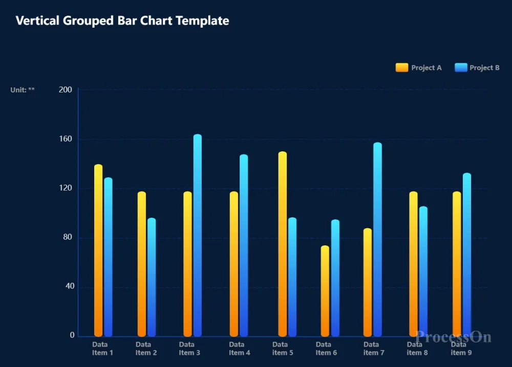
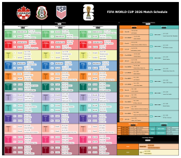
Vertical Grouped Bar Chart Template
Bar charts are one of the most basic and commonly used tools in data analysis. Their core value lies in converting complex data into visual language, which can help decision makers identify areas of strength and weakness, assist in decision making, and enable viewers to quickly understand trends and differences without having to read numbers. Whether it is daily data analysis or professional business reports, the rational use of bar charts can help you convey information more effectively.