Process Type
Graphical expression
Mind Type
Structured expression
Note Type
Efficient expression
Treemap
Bracket Diagram
Default Mode


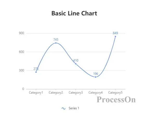
In the field of data visualization, line charts, as a classic and practical chart type, have become the preferred tool for displaying data trends due to their simplicity and intuitiveness. This article will explore the definition, applicable scenarios, types, production tools, and creation methods of line charts , and provide specific examples to help you fully master the application of line charts.
A line chart is a type of comparison chart that connects data points through a series of continuous line segments to show the trend of data changes over time or other continuous variables. It emphasizes the continuity and rate of change between data points rather than the specific value of a single data point. Line charts are often used to display time series data, such as stock prices, temperature changes, sales growth, etc.
Show trends: When you need to show the trend of data over time or other continuous variables, a line chart is the best choice.
Compare multiple series: When you need to compare the changing trends of multiple data series at the same time, a line chart can clearly show the differences and connections between the series.
Predict the future: By analyzing the trends of historical data, line charts can help predict future data trends.
Features: The most basic line chart, which only shows the changing trend of one or more data series over time or continuous variables.
Application scenarios: Suitable for trend analysis of a single data set, such as stock prices, temperature changes, etc.
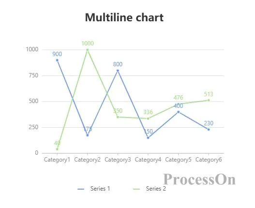
Features: Display multiple broken lines in the same chart to compare the changing trends of different data sets.
Application scenarios: Suitable for comparing changes in multiple variables, such as sales of different products, temperature changes in different regions, etc.
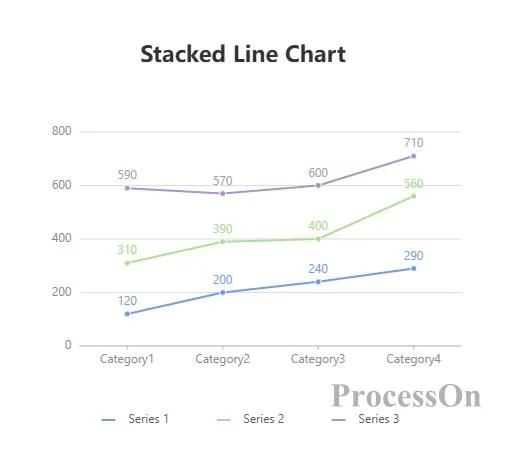
Features: Similar to a stacked column chart, but displayed in line form, each line represents a data set, and the area between the lines is filled to represent the cumulative value.
Application scenarios: Suitable for displaying cumulative changes in data, such as market share, inventory levels, etc.
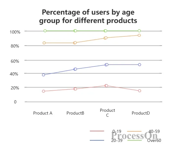
Features: Similar to a stacked line chart, but the sum of all lines is always 100%, which is used to show the changes in the proportion of each part in the whole.
Application scenarios: Suitable for analyzing the changes in the proportion of each part in the whole, such as the sales share of different categories, the growth rate of users in different age groups, etc.
Line chart : emphasizes the continuity and rate of change between data points, suitable for showing trends and predicting the future.
Bar chart : emphasizes the specific value of a single data point and is suitable for comparing differences between different categories.
Choosing which chart type to use depends on the information you want to convey and the needs of your audience. If you are interested in the changing trend of the data, a line chart is a better choice; if you are interested in the specific differences between different categories, a bar chart is more appropriate.
Microsoft Excel/Google Sheets: Built-in charting capabilities that allow you to quickly create basic line charts.
Tableau/Power BI: Professional-grade data visualization software that provides rich chart options and advanced analysis capabilities.
Online chart generators: such as Canva, ProcessOn , etc., can create beautiful line charts through drag and drop operations without programming knowledge.
1. Prepare data: Organize the data to be presented into a table format, making sure that the data columns contain time or other continuous variables and the corresponding data values.
2. Select data: Select the data area for which you want to create a line chart in Excel.
3. Insert a chart: Click the "Insert" tab, select the "Line Chart" type, and then select the appropriate line chart style from the drop-down menu.
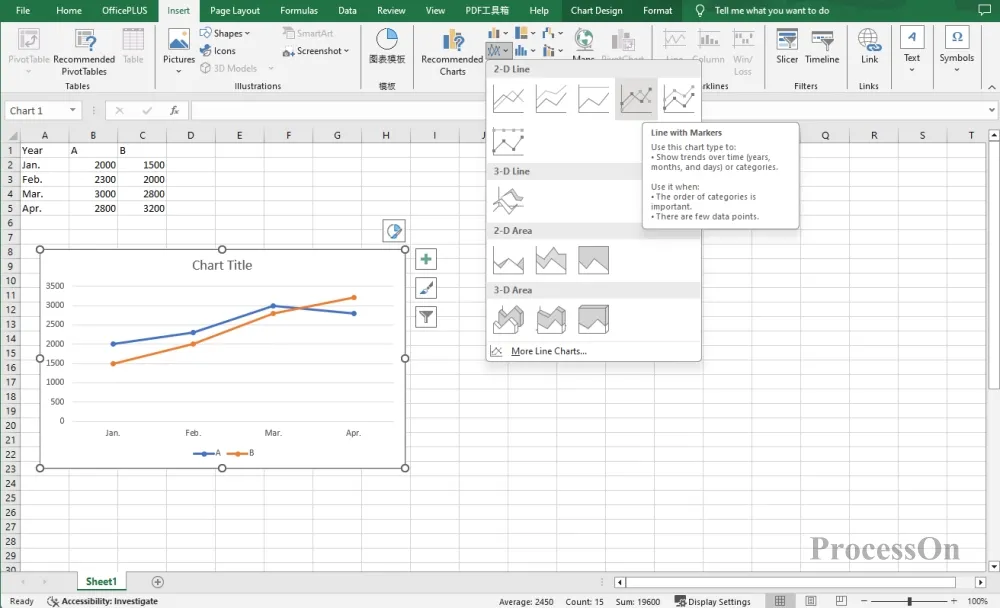
4. Customize charts: Adjust the chart title, axis labels, legend, data series colors, etc. as needed to make the chart clearer and more beautiful.
1. Open the ProcessOn official website, enter the personal file page, and click New to create a flowchart .
2. Click More Graphics under the graphics library on the left, select Chart-Line Chart, drag the line chart to the canvas, click Edit in the toolbar to set the category name and specific value on the right.
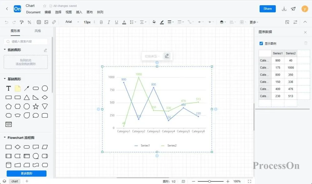
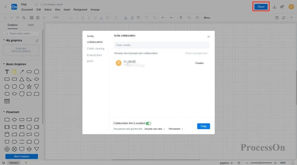
3. After creating the chart, you can save it as an image or PDF format for easy sharing and display.
The ProcessOn template community contains a variety of line chart templates for reference, and supports copying to improve drawing efficiency. The following are some templates for sharing.
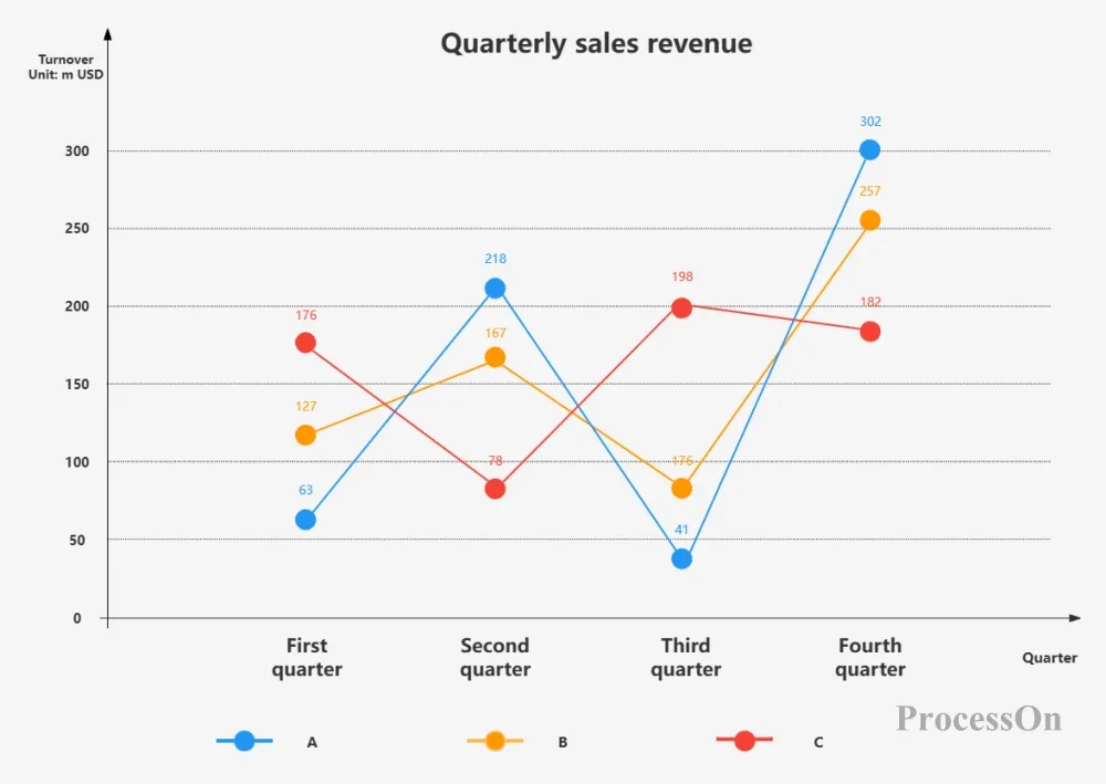
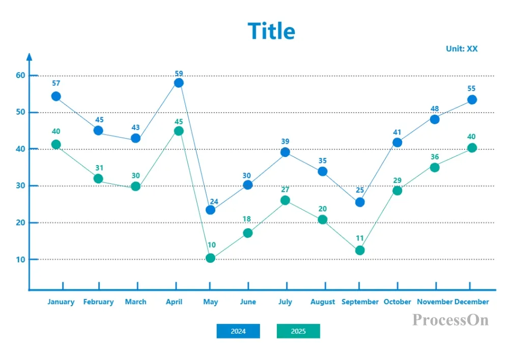
E-commerce website sales line chart
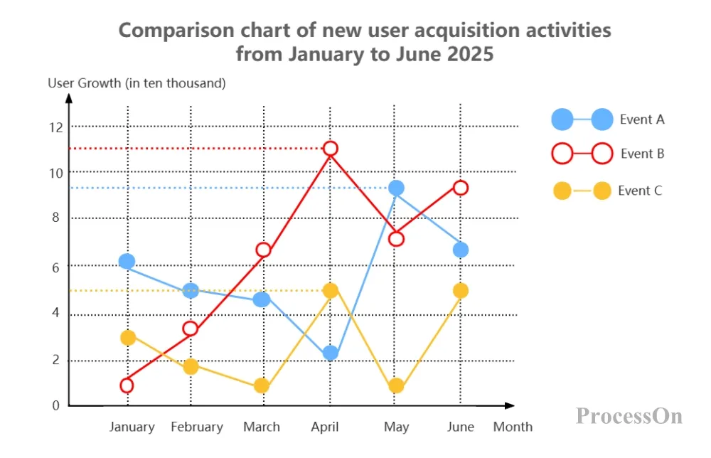
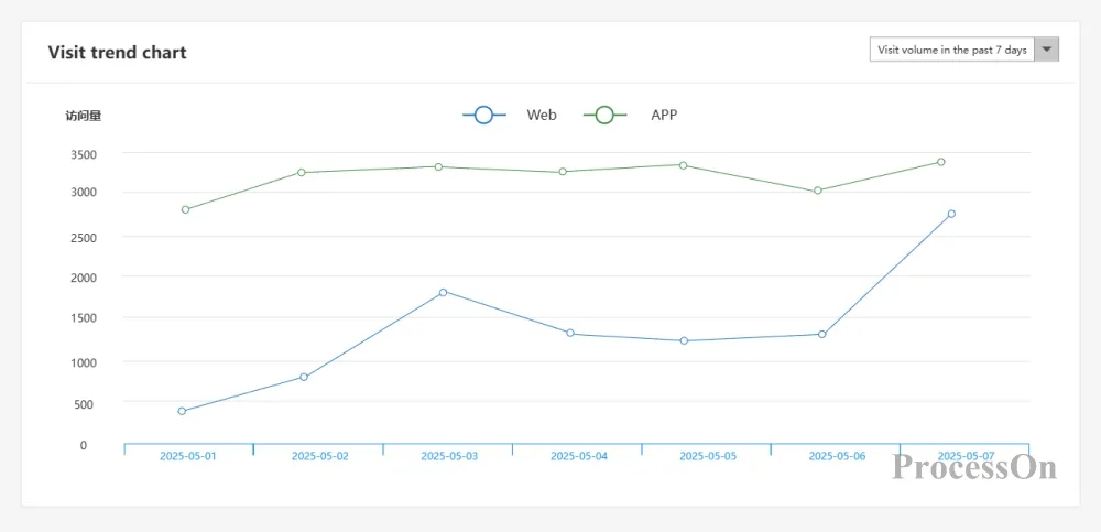
Line chart of website visits at each end
As an important tool for data visualization, line charts are widely used in various fields due to their simplicity and intuitiveness. By mastering the definition, applicable scenarios, types, comparison with bar charts, production tools, and creation methods of line charts, you can use line charts to display and convey data trends more efficiently. I hope this article can help you fully master the application of line charts and maximize their value in actual work.