Process Type
Graphical expression
Mind Type
Structured expression
Note Type
Efficient expression
Treemap
Bracket Diagram
Default Mode


In the era of data-driven decision-making, charts have become the "universal language" in business analysis, academic research, and project management. As a basic and powerful tool in the field of data visualization, pie charts have become a powerful assistant for people to process and interpret data with their concise and clear presentation. This article will help you systematically master the concept, classification and practical skills of pie charts, helping you easily master this classic chart form.
Pie charts divide a circle into multiple sectors to intuitively present the proportion of each part in the whole. In a pie chart, a circle (360°) is divided into multiple sectors in proportion, and the size of each sector is proportional to the corresponding data value, using the intuitive analogy of "cutting a cake" to convey the proportional relationship. It is frequently used in scenarios such as market share analysis, budget allocation visualization, and user group profiling .
Applicable conditions:
When you need to emphasize the data of "what parts the whole is composed of" , and the number of categories is ≤ 6 and the difference in proportion is ≥ 15% , you can use a pie chart to display the data.
Typical cases:
Market research: present the proportion of users choosing different products (e.g. Brand A 42%, Brand B 31%, others 27%)
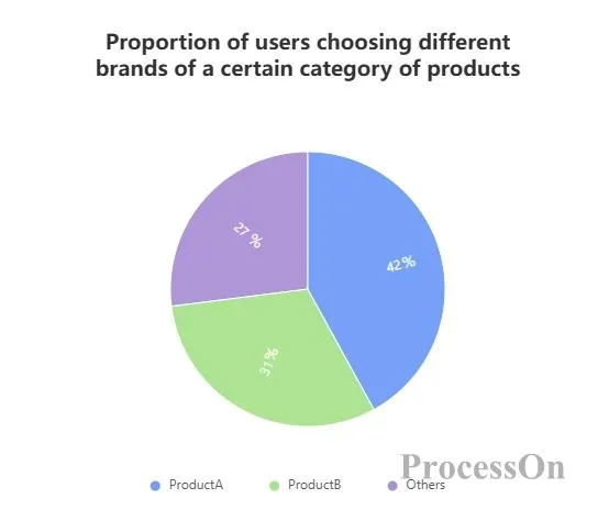
The proportion of users choosing different brands of a certain product category - pie chart
guide:
When the number of categories is >7, it is recommended to use a bar chart (such as sales comparison of each province) ;
When the difference in percentage is less than 5%, use a stacked bar chart instead (such as slight fluctuations in gross profit margin from quarter to quarter) .
Applicable conditions:
When the number of categories in the data to be presented is ≤5 and a consensus needs to be reached quickly , or the data of each category differ significantly (e.g., the maximum/minimum value is ≥3 times) , a pie chart can be used to present the data.
Typical cases:
Display website users ’ device distribution: iOS (55%), Android (35%), PC (8%), other (2%)
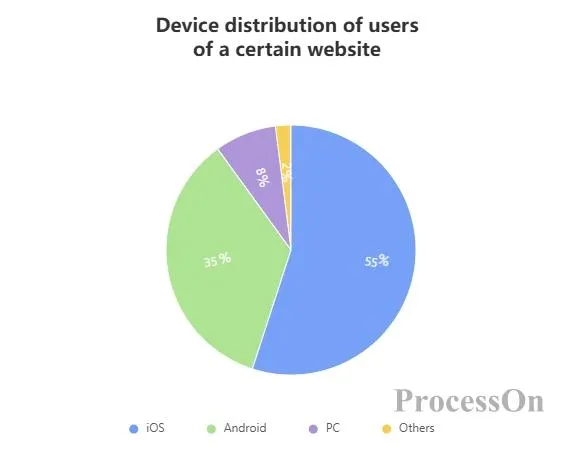
Pie chart of device distribution of users of a website
Optimization suggestions:
Categories with a proportion of less than 5% are combined into "Others" and displayed separately ;
Use contrasting colors (such as blue-orange, yellow-purple , etc. ) to reinforce key data .
Applicable conditions:
Pie charts can be used to display data when the core conclusion needs to be conveyed quickly through visualization or when the data dimension is single but requires multi-level nesting .
Typical cases:
Strategic meeting: Show the proportion of capital investment in core business and marginal business ( Business A accounts for 60%, Business B accounts for 20%, Business C accounts for 10%, Business D accounts for 10% )

Pie chart of the proportion of company business capital investment
Definition: The most traditional and basic pie chart format divides a complete circle into sectors of different sizes according to the proportion of each part. Each sector represents a category, and the size of the sector is proportional to the proportion of the category in the whole.
Features: Simple and intuitive, it can quickly let readers understand the relative size of each part in the whole, but when there are too many categories, the sector will become small and difficult to distinguish. It is suitable for showing the proportion of a small number of categories (usually no more than 7), such as showing the proportion of different departments in the total number of employees of a company, the proportion of different flavors of a product in the total sales volume, etc.
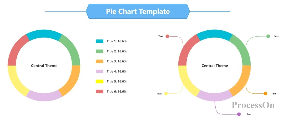
Definition: A donut chart is a variation of a pie chart. It is similar to a basic pie chart in that it also uses a sector-shaped area to display the proportion of each part. The difference is that the center of the donut chart is empty, forming a ring structure.
Features: Compared with the basic pie chart, the ring chart is more concise visually. The blank area in the center can be used to add additional information, such as the overall value, title, icon, etc., which enhances the information communication ability of the chart. It is often used in scenarios where the overall data needs to be highlighted in the center of the chart and the proportion of each part needs to be displayed at the same time. For example, when displaying sales data, the center can display the total sales, and the surrounding ring area can display the proportion of different product categories in the total sales.
Definition: On the basis of the basic pie chart, by adding a three-dimensional effect, the pie chart looks three-dimensional. The sector area is no longer a simple flat sector, but presents a three-dimensional shape.
Features: The 3D effect enhances the visual appeal of the chart, making it look more vivid and layered. However, the three-dimensional effect may distort the actual proportion of the sector area to a certain extent, causing readers to have a biased judgment of the data. It is suitable for scenes with high requirements for visual effects, fewer data categories, and more obvious differences in proportions, such as when making promotional posters, presentation cover pages, and other places where you need to attract the audience's attention.
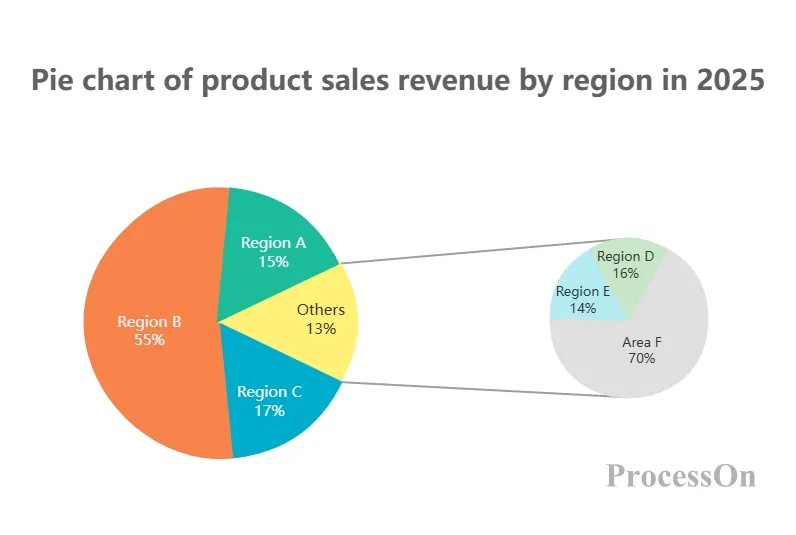
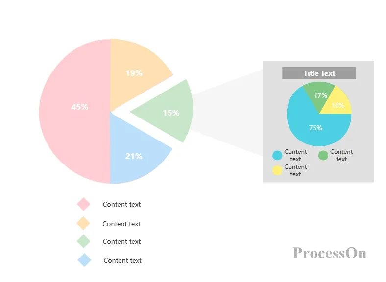
Definition: When there are many data categories and the basic pie chart is difficult to display clearly, the composite pie chart comes into being. It usually consists of a main pie chart and one or more secondary pie charts. The main pie chart displays the main categories and their proportions, and the secondary pie chart further subdivides one or several sectors in the main pie chart.
Features: It can effectively solve the problem of too many categories leading to too small pie areas, allowing readers to understand the overall composition and to view the detailed breakdown of certain important categories. It is often used to display hierarchical data. For example, when displaying the overall revenue composition of a company, the main pie chart shows the proportion of different business departments in the total revenue, and the secondary pie chart shows the revenue proportion of different product lines under a certain important business department.
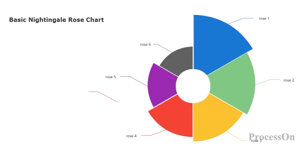
Definition: Also called polar coordinate pie chart, it divides the polar coordinate plane into several equiangular areas, and then fills the corresponding equiangular areas according to the size of the data. The length of the stretch is proportional to the value of the category.
Features: It can highlight the numerical differences between different categories. Even if the categories with similar proportions may have large differences in numerical values, they can be clearly displayed through the length of the fan-shaped area. It is suitable for scenarios that need to simultaneously display the relationship between the part and the whole and the numerical differences between categories. For example, in medical statistics, it can show the proportion of different diseases in the total number of cases and highlight the absolute differences in the number of cases of certain diseases.
Microsoft Excel/Google Sheets: Built-in charting capabilities that allow you to quickly create basic pie charts .
Tableau/Power BI: Professional-grade data visualization software that provides rich chart options and advanced analysis capabilities.
ProcessOn: Chart maker that allows you to create pie charts online for free . No programming knowledge is required. You can create beautiful pie charts by dragging and dropping .
Taking ProcessOn as an example, the following steps for making a pie chart are described in detail :
1. Open the ProcessOn official website, enter the personal file page, and click New to create a flowchart .
2. Click More Graphics under the graphics library on the left, select [Chart], and click OK.
3. Drag the pie chart to the canvas. The toolbar above can be used to switch the pie chart type. Click Edit to set the category name and specific value on the right.
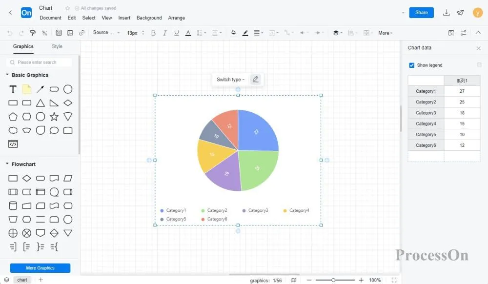
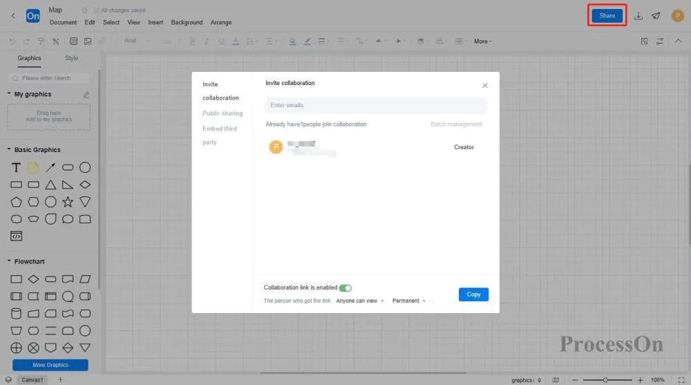
4. After editing, you can download the pie chart as image, PDF and other formats, or generate an online link to share and collaborate with others.
The ProcessOn template community contains a variety of pie chart templates and examples for reference, and supports copying to improve drawing efficiency. The following are some templates for sharing.
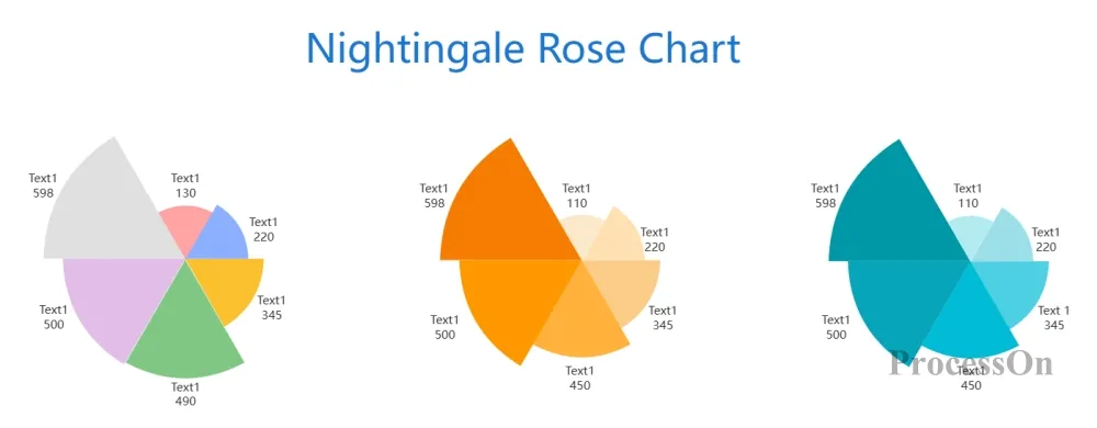
Nightingale Rose Diagram Template
As an intuitive and efficient data visualization tool, pie charts play an irreplaceable role in many fields. Whether it is the analysis of consumer preferences in market research or the display of the proportion of various income and expenditure in financial statements, pie charts can be used to provide decision makers with clear data insights and help them make more scientific and reasonable judgments and decisions.