
Pie chart template - color
8 Report
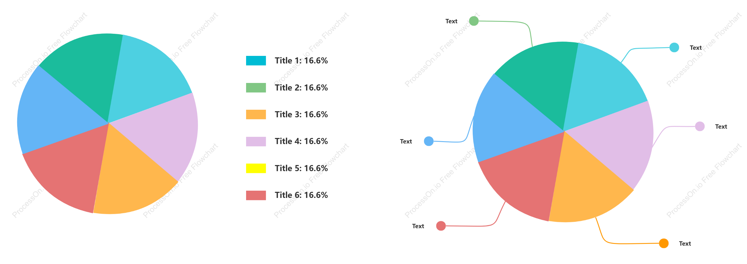
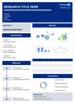
This pie chart template is designed to visually represent data distribution using color-coded segments. Each segment, labeled as Title 1 through Title 6, equally shares 16.6% of the chart, indicating an even distribution across these categories. Accompanying text sections provide additional context or explanations for each title, ensuring a comprehensive understanding of the data presented. This template is ideal for illustrating balanced datasets where each category holds equal importance, facilitating clear and effective communication of information.
Related Recommendations
Other works by the author
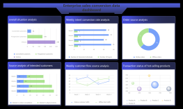
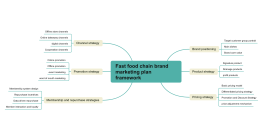
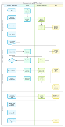
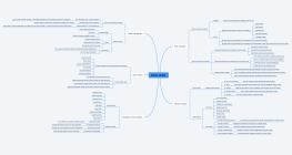
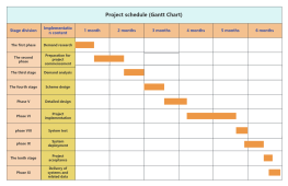
Outline/Content
See more
Text
Title 4: 16.6%
Title 1: 16.6%
Title 5: 16.6%
Title 6: 16.6%
Title 2: 16.6%
Title 3: 16.6%
Collect
Collect
Collect
Collect
Collect

0 Comments
Next Page