Process Type
Graphical expression
Mind Type
Structured expression
Note Type
Efficient expression
Treemap
Bracket Diagram
Default Mode


In the era of data-driven decision-making, whether it is corporate executives analyzing business indicators, scientific researchers presenting experimental data, or students completing course reports, how to present complex data in an intuitive and easy-to-understand way has become a key issue. As a basic and powerful tool in the field of data visualization, column charts have become a powerful assistant for people to process and interpret data with their concise and clear presentation. Today, let us take a deep look at the secrets of bar charts , master their use, and provide strong support for data insights and decision-making.
A column chart , also known as a vertical bar chart, is a type of chart that uses the height of a rectangle to display the size of data. In a column chart , different categories or groups are usually marked on the horizontal axis, and the vertical axis represents the numerical value of the data. Each category corresponds to a rectangular column, and the height of the column is proportional to the data value corresponding to the category. In this way, people can quickly compare the data differences between different categories and intuitively understand the distribution of data.
Column Chart
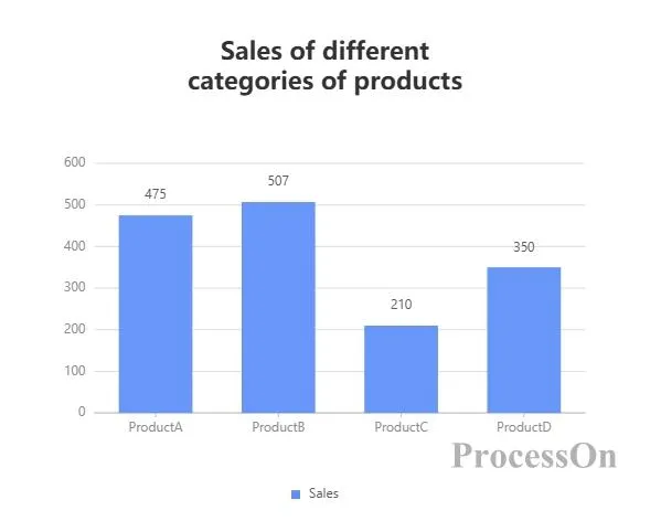
When you need to compare data differences between different categories, a column chart is the tool of choice. These categories can be product type, region, department, age group, etc. For example, if an e-commerce company wants to compare the sales of different categories of goods in a certain month, it can use a column chart to clearly show the sales of each category and find out the sales champions and potential categories.
A column chart can intuitively show the distribution of data in different intervals or categories. By grouping the data and plotting it into a column chart , you can clearly see the central tendency, dispersion, and outliers of the data. For example, when analyzing student test scores, you can group the scores by score range, use a column chart to show the number of students in each score range, understand the distribution of scores, and judge the overall learning level of the class.
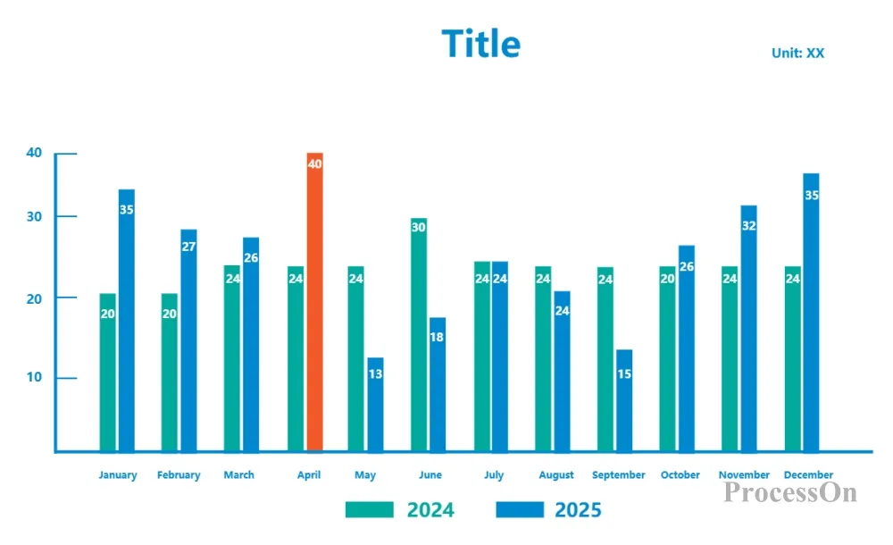
If the data is collected at a certain time interval (such as day, week, month, year), and the data size at different time points needs to be compared, the column chart is also suitable. For example, if a restaurant owner wants to know the customer flow of each day in the past week in order to arrange staff shifts and food purchases reasonably, he can use a column chart to display the daily customer flow columns to intuitively see which day has high customer flow and which day has low customer flow.
The basic form of a column chart, with bars arranged vertically. Each category corresponds to an independent bar, and the length or height of the bar directly represents the value of the category. It is suitable for comparing single values of different categories, such as sales in different regions, sales of different products, etc.
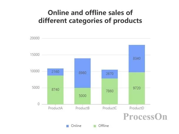
2D stacked column chart: stacks rectangular bars of different series together. The height of each rectangular bar represents the value of the series in the category, and the height of the entire column represents the sum of the values of all series in the category. It is often used to show the proportion of each part in the whole and the total amount of the whole. For example, to show the annual online and offline sales of different product lines of a company , each product line is a category, and each sales channel is a series. Through the 2D stacked column chart, you can clearly see the annual online and offline sales of each product line , as well as the changes in the annual total sales.
3D stacked column chart: Adds a 3D effect to the 2D stacked column chart, making the chart look more three-dimensional, but it may affect the readability of the data to a certain extent. Use it in scenarios where you need to emphasize visual effects or display data in multiple dimensions.
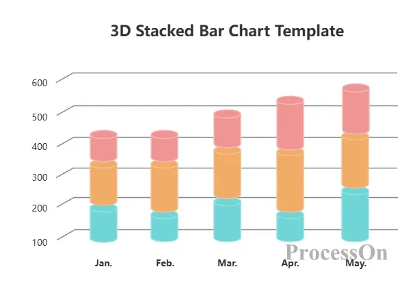
3D stacked column chart template
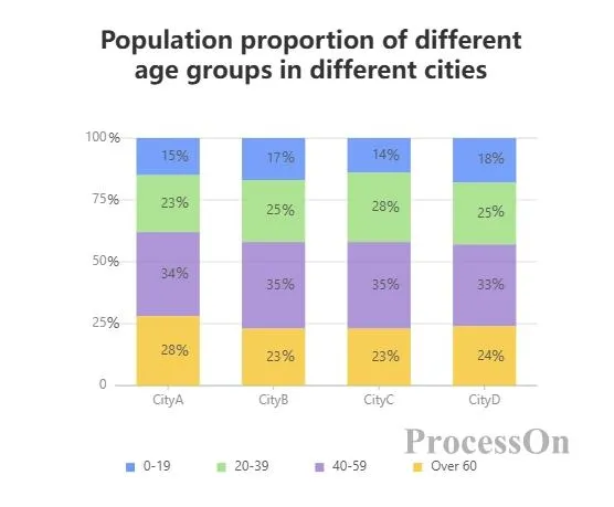
Similar to stacked column chart, but the height of each column is always 100%, and the height of each series of rectangular bars represents the percentage of the value of the series in the category to the total value of the category. The focus is on showing the proportional relationship of each part in the whole, rather than the absolute value. For example, to analyze the proportion of the population of different age groups in different cities , the percentage stacked column chart can intuitively show the proportion of each age group in different cities .
arranges rectangular bars of different series in groups. The rectangular bars in each group represent a series, and the groups correspond to different categories. It is suitable for comparing the numerical differences between series under different categories. For example, to compare the number of male and female employees in a company in different years , each year is a group and each gender is a series. The grouped column chart can clearly show the difference in the number of male and female employees in different years .

Although both column charts and bar charts essentially represent data size by the length of rectangular bars, there are some obvious differences between them in practical applications:
a column chart are placed vertically, with the vertical axis representing the value and the horizontal axis representing the category; while the bars of a bar chart are placed horizontally, with the horizontal axis representing the value and the vertical axis representing the category. This difference in direction determines their applicability in different scenarios.
Column chart : more suitable for displaying data comparisons with shorter category names and smaller quantities. When the category names are long, using a column chart may cause the horizontal axis labels to overlap, affecting the readability of the chart. In addition, when a column chart displays time series data, the time axis is usually on the horizontal axis, which is more in line with people's reading habits and is convenient for observing the trend of data changes over time.
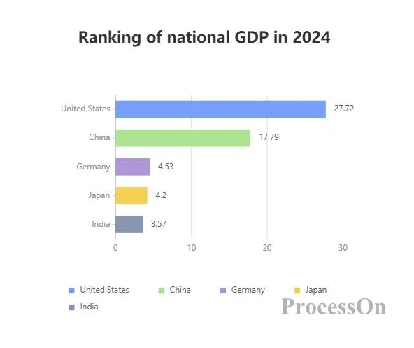
Bar chart: It has advantages when the category names are long or the number is large. Horizontally placed rectangular bars can accommodate longer labels, avoid label overlap, and make the chart clearer and easier to read. For example, when comparing GDP data of different countries, since the country names are long, using a bar chart can better display the label information.
column charts are arranged vertically, they give a feeling of upward extension and growth when displaying data, and are more suitable for highlighting the size differences and changing trends of data; bar charts are arranged horizontally, which is visually more stable. When displaying large amounts of data, readers can more easily compare different categories of data horizontally.
ProcessOn: ProcessOn is a professional chart drawing tool. Users only need to drag the column chart template and modify the data to generate a column chart. ProcessOn also supports drawing mind maps, flow charts and other charts. column charts can be used in combination with these charts to enrich the readability of documents.
Excel: Excel provides powerful chart making functions. It has a rich set of column chart templates. Users only need to input data and generate various styles of column charts through simple operations . Excel's data filtering, sorting and calculation functions also facilitate the production of column charts , which are suitable for data analysis and report making of various scales.
Tableau: Tableau is a professional data visualization tool that supports the connection of multiple data sources and can quickly convert data into intuitive column charts . Tableau provides a wealth of visualization options and interactive functions. Users can easily adjust the style and layout of column charts through drag-and-drop operations , and can also filter, drill and link data to deeply explore the information behind the data. Tableau is suitable for data analysts, business personnel and other users who need to perform complex data visualization and exploratory analysis.
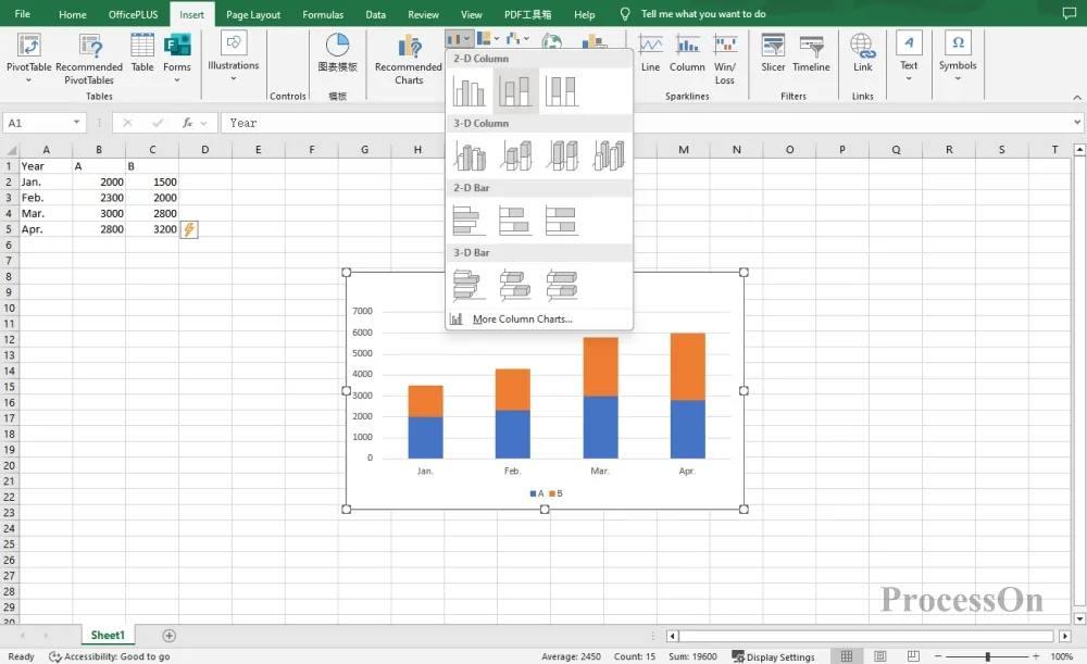
Open the EXCEL chart, select the horizontal and vertical axis data of the table, click [Insert] on the top toolbar to generate a column chart . Select the column chart and set the style or change the type of the column chart .
1. Open the ProcessOn official website, enter the personal file page, and click New to create a flowchart .
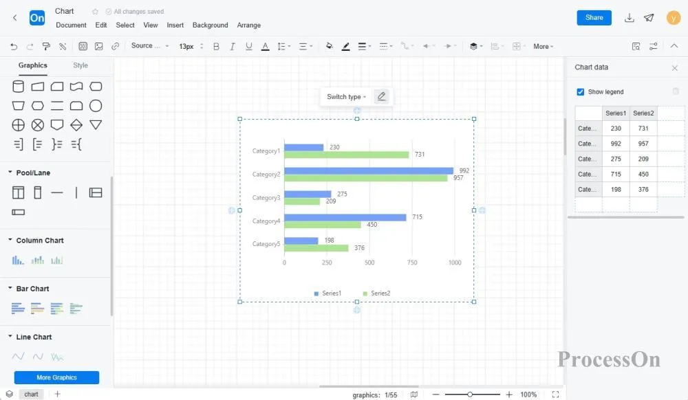
2. Click More Graphics under the graphics library on the left, select Chart- Column Chart , drag the column chart to the canvas, the toolbar above can switch the column chart type, and click Edit to set the category name and specific value on the right.
The ProcessOn template community contains a variety of column chart templates and examples for reference, and supports copying to improve drawing efficiency. The following are some templates for sharing.
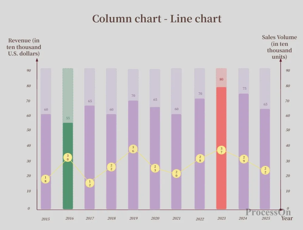
Column chart + line chart template
Column chart template-business style
column charts are widely used in various fields. By mastering the production methods and usage skills of column charts , we can transform complex data into intuitive and easy-to-understand charts, providing strong support for data analysis and decision - making. Whether reporting business data at work or presenting research results in study, column charts will become our indispensable assistant. Try to make your own column chart now !