
3D Stacked Bar Chart Template
0 Report
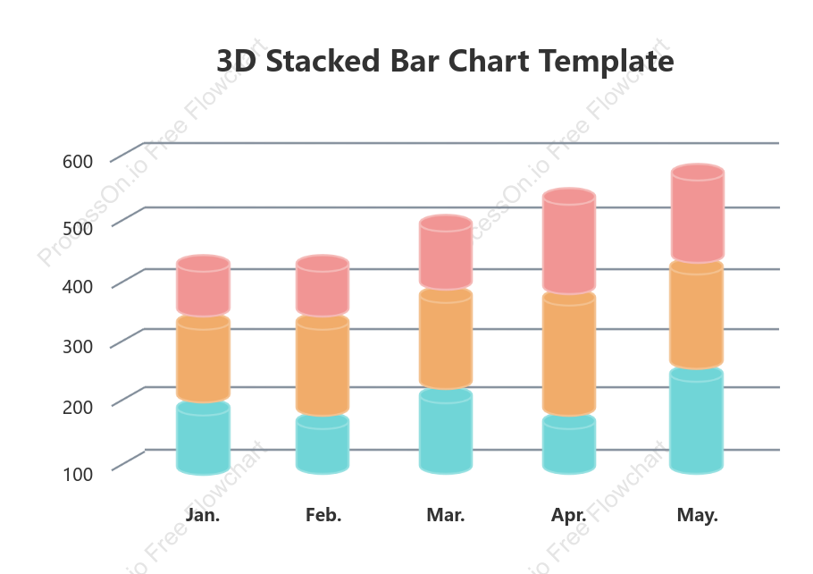
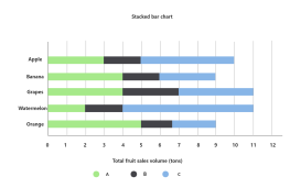
The 3D Stacked Bar Chart Template provides a visual representation of data distribution over several months, highlighting variations in values for January through May. Each month is represented with distinct stacked bars, illustrating the comparative metrics—such as 300 in February, 600 in May, and 500 in January. This template serves as an effective tool for analyzing trends and patterns over time, enabling users to draw insights from the fluctuating figures. Ideal for presentations or reports, this chart facilitates a clear and concise understanding of data progression across the specified period.
Related Recommendations
Other works by the author
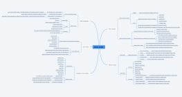
Outline/Content
See more
Feb.
300
100
May.
600
400
Mar.
200
Jan.
500
Apr.
3D Stacked Bar Chart Template
Collect
Collect
Collect
Collect
Collect

0 Comments
Next Page