
Column chart - Line chart
0 Report
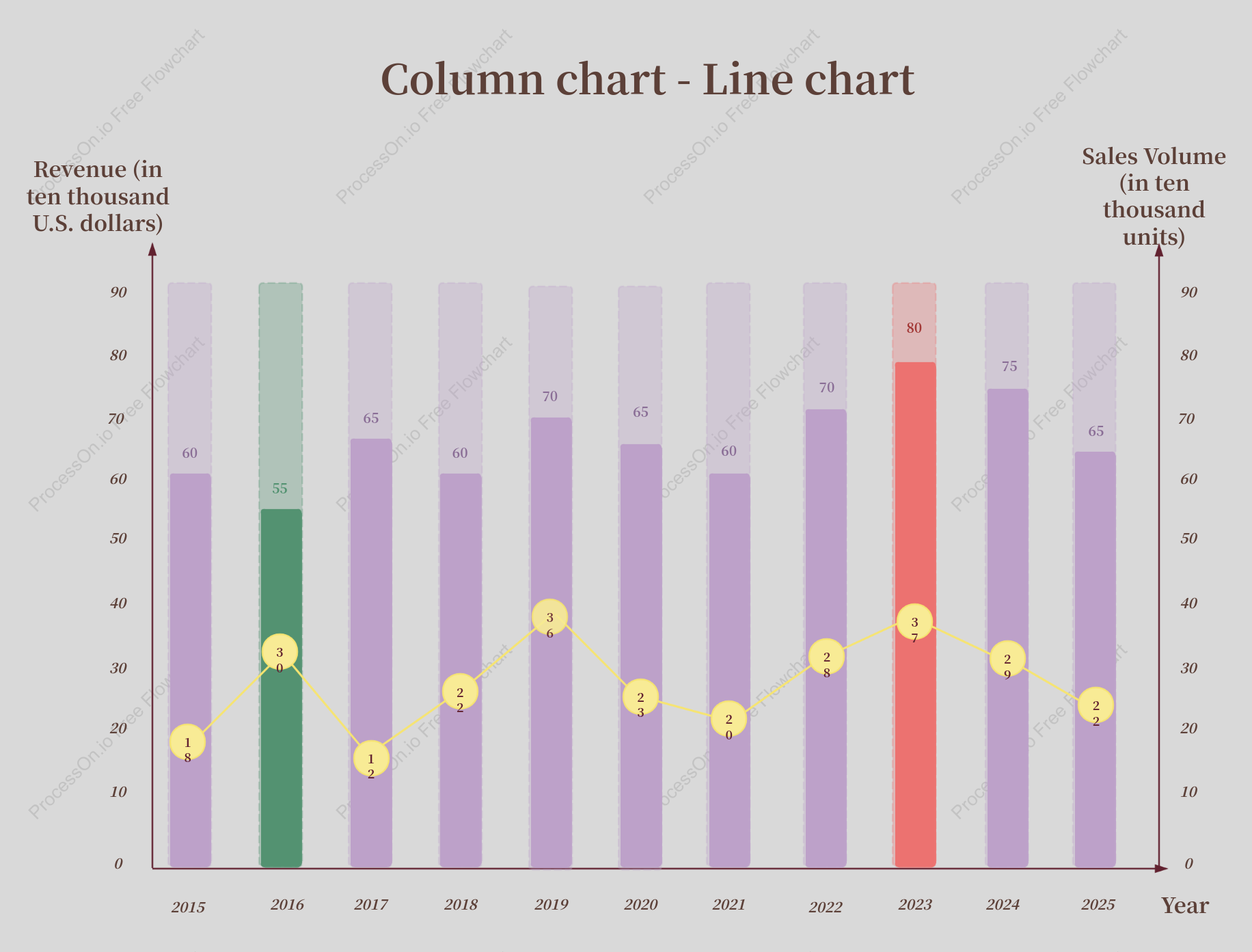
This visualization combines a column chart and a line chart to depict the revenue and sales volume trends from 2015 to 2025. The column chart illustrates the revenue in ten thousand U.S. dollars, while the line chart represents the sales volume in ten thousand units. Key data points include significant revenue peaks in 2023 and consistent sales volume growth over the years. This dual-chart format offers a comprehensive view of financial performance and market demand, aiding in strategic planning and decision-making.
Related Recommendations
Other works by the author
Outline/Content
See more
Revenue (in ten thousand U.S. dollars)
65
2023
2024
80
40
70
10
23
0
90
36
2015
22
2025
60
2018
20
2017
30
75
2022
55
28
2021
18
29
Year
37
2016
Sales Volume (in ten thousand units)
Column chart - Line chart
2020
2019
50
12

Collect
Collect
Collect
Collect

0 Comments
Next Page