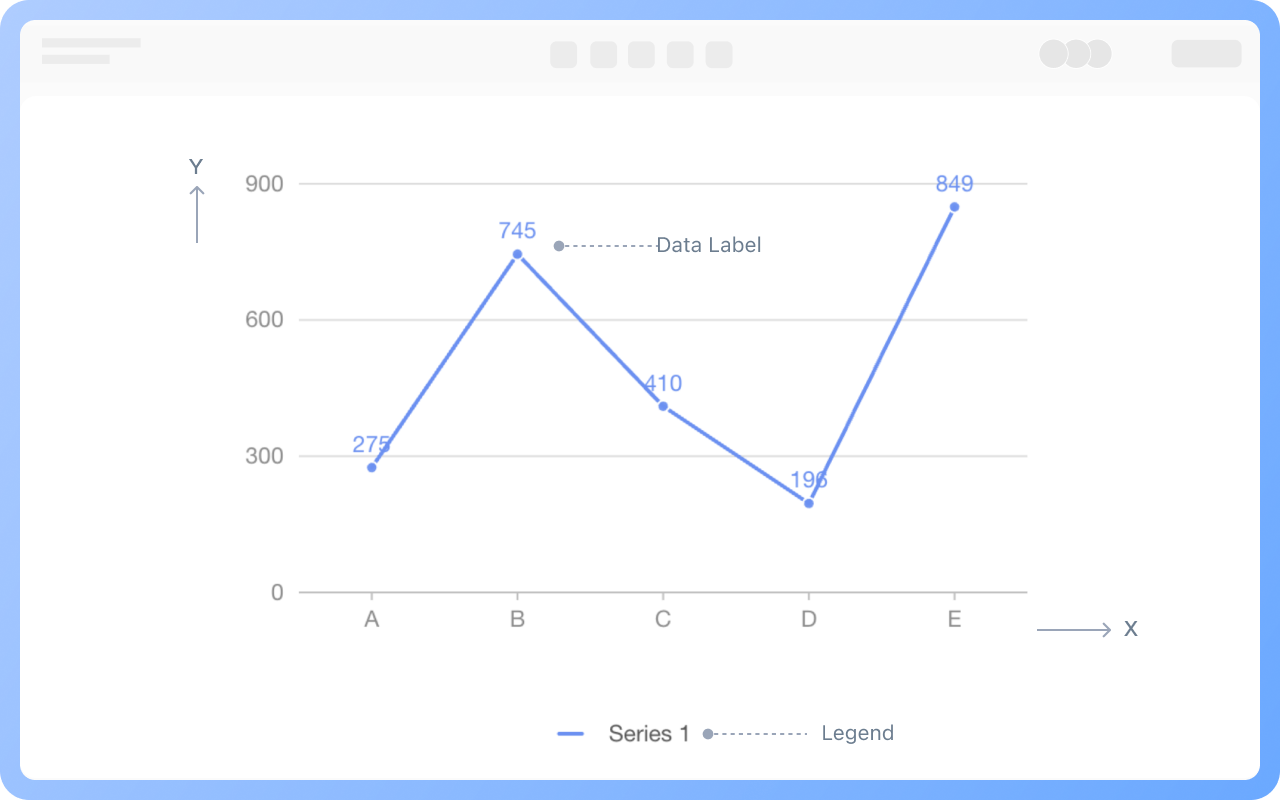
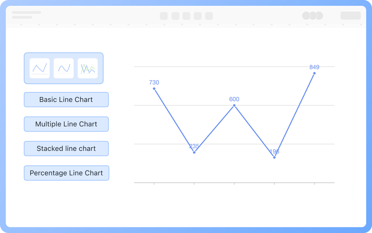
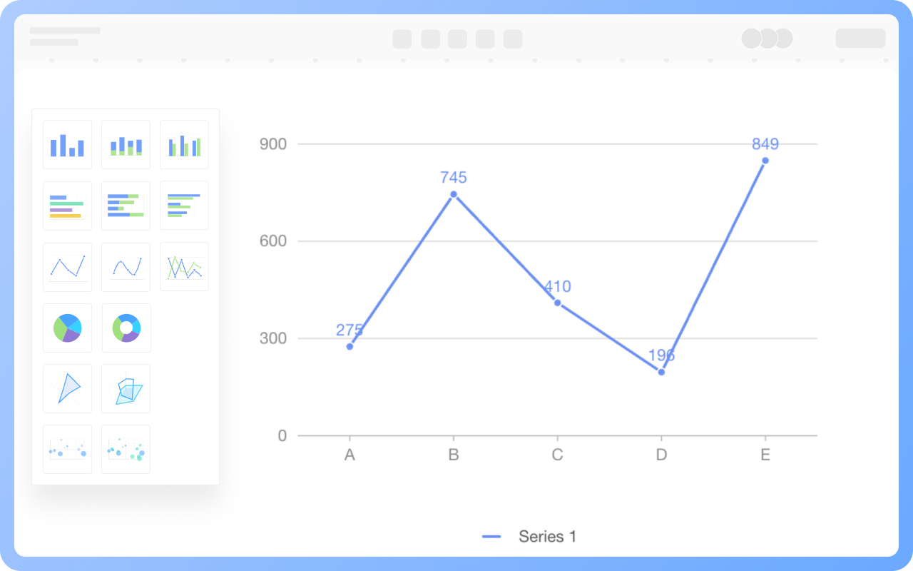
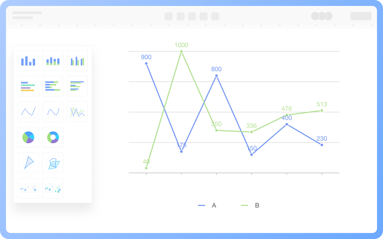
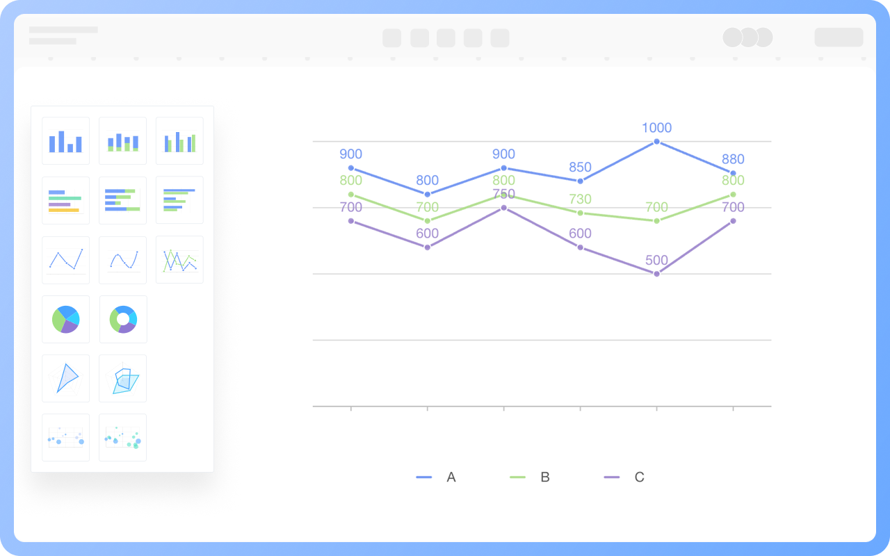
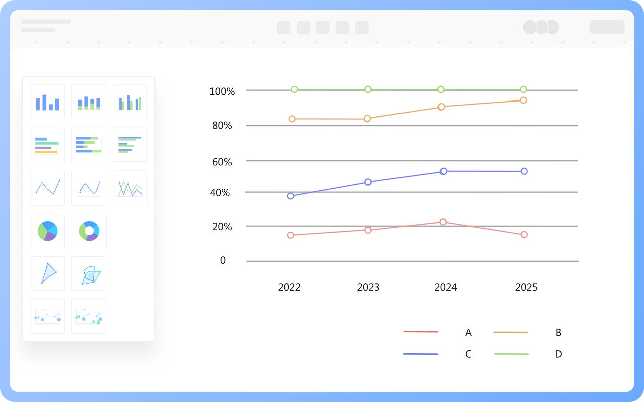
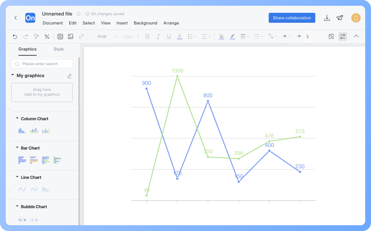
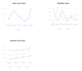
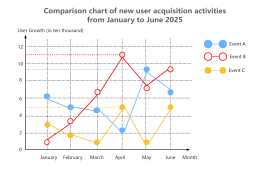
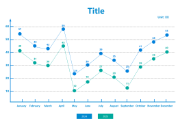
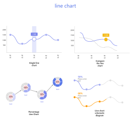
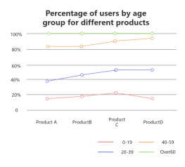
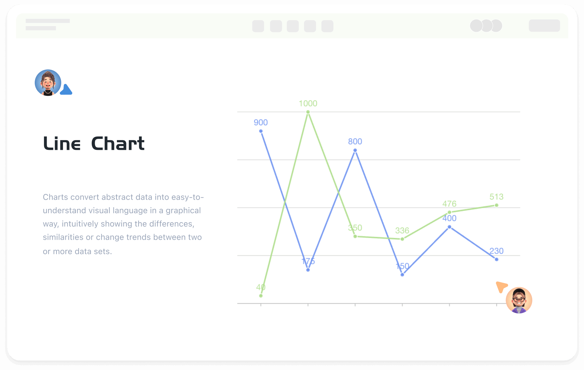
Register
Process Type
Graphical expression
Mind Type
Structured expression
Note Type
Efficient expression

Online Line Chart Creation Tool

Free to use
Online Line Chart Creation Tool
What is Line Chart

The line chart, a type of comparison chart, connects data points with a series of continuous line segments to reflect the trend of data changes over time, categories, or ordered variables. It emphasizes the continuity and rate of change between data points rather than the specific values of individual data points.
ProcessOn supports online creation of line charts and offers a vast number of line chart templates and examples for easy drawing of professional and aesthetically pleasing line charts.

Free to use

ProcessOn Line Chart Key Features

Online Collaboration

Supports real-time multi-user co-creation with shareable links for instant information transfer

Online Collaboration
One-Click AI Generation

Automatically generates graphics from text input and applies style enhancements

One-Click AI Generation
Personalized Style Customization

Prebuilt themes with full customization for personalized designs

Personalized Style Customization
Multiple Component Types

Supports icons, images, labels, LaTeX formulas, code blocks, links, attachments and more

Multiple Component Types
Multi-Format Compatibility

Export: PNG, VISIO, PDF, SVG | Import: VISIO, Mermaid

Multi-Format Compatibility
Cross-Device Sync

Real-time cloud storage, multi-device sync, version history, and secure data protection

Cross-Device Sync
Components of a Line Chart

Axes: The horizontal axis (X-axis) defines the independent variable (such as time, categories), and the vertical axis (Y-axis) defines the dependent variable (such as values, percentages).
Data Line: The data line marks the position of specific values, and the line connects data points to form a trend line.
Legend and Data Labels: The legend explains the meaning of the lines, and data labels directly display the values.

Create Charts Online
Components
Types of Line Charts

Line charts can be divided into multiple types based on the number of data series being compared and the application scenarios. The most common line charts are basic line charts, multiple line charts, stacked line charts, and percentage stacked line charts.

Create Charts Online
Types
Basic Line Chart

The most basic line chart, which only shows the continuous change of a single data series over time or ordered categories.
Suitable for trend analysis of a single dataset, such as sales trends, stock prices, temperature changes, etc.

Create Charts Online
Basic
Multiple Line Chart

Overlay multiple lines in the same coordinate system to compare the synchronous changes of different data series.
Suitable for comparing changes in multiple variables, such as comparing sales of different products, temperature changes in different regions, etc.

Create Charts Online
Multiple
Stacked Line Chart

Similar to a stacked bar chart but presented in line form, each line represents a dataset, and the area between lines is filled to represent cumulative values.
Suitable for showing cumulative changes in data, such as market share, inventory levels, etc.

Create Charts Online
Stacked
Percentage Stacked Line Chart

Similar to a stacked line chart, but the sum of all lines is always 100%, used to show the proportional change of each part in the whole.
Suitable for analyzing the proportion change of each part in the whole, such as the sales proportion of different categories, the growth proportion of users in different age groups, etc.

Create Charts Online
Percentage

Line Chart How to Draw?

Line ChartHow to Draw?
1
Create a new flowchart, check the 'Chart' symbols under 'More Shapes' to the shapes area.
2
Drag the text box from the 'Basic Shapes' in the left shape area to the canvas, and set the title name of the line chart.
3
Select the category of line chart to use, drag the bar chart shape to the canvas.
4
Select the bar chart, the top toolbar can switch the bar chart category, click the 'Edit' button, the right side can set the category name and specific values of the line chart.
5
Click different series of the line chart to display only one series of data.
6
Check whether the data values in the line chart are filled in accurately. This way, a line chart is completed.
Free to use

Line Chart Drawing Guide

  • What is a line chart and how to draw it?

    What is a line chart and how to draw it?

    In the field of data visualization, line charts, as a classic and practical chart type, have become the preferred tool for displaying data trends due to their simplicity and intuitiveness. This article will explore the definition, applicable scenarios, types, production tools, and creation methods of line charts , and provide specific examples to help you fully master the application of line charts.
    Skye
    2025-05-07
    875
  • What is a bar chart and how to draw it?

    What is a bar chart and how to draw it?

    In today's data-driven world, how to efficiently and intuitively display data has become the focus of attention of practitioners in various industries. As one of the most basic and commonly used tools in the field of data visualization, bar charts play an irreplaceable role in information transmission with their concise and clear characteristics. This article will take you to an in-depth understanding of the definition, application scenarios, types, production tools and templates of bar charts .
    Skye
    2025-04-27
    720
  • What is a column charts and how to draw it?

    What is a column charts and how to draw it?

    As a basic and powerful tool in the field of data visualization, column charts have become a powerful assistant for people to process and interpret data with their concise and clear presentation. This article will comprehensively introduce column charts from the perspective of concepts, types, and production tutorials, and will explain them with examples and templates to help you master this tool .
    Skye
    2025-06-02
    896
  • What is a pie chart and how to draw one?

    What is a pie chart and how to draw one?

    In the era of data-driven decision-making, charts have become the "universal language" in business analysis, academic research, and project management. As a basic and powerful tool in the field of data visualization, pie charts have become a powerful assistant for people to process and interpret data with their concise and clear presentation. This article will help you systematically master the concept, classification and practical skills of pie charts, helping you easily master this classic chart form.
    Skye
    2025-05-19
    1368

Line Chart Template Recommendations

More Templates

Line Chart Frequently asked questions

How to add a title to a line chart?

Drag the 'Text' graphic from the 'Basic Graphics' section on the right to above the line chart, double-click to set the title.

How to add a series or category to a line chart?

Double-click the line chart, and add text or numbers in the dashed box after the existing category or series in the right menu.

How to hide the legend of a line chart?

Double-click the line chart, and you can hide the legend in the right menu.

How to delete a series or category from a line chart?

Double-click the line chart, select the series, category name, or specific data in the right menu, click the 'Delete' button, and choose to delete the entire row or column.

How to modify the text, lines, and graphic styles (font, color, etc.) of a line chart?

The text, lines, and graphic styles of line charts under the 'Chart' category cannot be modified. You can use graphic elements like rectangles under 'Basic Graphics' to draw a line chart, which allows modification of text, lines, and graphic styles.

How to export a line chart as an image or PDF format?

Click the 'Download' button in the upper right corner to export the line chart as PNG, JPG, PDF, etc.

What is the difference between a line chart and a bar chart?

A line chart focuses on showing the trend of data changes over time, suitable for continuous data or observing time series. A bar chart emphasizes comparisons between categories, suitable for displaying static or categorized data.

Related Diagrams