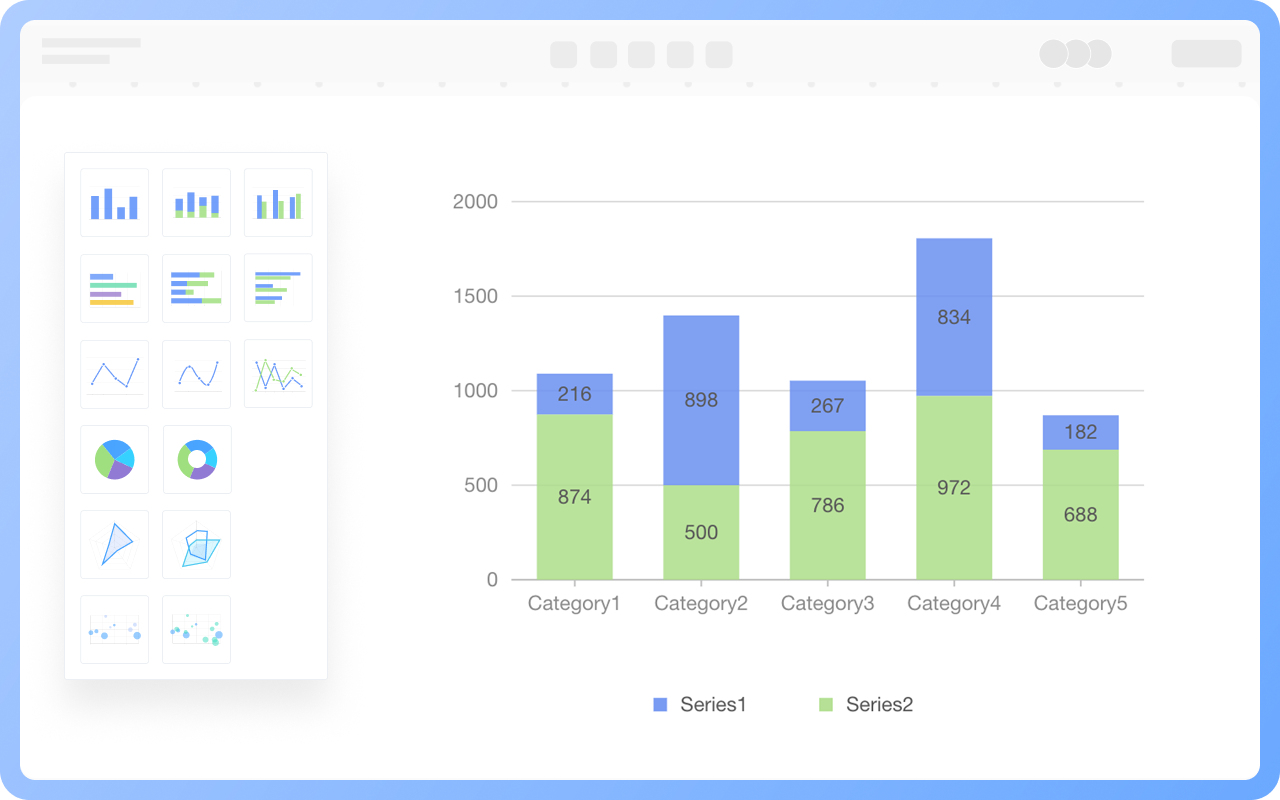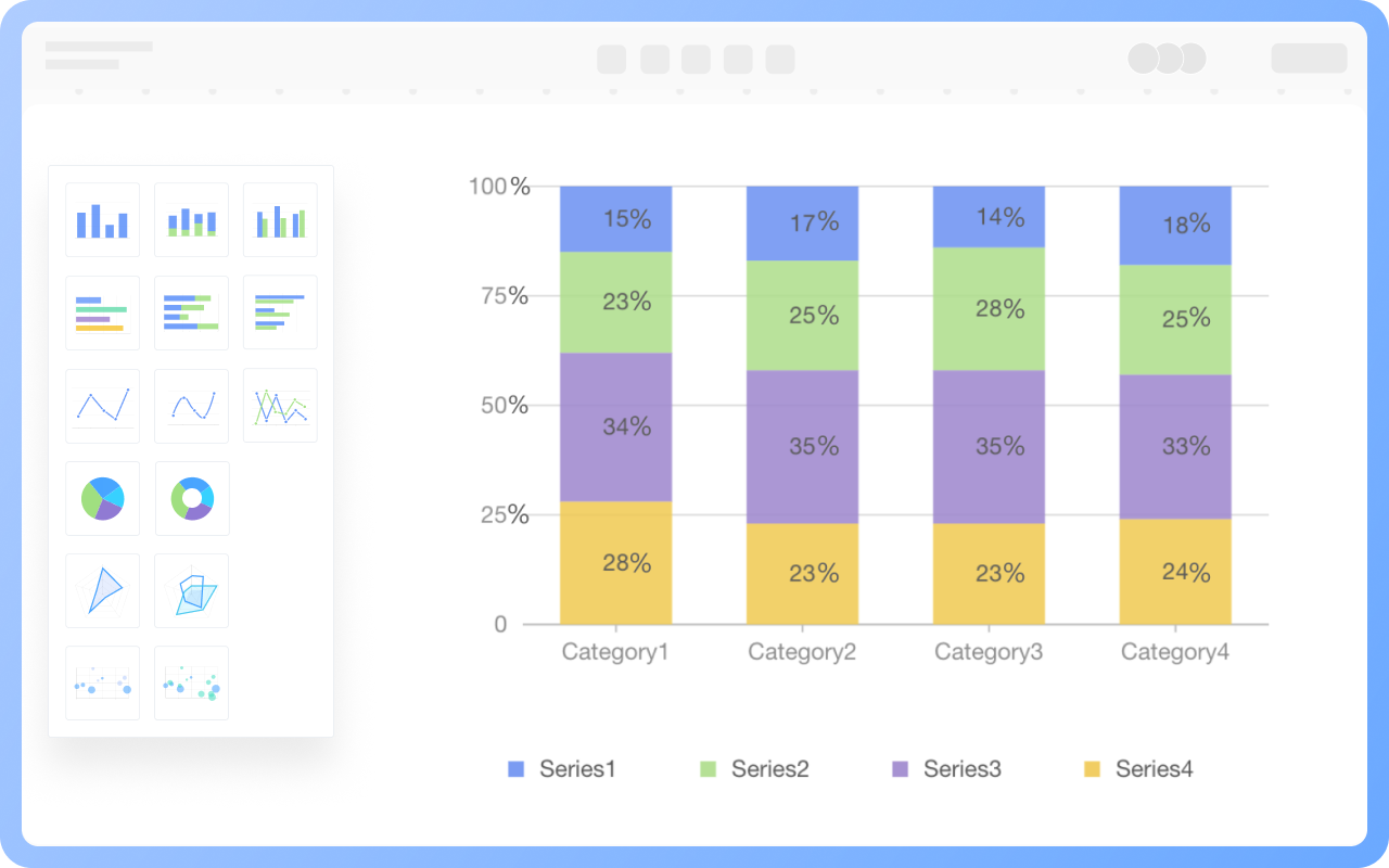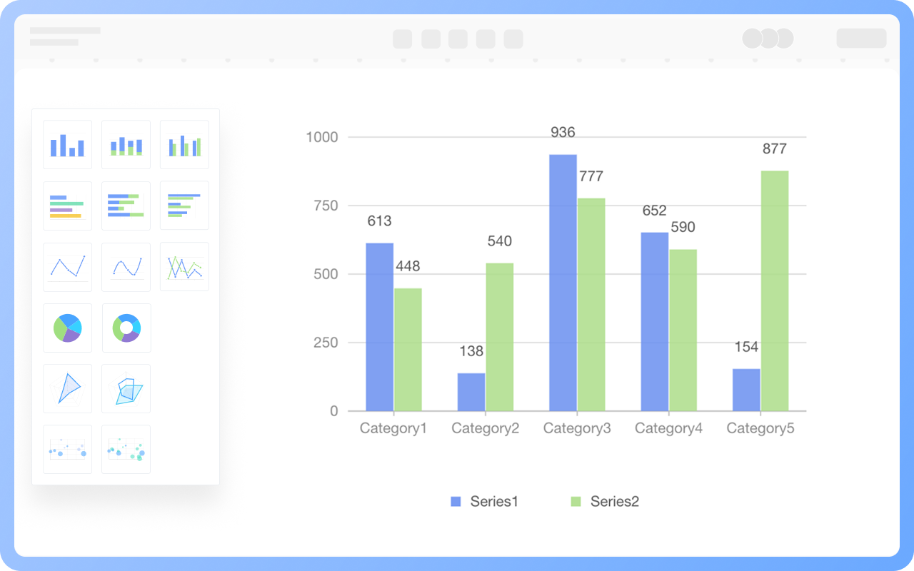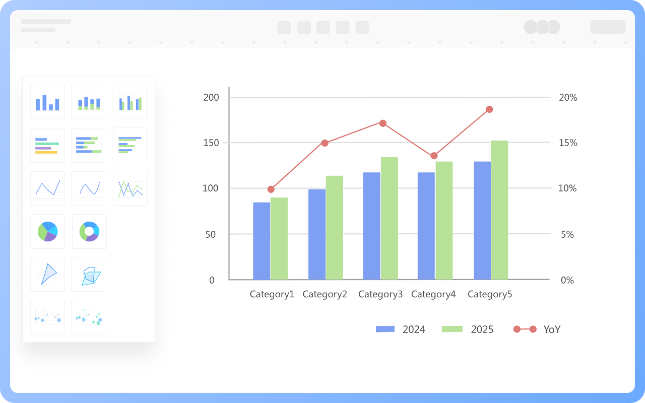


Supports various online column chart creation methods
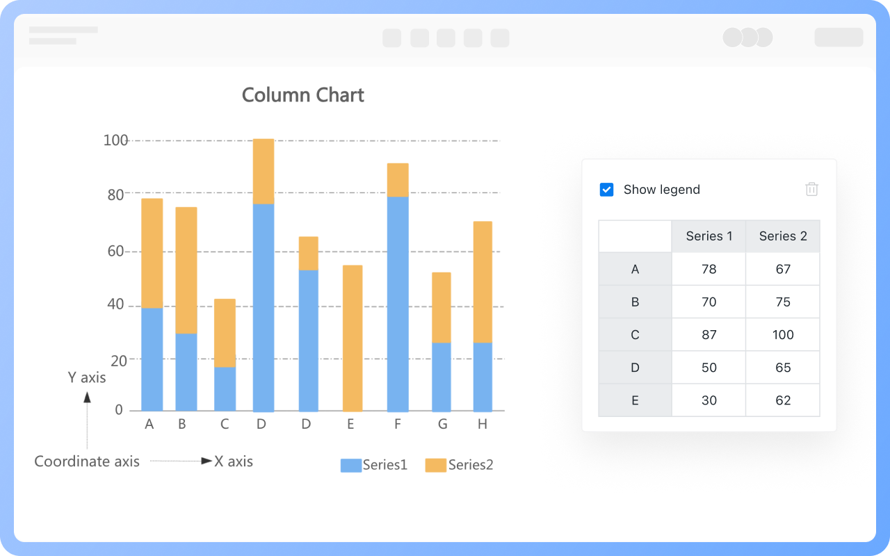
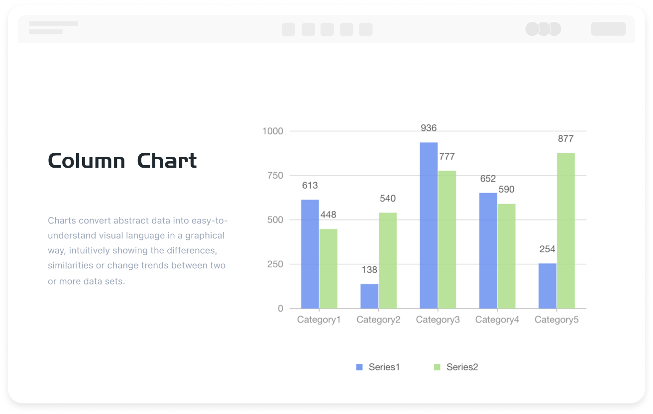
The components of a column chart are as follows:
Axis: The horizontal axis (X-axis) and vertical axis (Y-axis) are used to display category labels and numerical scales.
Rectangles: The height of the rectangles represents the specific numerical value.
Legend and Data Labels: The legend is used for comparing multiple series, and the data labels directly display the numerical values.
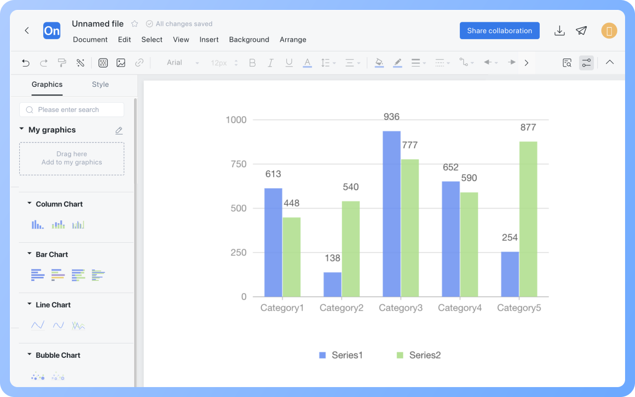
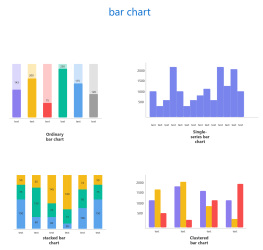
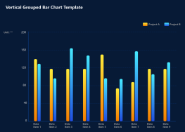
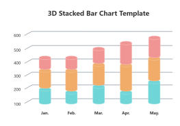
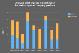
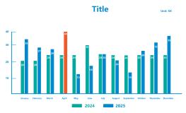
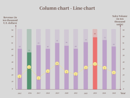
ProcessOn supports the creation of various types of column charts. You can freely set the data on the X-axis and Y-axis and instantly see the effect of the column chart after data modification. A large number of beautiful column chart templates are also available in the template community for reference.