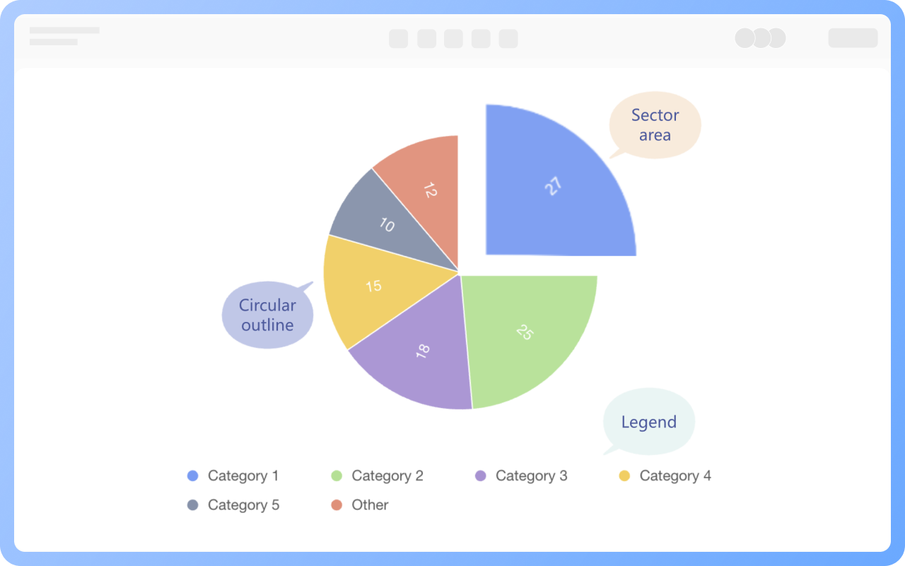


How to create a pie chart?
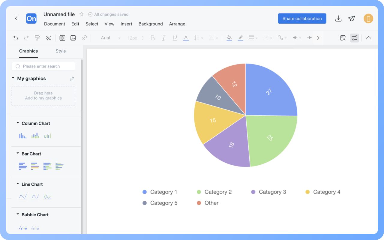
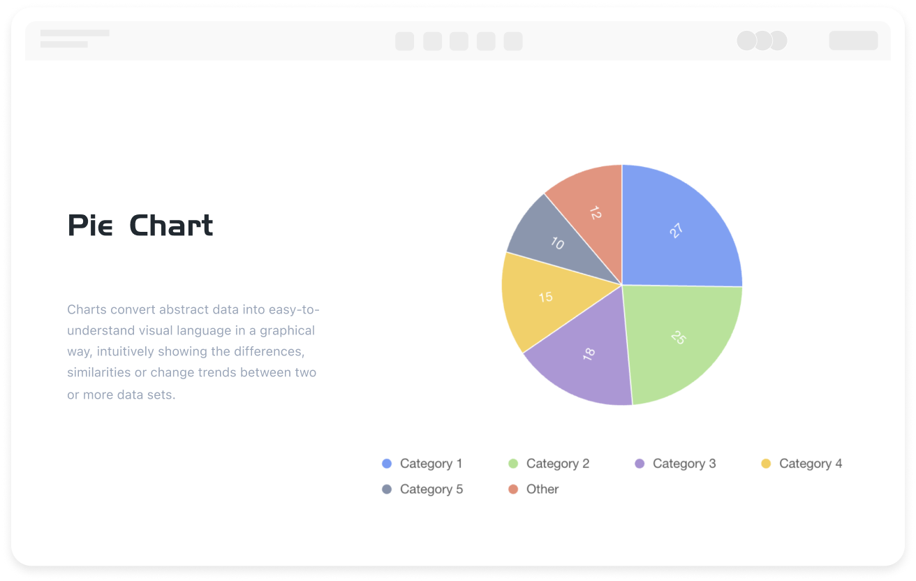
With ProcessOn, there's no need to import external files or manually clean data. Simply drag a pie chart template into the canvas, enter the category name and value in the pie chart data box, and the system will automatically calculate the proportions and generate a basic pie chart.
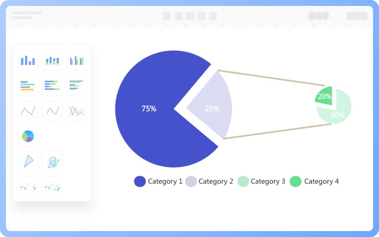
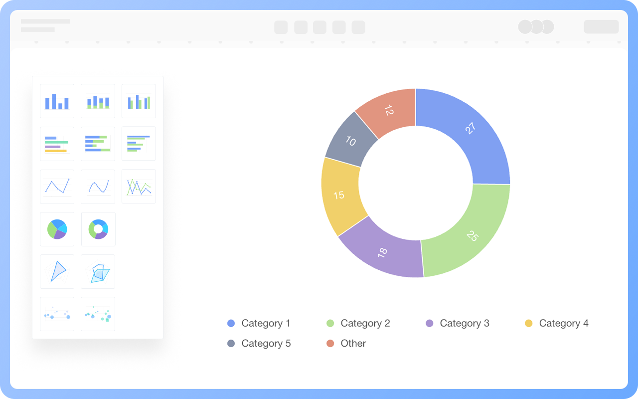
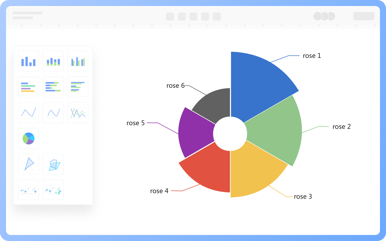
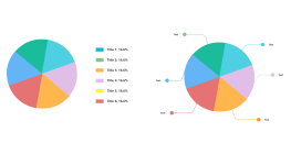
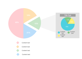
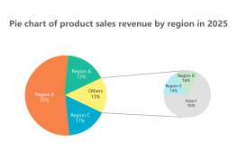
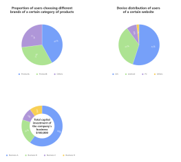
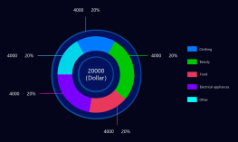
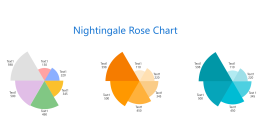
Additionally, the template community offers a wealth of pie chart examples for your reference and use.