
Pie chart of product revenue distribution
5 Report
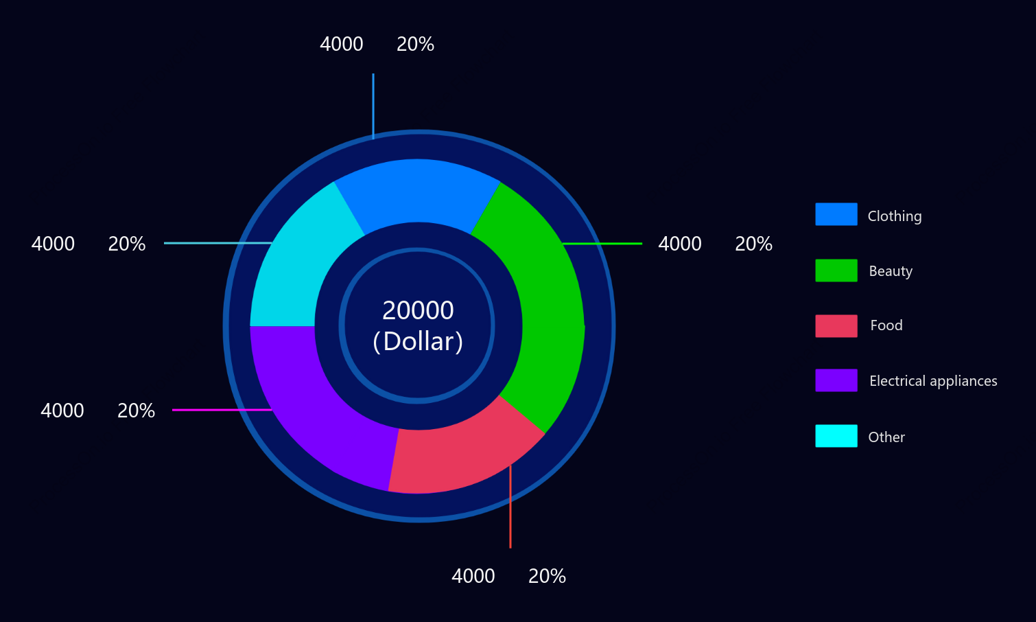
This pie chart illustrates the distribution of product revenue across various categories. Each category—Electrical Appliances, Food, Beauty, and Other—contributes equally, accounting for 20% of the total revenue. The Clothing category stands out with a significantly higher revenue of $20,000, highlighting its dominance in the overall revenue structure. This visual representation provides a clear understanding of how each product category contributes to the company's financial performance, offering valuable insights for strategic planning and resource allocation.
Related Recommendations
Other works by the author
Outline/Content
See more
4000 20%
Electrical appliances
Food
Beauty
Clothing
20000(Dollar)
Other

Collect

0 Comments
Next Page