Register
Process Type
Graphical expression
Mind Type
Structured expression
Note Type
Efficient expression

Online Donut Chart Maker

Free to use
Online Donut Chart Maker
What is Donut Chart

A donut chart is a type of chart that evolved from a pie chart. It consists of one or more concentric rings, each divided into several sectors, with the size of each sector representing the proportion of different data categories in the whole.
ProcessOn supports online creation of doughnut charts and offers a large number of doughnut chart templates and examples for easy creation of professional and aesthetically pleasing doughnut charts.

Free to use

ProcessOn Donut Chart Key Features

Online Collaboration

Supports real-time multi-user co-creation with shareable links for instant information transfer

Online Collaboration
One-Click AI Generation

Automatically generates graphics from text input and applies style enhancements

One-Click AI Generation
Personalized Style Customization

Prebuilt themes with full customization for personalized designs

Personalized Style Customization
Multiple Component Types

Supports icons, images, labels, LaTeX formulas, code blocks, links, attachments and more

Multiple Component Types
Multi-Format Compatibility

Export: PNG, VISIO, PDF, SVG | Import: VISIO, Mermaid

Multi-Format Compatibility
Cross-Device Sync

Real-time cloud storage, multi-device sync, version history, and secure data protection

Cross-Device Sync
Composition Elements of the Donut Chart

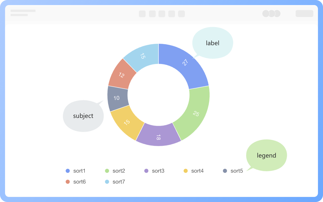
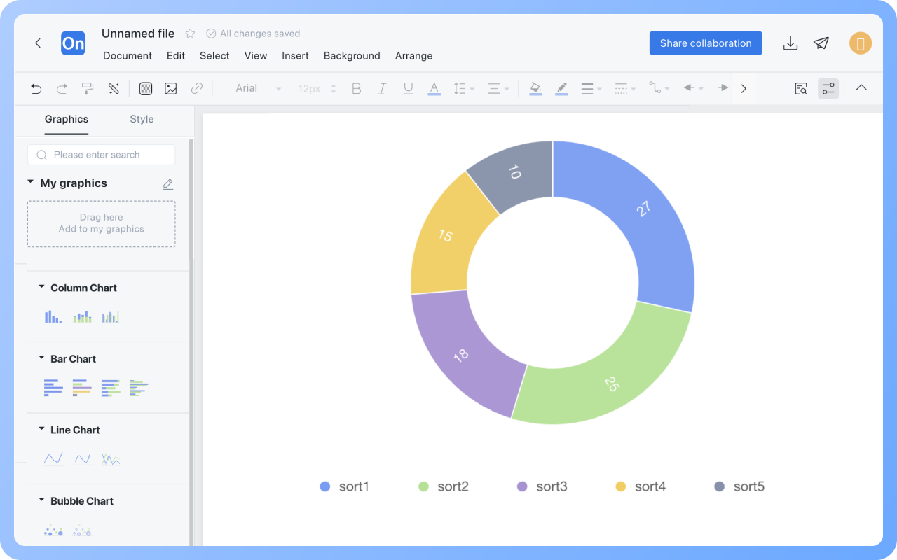
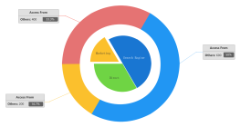
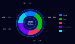
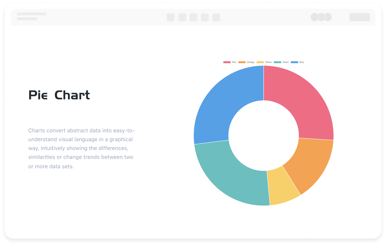
Ring Body (Data Layer): Composed of one or more concentric rings, each ring is divided into several sector areas. The arc length/area proportion of the sector directly reflects the data weight.
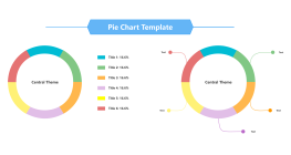
Label System (Information Layer): Sector names and sector values.
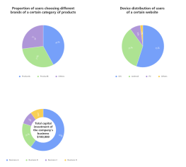
Legend and Annotations (Auxiliary Layer): Legends can use color blocks + text descriptions. If there is a total value, it can be marked within the center of the ring.
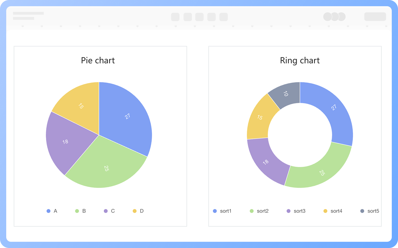
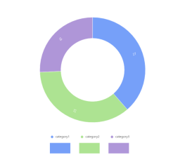
Create Charts Online
Composition
Donut Chart and Pie Chart

The donut chart is a variant of the pie chart. It is similar to the basic pie chart, using sector areas to show the proportion of each part. The difference is that the center of the ring chart is empty, forming a ring structure.
Compared to the basic pie chart, the ring chart is visually more concise. The blank area in the center can be used to add additional information, such as total values, titles, icons, etc., enhancing the information transmission capability of the chart.

Create Charts Online
Donut
When to Use a Donut Chart?

Display the proportion relationship between the whole and parts: When there is a need to clearly present the share of different category data in the overall, the donut chart is an excellent choice.
Comparison of multiple data groups: If there is a need to compare the proportion of similar data in different time periods, regions, or business lines, the donut chart can be chosen.
Emphasize core data: Since the hollow area in the center of the donut chart can hold important information, when there is a need to highlight a key data or core conclusion, the ring chart can play a unique advantage.

Create Charts Online
When
Design Principles of the Donut Chart

Reasonable Data Classification: The classification standard should be clear and unified, and each data category should be independent and non-overlapping.
Sector Area Matches Data Proportion: The area of each sector must strictly be proportional to the proportion of the corresponding data category in the whole.
Coordinated Color Matching: When choosing colors, pay attention to the contrast and coordination of colors to avoid using colors that are too similar, making it difficult to distinguish sector areas.

Create Charts Online
Design

Donut Chart How to Draw?

Donut ChartHow to Draw?
1
Create a new flowchart, check the 'Chart' symbol in 'More Shapes' below the graphics area to the graphics area.
2
Drag the text box from 'Basic Shapes' in the left graphics area to the canvas and set the title name of the donut chart.
3
Select the 'Donut Chart' from the 'Pie Chart' in the graphics area and drag it to the canvas.
4
Select the donut chart, click the 'Edit' button on the top toolbar, and you can set the category name and specific values of the donut chart on the right.
5
Click on different series of the donut chart to display only one series of data.
6
Check whether the data values in the donut chart are filled in accurately. In this way, a donut chart is completed.
Free to use

Donut Chart Drawing Guide

  • How to create a comparison chart? Types, tutorials, templates

    How to create a comparison chart? Types, tutorials, templates

    Comparison charts are used to graphically display the differences, similarities, or trends between two or more data sets. This article will explore the concepts, types, and drawing tutorials of comparison charts , and share multiple comparison chart templates, hoping to help readers master this tool.
    Skye
    2025-01-10
    1626
  • What is a pie chart and how to draw one?

    What is a pie chart and how to draw one?

    In the era of data-driven decision-making, charts have become the "universal language" in business analysis, academic research, and project management. As a basic and powerful tool in the field of data visualization, pie charts have become a powerful assistant for people to process and interpret data with their concise and clear presentation. This article will help you systematically master the concept, classification and practical skills of pie charts, helping you easily master this classic chart form.
    Skye
    2025-05-19
    1371
  • What is a column charts and how to draw it?

    What is a column charts and how to draw it?

    As a basic and powerful tool in the field of data visualization, column charts have become a powerful assistant for people to process and interpret data with their concise and clear presentation. This article will comprehensively introduce column charts from the perspective of concepts, types, and production tutorials, and will explain them with examples and templates to help you master this tool .
    Skye
    2025-06-02
    897
  • What is a bar chart and how to draw it?

    What is a bar chart and how to draw it?

    In today's data-driven world, how to efficiently and intuitively display data has become the focus of attention of practitioners in various industries. As one of the most basic and commonly used tools in the field of data visualization, bar charts play an irreplaceable role in information transmission with their concise and clear characteristics. This article will take you to an in-depth understanding of the definition, application scenarios, types, production tools and templates of bar charts .
    Skye
    2025-04-27
    720
  • What is a line chart and how to draw it?

    What is a line chart and how to draw it?

    In the field of data visualization, line charts, as a classic and practical chart type, have become the preferred tool for displaying data trends due to their simplicity and intuitiveness. This article will explore the definition, applicable scenarios, types, production tools, and creation methods of line charts , and provide specific examples to help you fully master the application of line charts.
    Skye
    2025-05-07
    878

Donut Chart Template Recommendations

More Templates

Donut Chart Frequently asked questions

How to add a title to a donut chart?

Drag the 'Text' shape from the 'Basic Shapes' section on the right to above the donut chart, and double-click to set the title.

How to add a series or category to a donut chart?

Double-click the donut chart, and add text or numbers in the dashed box after existing categories or series in the right menu bar.

How to delete a series or category from a donut chart?

Double-click the donut chart, select the series, category name, or specific data in the right menu bar, click the 'Delete' button, and choose to delete the entire row or column.

How to hide the legend of a donut chart?

Double-click the donut chart, and you can hide the legend in the right menu bar.

How to switch a donut chart to a pie chart?

Select the donut chart, and use the 'Switch Type' option in the top toolbar to change the donut chart to a pie chart.

How to modify the text, lines, and graphic styles (font, color, etc.) of a donut chart?

The text, lines, and graphic styles of donut charts under the 'Chart' category cannot be modified. You can use circle, sector, and other graphic elements under 'Basic Shapes' to draw a donut chart. The donut chart drawn this way allows modification of text, lines, and graphic styles.

How to export a donut chart as an image or PDF format?

Click the 'Download' button at the top right to export the donut chart as PNG, JPG, PDF, etc.

Related Diagrams