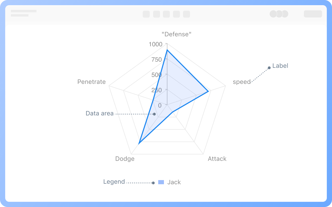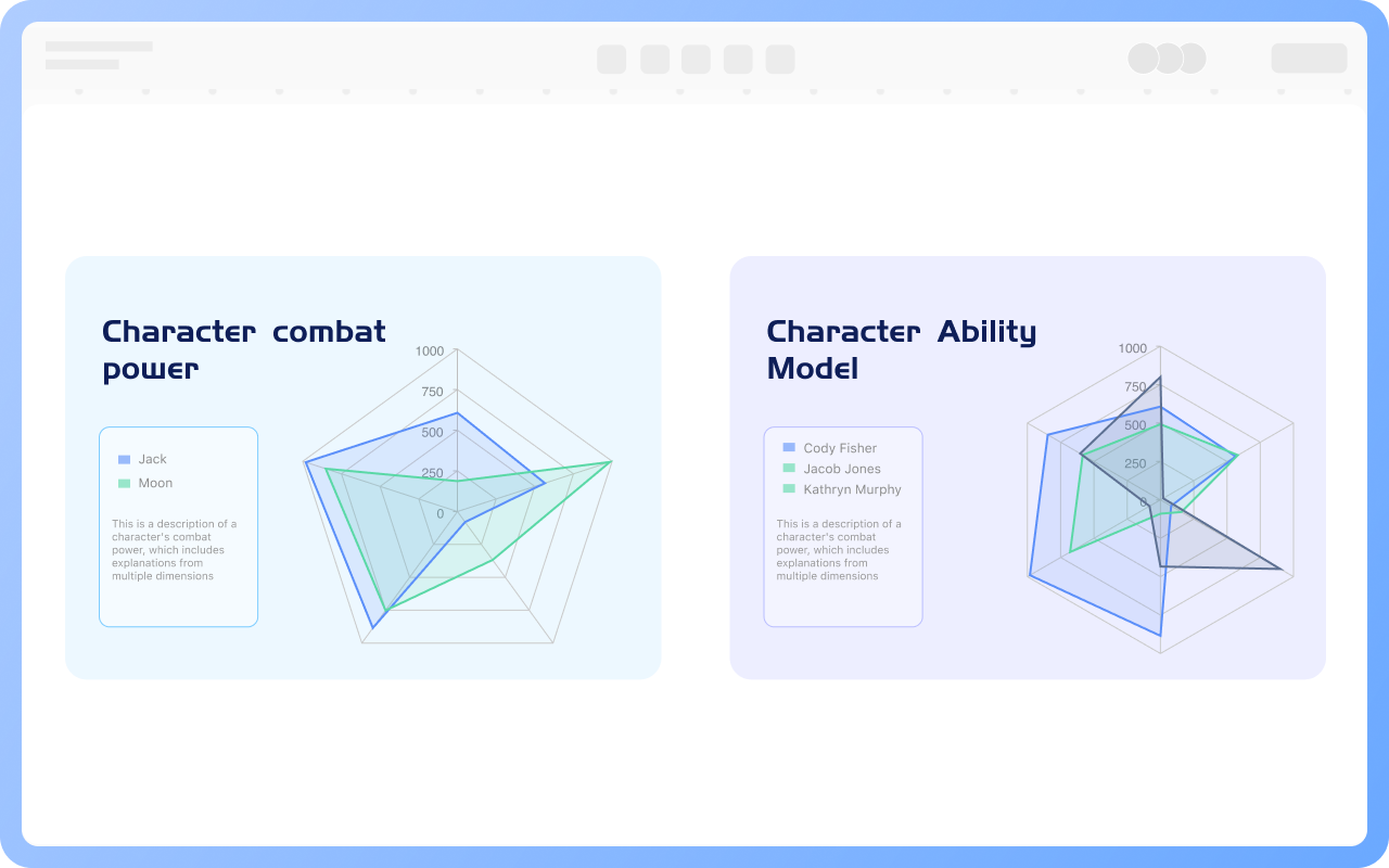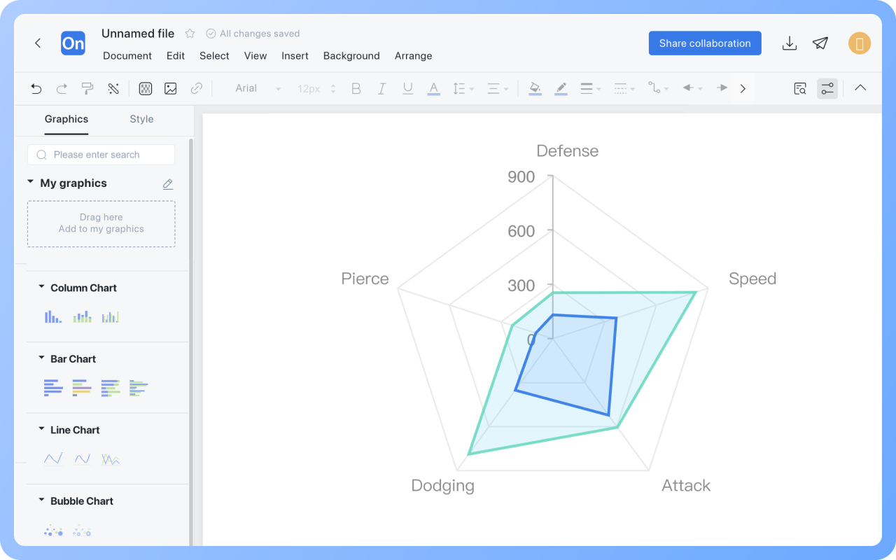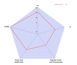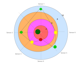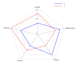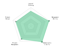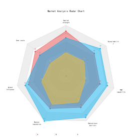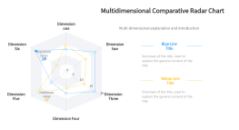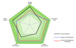
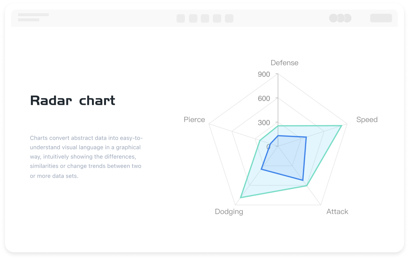


Easily Create Radar Charts Using Templates
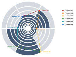
ProcessOn supports the design of professional and attractive radar charts. The drag-and-drop operation is simple and efficient. You can use polygon shapes to create radar charts, presenting data of any number of dimensions, and choose from a variety of color schemes. The template community also offers a wealth of radar chart templates and examples; simply fill in the text to complete your radar chart.