Components of Bubble Chart
A bubble chart can consist solely of scattered bubbles, be combined with a coordinate system, or be connected with various lines to express relationships.

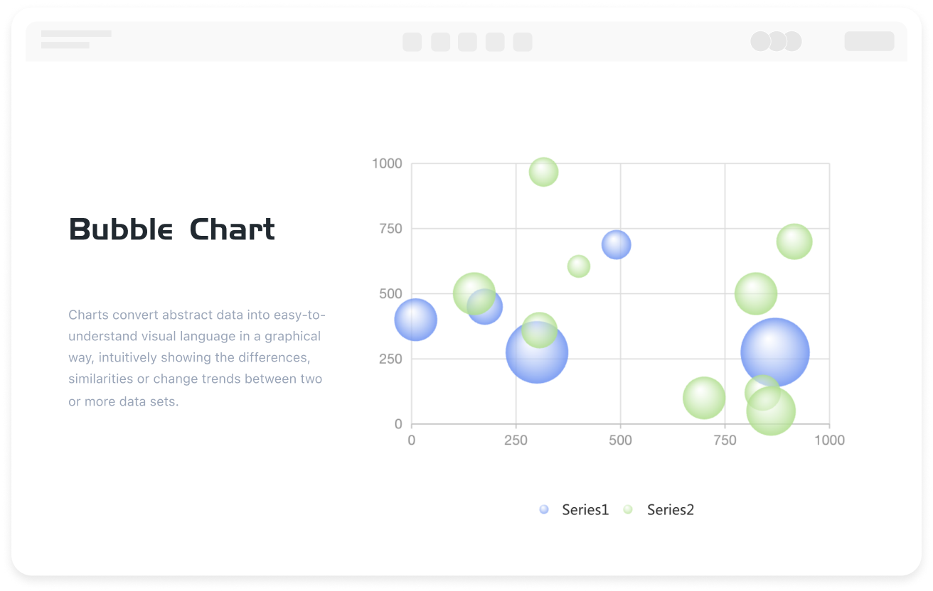


A bubble chart is a chart that primarily uses bubble shapes to display information. Bubble charts have the advantages of a simple and intuitive appearance and data visualization, and are used in various scenarios such as organizing personal relationships and the clever presentation of statistical data.
ProcessOn supports online creation of bubble charts and offers a large number of bubble chart templates and examples for easy creation of professional and beautiful bubble charts.
A bubble chart can consist solely of scattered bubbles, be combined with a coordinate system, or be connected with various lines to express relationships.
Depending on the application scenario, common and commonly used bubble charts are divided into two categories: data bubble charts and concept bubble charts.
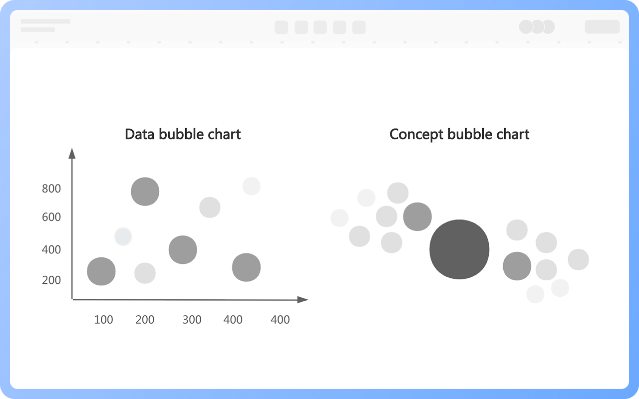
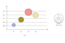
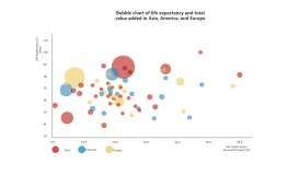
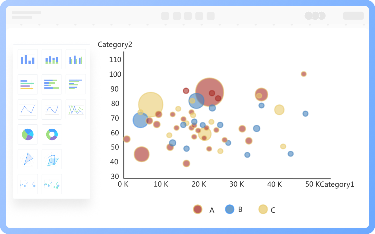
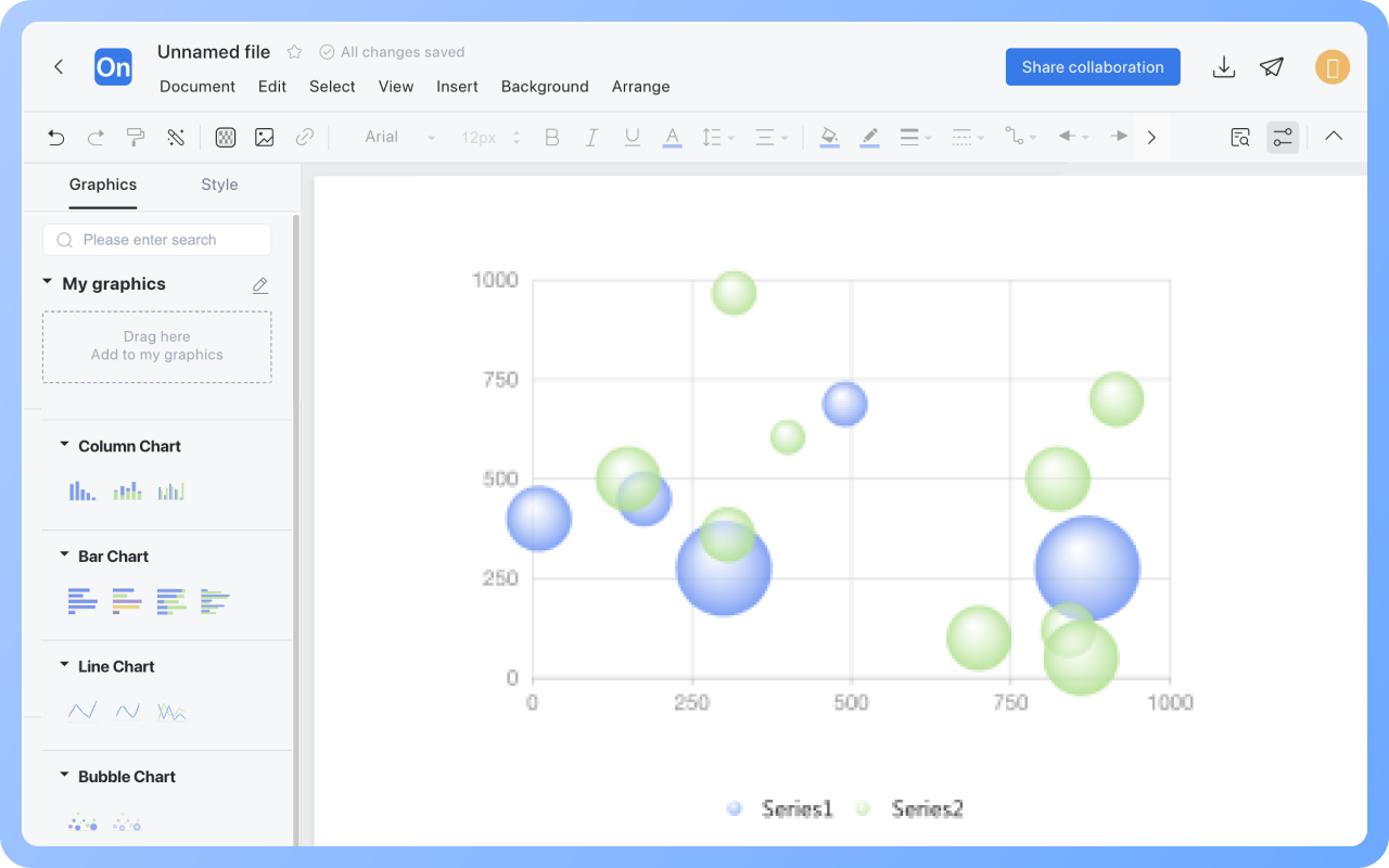
Data bubble charts are visualization tools that extend scatter plots, simultaneously displaying data characteristics across three dimensions: the X-axis, Y-axis, and bubble size.
ProcessOn provides bubble chart templates that include elements such as the X-axis, Y-axis, and bubbles. Simply fill in the data, and a visual data bubble chart will be automatically generated. The bubble charts also feature dynamic demonstrations; you can select to display only a specific data element within the bubble chart.
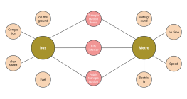
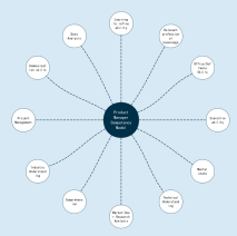
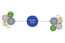
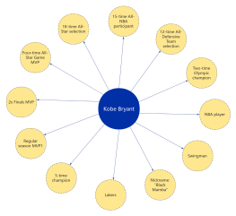
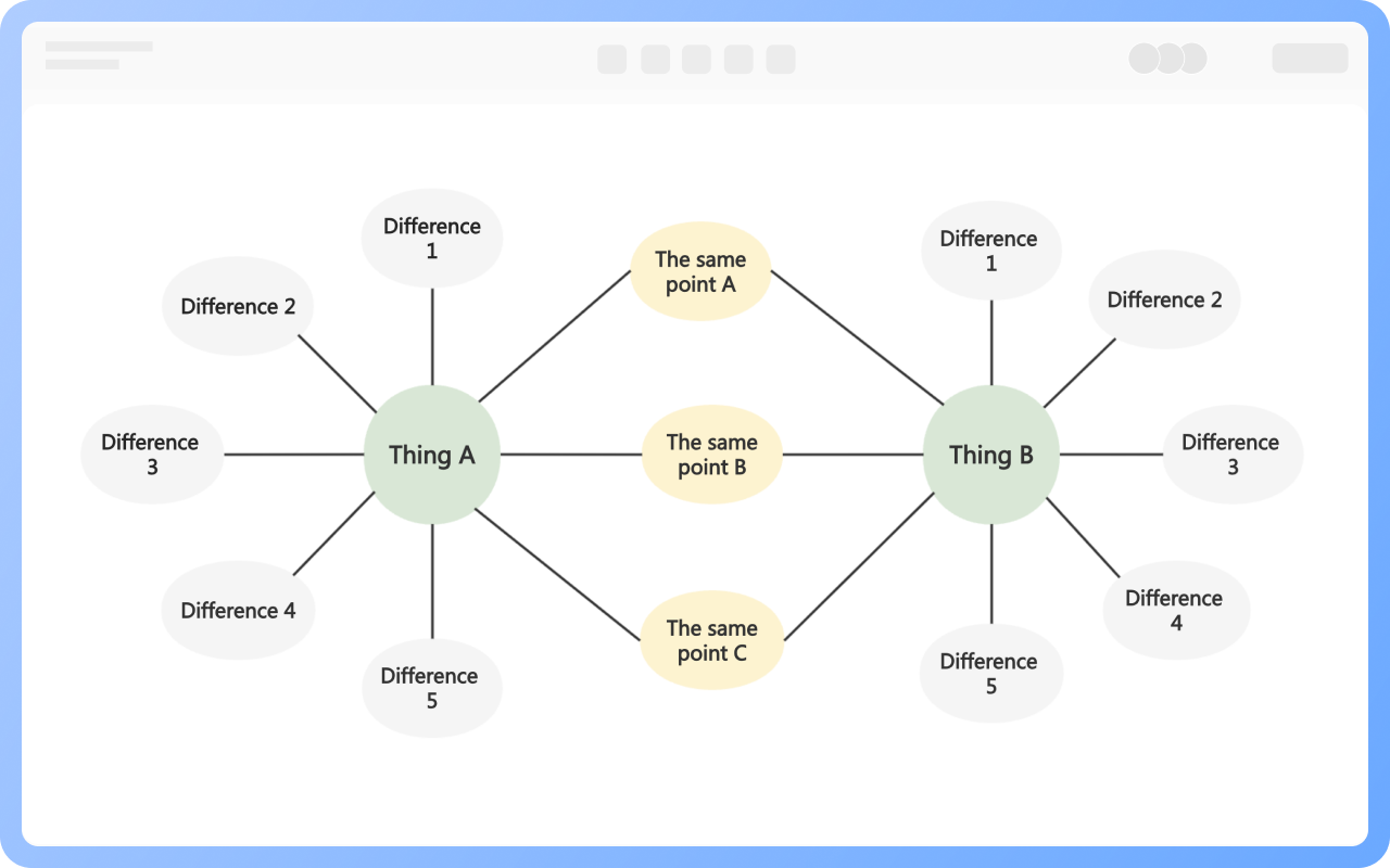
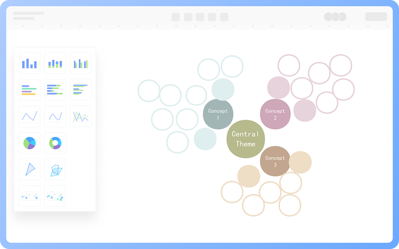
Concept bubble charts, also known as mind bubble charts, are similar to mind maps, emphasizing the presentation of branching relationships. They help learners better understand and remember concepts and their relationships within a knowledge base, improving learning efficiency.
ProcessOn also supports designing concept bubble charts. The drag-and-drop operation is simple and efficient. You can create bubble charts using shapes such as circles and ellipses, connect them with lines, and use various color schemes.
Bubble charts have a wide range of applications. Here are a few common ones:
1. Business Analysis: Optimizing product portfolios, evaluating product market performance, and adjusting resource allocation.
2. Financial Investment: Balancing risk and return to build an optimal investment portfolio.
3. Urban Planning: Linking traffic congestion with population distribution helps optimize urban transportation layout.

Supports real-time multi-user co-creation with shareable links for instant information transfer
Automatically generates graphics from text input and applies style enhancements

Prebuilt themes with full customization for personalized designs
Supports icons, images, labels, LaTeX formulas, code blocks, links, attachments and more
Export: PNG, VISIO, PDF, SVG | Import: VISIO, Mermaid
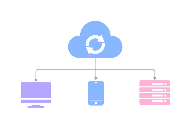
Real-time cloud storage, multi-device sync, version history, and secure data protection
Drag the "Text" graphic from the "Basic Graphics" section on the right to the line chart, then double-click to set a title.
Double-click a bubble chart to add text or numbers in the blank dashed box under Data in the right menu bar.
Double-click a bubble chart to hide the legend in the right menu bar.
Double-click a bubble chart to set the bubble size in the "Size" column on the right menu bar.
Double-click a bubble chart to select specific data in the right menu bar, then click "Delete" to delete the entire row.
The text, line, and graphic styles of bubble charts in the "Chart" category cannot be modified. You can use graphic elements such as circles in the "Basic Graphics" section to create bubble charts. The text, line, and graphic styles of bubble charts created this way can be modified.
Click the "Download" button in the upper-right corner to export the bubble chart to formats such as PNG, JPG, and PDF.