
Transportation comparison double bubble chart
1 Report
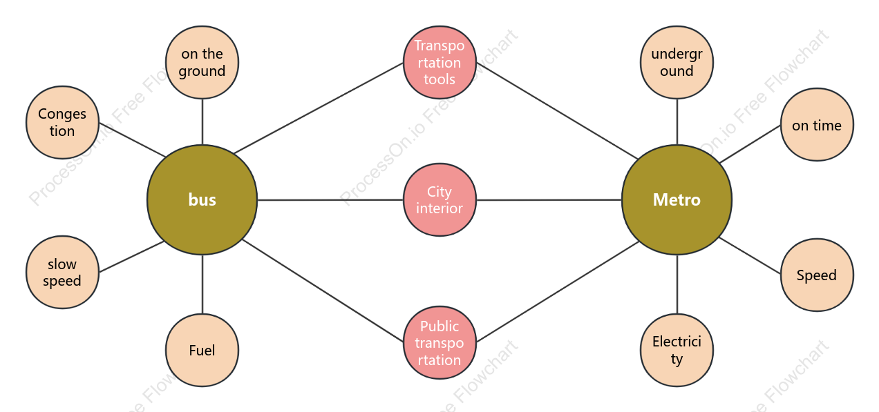
This is a transportation comparison double bubble chart designed to illustrate the differences and similarities between various transportation tools. The chart categorizes transportation into public options like buses and metros, highlighting factors such as electricity and fuel usage, congestion levels, and speed. It contrasts ground transportation with underground options, emphasizing city interior travel. The chart aims to provide a clear comparison to help understand the efficiency, speed, and environmental impact of each transportation method.
Related Recommendations
Other works by the author
Outline/Content
See more
Transportation tools
Public transportation
on the ground
Electricity
Fuel
Congestion
on time
slow speed
Speed
bus
City interior
underground
Metro

0 Comments
Next Page