Bubble charts are charts that display information in the shape of bubbles. They can be directly scattered bubbles, combined with coordinate systems, or use various connecting lines to express relationships between them.

Brainstorming - Bubble Diagram Template
Bubble charts are increasingly popular and studied by professionals because of their simple and intuitive appearance, visual data information, wide variety, and wide application fields. They help organize thoughts, inspire thinking and imagination, and other advantages. Bubble charts have
a wide range of applications. Whether it is to organize relationships between people, cleverly present statistical data, or to provide enlightenment education for children , bubble charts are a more suitable choice. In recent years, primary school teachers have helped many children understand concepts and master knowledge efficiently through bubble charts, a visual graphic type, which has increased the fun of learning.
There are two common and commonly used types : data bubble charts and concept bubble charts.
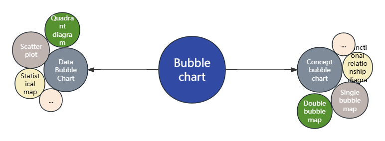
1. Data Bubble Chart
The data bubble chart is a type of data visualization chart. It extends the traditional scatter plot and displays more information by introducing a third dimension (usually the size of the bubble).
a data bubble chart include:
X-axis and Y-axis: These two axes represent two different variables and are used to locate the position of each data point in the chart.
Bubble: Each data point is represented as a bubble, and the position of the bubble is determined by its value on the X and Y axes.
Bubble size: The size of the bubble usually represents the value of a third variable, which can be quantity, frequency, importance level, etc. The larger the bubble, the higher the value of the data point in the third dimension.
Colors and labels (optional): To enhance the readability and aesthetics of the chart, bubble charts can also include colors and labels. Colors can be used to distinguish different categories or groups, while labels can be used to display specific data point information .
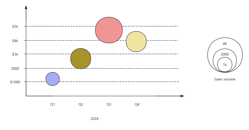
Advertising Spending-Sales Bubble Chart
In the above figure, the x-axis represents the four fiscal quarters of 2019, the y-axis represents advertising expenditures, and sales are shown by the size of the bubbles. The graph shows that there is a clear positive correlation between advertising expenditures and sales over time.
Data bubble charts are widely used. They can be used to show the relationship between multiple variables and help users discover patterns and trends in data.
For example, in business analysis, bubble charts can be used to compare sales, market share, and growth rates of different products. The size of these bubbles can represent the size of sales or market share, while the position and color can be used to distinguish different products or markets. In medical research, it can be used to show the comparison of the therapeutic effects of different drugs on patients. The size of the bubbles can represent the effectiveness of the treatment, while the position and color can be used to distinguish different drugs or patient groups. In geographic data analysis, bubble charts can be combined with maps to show indicators such as population density and economic development in different regions. By placing bubbles in a specified geographic area on the map, the distribution of certain indicators in the area can be intuitively displayed.
Data Bubble Chart Template
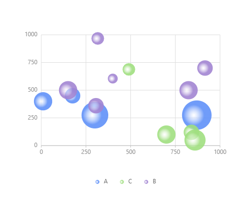
Bubble Diagram Template
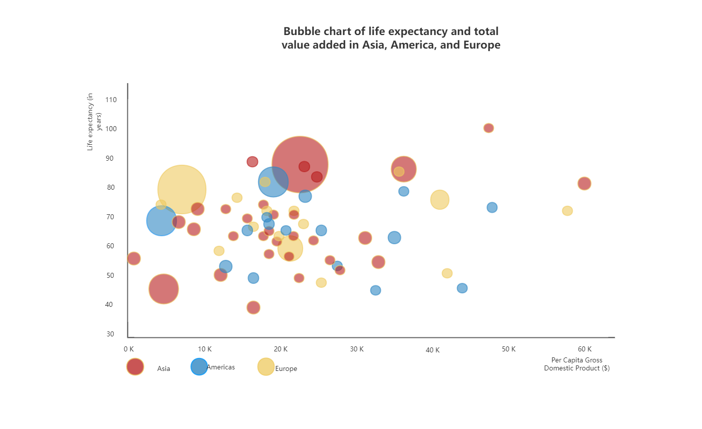
Bubble chart of life expectancy and output increase in Asia, America and Europe
2. Concept bubble chart
Concept bubble diagram is also called thinking bubble diagram. It is similar to mind map. It focuses on the presentation of branch relationship. Usually, large bubbles are the theme. The smaller the bubble, the more it can show its branches. Bubbles of the same level show parallel relationship. It focuses on the characteristic description of a concept to expand it in detail.
In education and learning, concept bubble diagrams can help students better understand and remember concepts and their relationships in a subject, thus improving learning outcomes. In enterprises and organizations, concept bubble diagrams can also be used to organize and display concepts and their relationships in a knowledge base, making it easier for employees to access and learn.
Concept bubble diagrams can be divided into single bubble diagrams, double bubble diagrams, network bubble diagrams, etc.
Single Bubble Chart
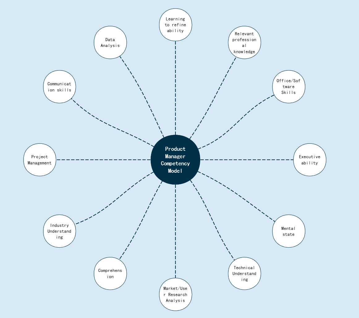
Product Manager Competency Model Bubble Chart
Double Bubble Chart
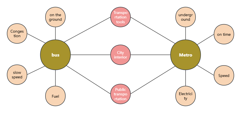
Transportation comparison double bubble chart
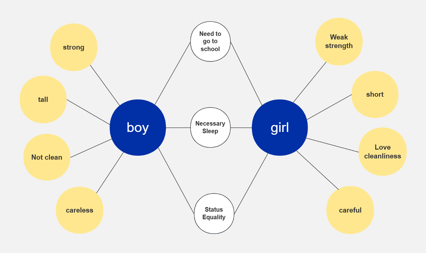
Boys and girls comparison double bubble chart
Step 1: Open ProcessOn, go to the Personal File page, click New - Create Flowchart
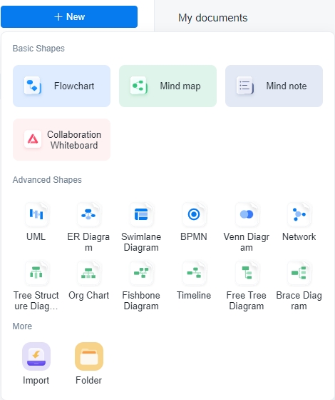
Step 2: You can use basic graphics to draw a bubble chart, or you can click [More Graphics] on the left, select Chart-Bubble Chart, and click OK.
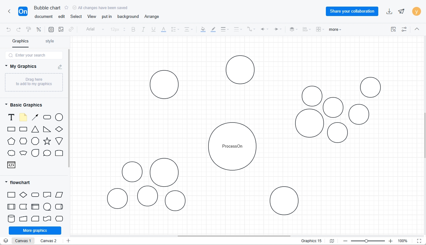
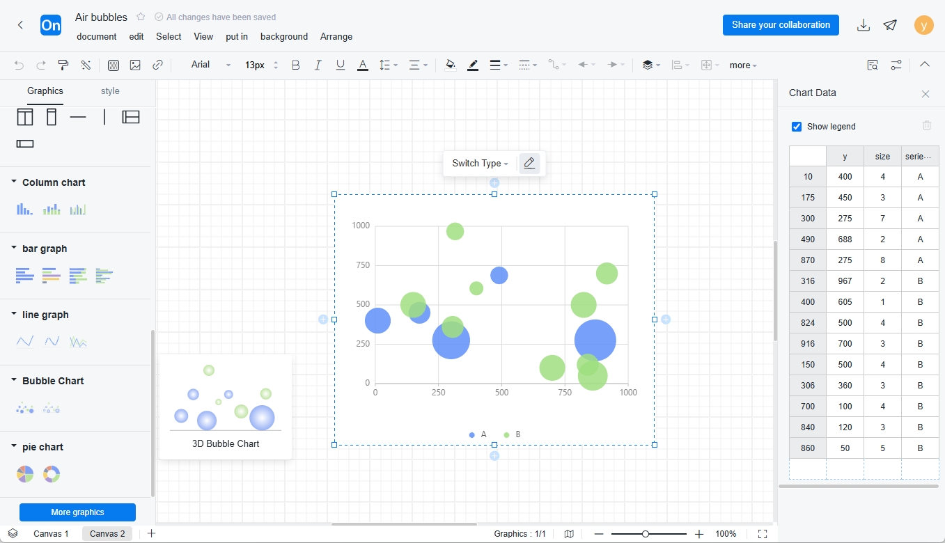
Step 3 : Drag the bubble chart to the canvas, double-click the bubble chart, and you can set the data values of the X-axis, Y-axis and bubbles in the chart data on the left.
Important tips:
1. Make sure your data labels are clear . When creating a bubble chart, make sure the labels are clear and easy to understand, especially when creating a data bubble chart.
2. The bubble size should be relatively appropriate. The bubble size should be adjusted according to the size of the data that the bubble wants to express. It cannot be adjusted arbitrarily. Note that the bubble size is adjusted based on the area rather than the diameter.
3. Don’t use strange shapes . The main graphics in a bubble chart are bubbles. Avoid using irregular shapes, which may lead to inaccurate expression.
Bubble charts are widely used. They can be used to show the relationship between multiple variables and help users discover patterns and trends in data. It is an intuitive, easy-to-understand and powerful data visualization chart type that can help users better understand and analyze data, discover patterns and trends in data, and provide strong support for decision-making and planning.