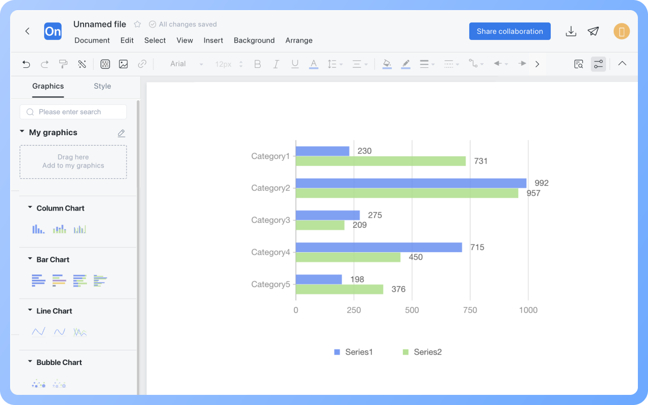


Involve your team in bar chart design and creation
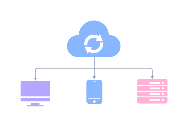
ProcessOn supports online sharing and collaboration of bar charts, inviting team members to the bar chart maker for real-time editing and modification. It supports exporting to image, PDF, and other formats, which you can then import into Excel or PowerPoint presentations for use.