
Sales Line Chart Template
0 Report
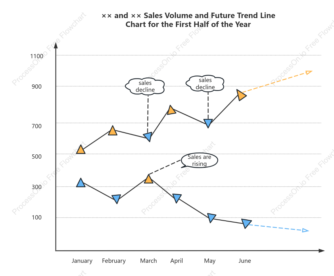
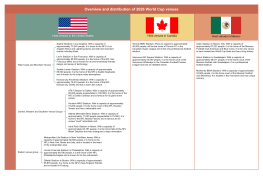
The Sales Line Chart Template provides a clear visualization of sales volume and trends for the first half of the year. It highlights the fluctuations in sales, with notable increases in January and May, reaching peaks of 1100 and 900, respectively. However, there are also periods of decline, such as in February and June, with sales dropping to 100 and 300. This chart serves as a valuable tool for analyzing past performance and predicting future trends, aiding in strategic planning and decision-making for the sales department.
Related Recommendations
Other works by the author
Outline/Content
See more
500
March
900
May
700
1100
January
300
April
sales decline
June
Sales are rising
100
×× and ×× Sales Volume and Future Trend Line Chart for the First Half of the Year
February
Collect
Collect
Collect

0 Comments
Next Page