Register
Process Type
Graphical expression
Mind Type
Structured expression
Note Type
Efficient expression

Professional Online Quadrant Chart Drawing Tool

Free to use
Professional Online Quadrant Chart Drawing Tool
What is Quadrant Chart

The quadrant chart is a two-dimensional coordinate chart that divides the plane into four areas (quadrants). It uses the horizontal and vertical axes to represent two different variables or dimensions. Each data point is accurately positioned in the corresponding quadrant based on its values on the two variables.
ProcessOn supports online creation of quadrant charts and offers a vast number of templates and examples for easy replication, allowing you to effortlessly draw professional and aesthetically pleasing quadrant charts.

Free to use

ProcessOn Quadrant Chart Key Features

Online Collaboration

Supports real-time multi-user co-creation with shareable links for instant information transfer

Online Collaboration
One-Click AI Generation

Automatically generates graphics from text input and applies style enhancements

One-Click AI Generation
Personalized Style Customization

Prebuilt themes with full customization for personalized designs

Personalized Style Customization
Multiple Component Types

Supports icons, images, labels, LaTeX formulas, code blocks, links, attachments and more

Multiple Component Types
Multi-Format Compatibility

Export: PNG, VISIO, PDF, SVG | Import: VISIO, Mermaid

Multi-Format Compatibility
Cross-Device Sync

Real-time cloud storage, multi-device sync, version history, and secure data protection

Cross-Device Sync
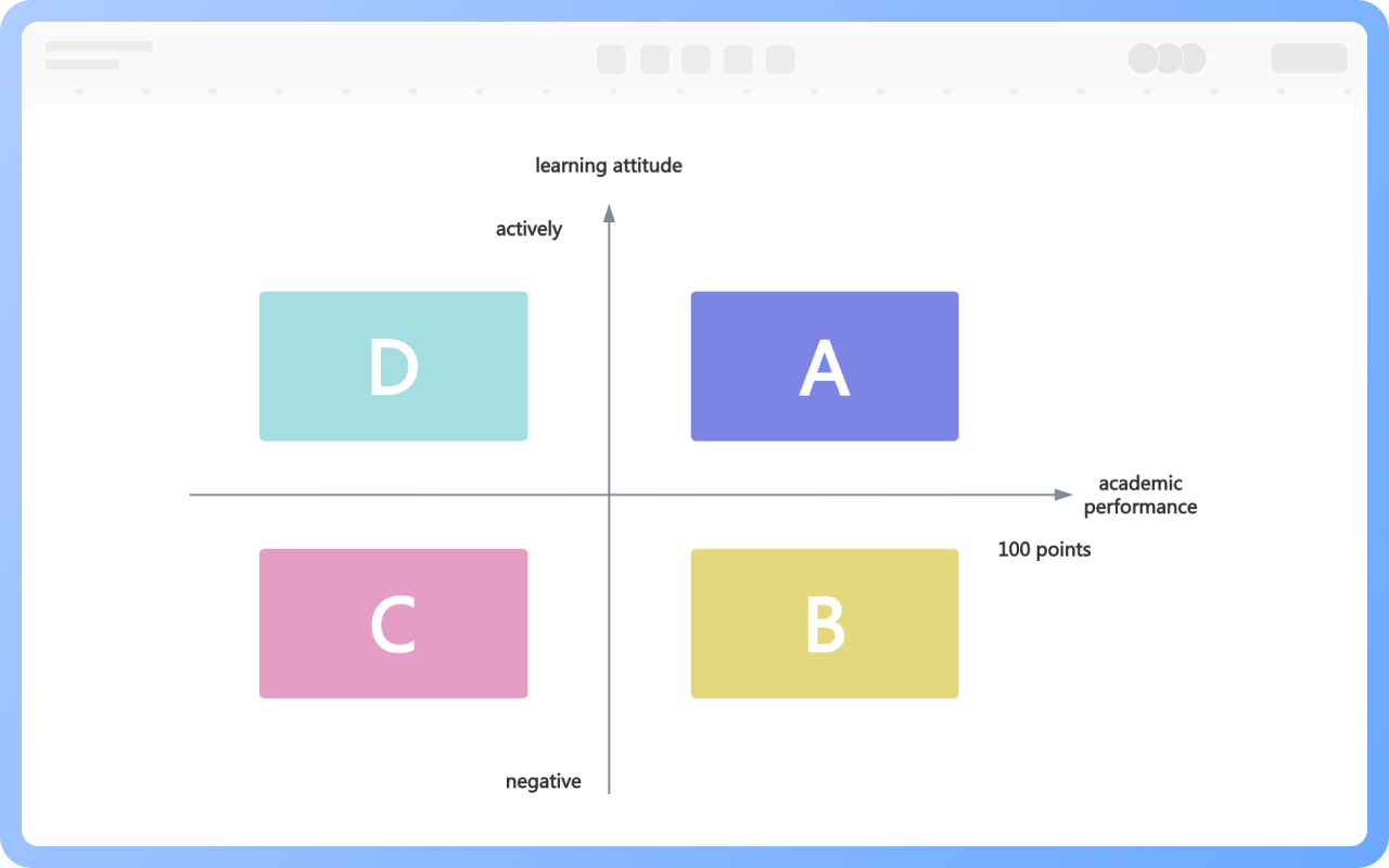
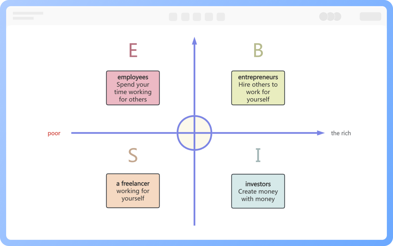
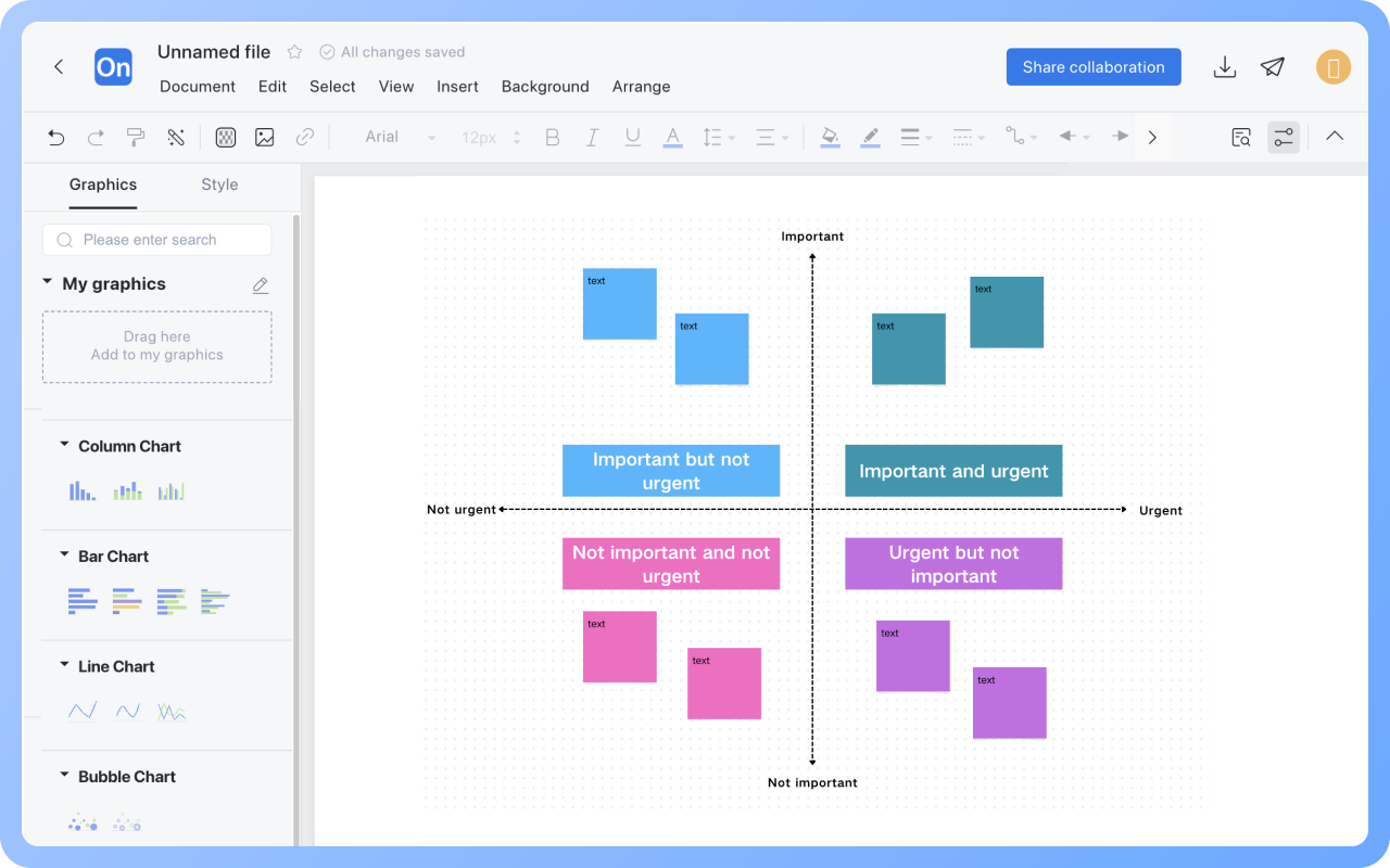
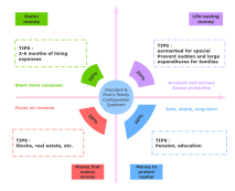
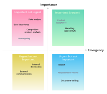
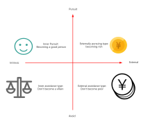
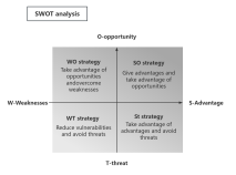
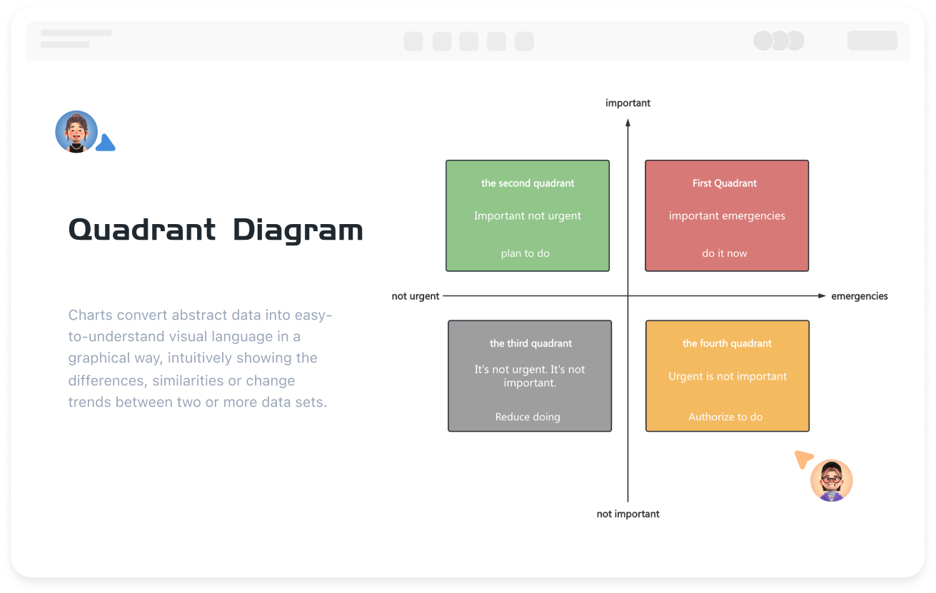
The Role of Quadrant Charts

Data Classification: Classify data by two dimensions, clearly distinguishing different groups or characteristics, such as categorizing customer types by purchase frequency and amount.
Relationship Presentation: Visually display the correlation between two variables, such as whether advertising investment and sales are positively correlated or dispersed.
Trend Prediction: Observe data changes in quadrants to predict development directions, such as transitions in product lifecycle stages.
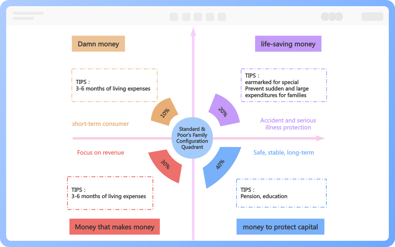
Decision Support: Provide a basis for resource allocation and strategy formulation, such as using the Boston Matrix to guide business decisions.

Create Charts Online
The
Division of Quadrant Charts

1. Determine the Axes
Identify the two key variables to be analyzed, serving as the horizontal axis (X-axis) and vertical axis (Y-axis). For instance, when analyzing student learning, academic performance can be chosen as the horizontal axis and learning attitude as the vertical axis.
2. Divide the Axis Scale
Divide the scale based on the nature of the variables and data range. If the variable is numerical, like scores (0 - 100 points), divide at regular intervals; if qualitative, like learning attitudes categorized as "positive, average, negative," assign corresponding values for division.
3. Determine the Division Lines
Usually, the midpoint or target value of the horizontal and vertical axes is used as the division line. For example, use 60 points (passing line) and 85 points (excellent line) as boundaries on the performance axis, and the boundary values between positive and average, average and negative on the learning attitude axis. The intersection of the two lines forms a cross, dividing the plane into four quadrants.

Create Charts Online
Division
Best Practices for Designing Quadrant Charts

1. Clearly define the analysis purpose and select two key variables with strong correlation that can effectively reflect the issue as the horizontal and vertical axes, such as choosing market growth rate and market share when analyzing products.
2. Divide the quadrants based on data distribution or target values. If data is evenly distributed, use the median; if there is a clear target, such as a passing line or excellent line, use it as the boundary to ensure scientific division.
3. Name the quadrants, summarizing their characteristics with concise language, like "Star Business" or "Problem Business." Also, label the meaning, units, and data sources of the axes to enhance chart credibility.
4. Avoid excessive elements that interfere, keeping the chart simple. Use different colors to distinguish quadrants, but avoid too many colors to ensure visual clarity, allowing readers to quickly understand the information conveyed by the chart.

Create Charts Online
Best
S&P Family Asset Quadrant Chart

The S&P Family Asset Quadrant Chart is proposed by the globally authoritative credit rating agency Standard & Poor's, achieving steady growth and risk isolation through scientific family asset allocation.
The S&P Chart achieves a balance of short-term liquidity, risk protection, income growth, and long-term stability through "four accounts," recognized as the golden rule of family financial management.

Create Charts Online
S&P
The Four Quadrants of Wealth

The Four Quadrants of Wealth (ESBI Model) is proposed by Robert Kiyosaki in "Rich Dad Poor Dad," dividing personal income sources into four quadrants, revealing the impact of different income models on wealth accumulation.
The four quadrants are: E Quadrant (Employee), S Quadrant (Self-employed/Freelancer), B Quadrant (Business Owner/System Owner), and I Quadrant (Investor).
The ESBI Model emphasizes the transition from "active income" to "passive income," achieving wealth transformation through system building or investment.

Create Charts Online
The

Quadrant Chart How to Draw?

Quadrant ChartHow to Draw?
1
Search for 'Quadrant Chart' in the template community to use a template to create a new one, or create a blank flowchart. In the shapes section, check the categories of shape symbols you need to add to the shape area under 'More Shapes'.
2
Drag the rectangle element from the left side of the shape area to the canvas, and create a line from the midpoint of the rectangle's border to the midpoint of the opposite border to form the xy-axis.
3
Drag the text box from the shape area to the xy-axis and different quadrants, and fill in the text content.
4
Use different colors to represent the content of different quadrants to enhance readability.
5
Once the quadrant chart is completed, it can be downloaded or shared with others.
Free to use

Quadrant Chart Drawing Guide

  • Learn five classic charts to make complex information clear in seconds

    Learn five classic charts to make complex information clear in seconds

    In an era of information explosion, efficiently communicating complex concepts has become a critical skill. Scatter plots , funnel plots, quadrant plots, matrix plots, and iceberg plots—five classic visualization tools—help people overcome cognitive limitations by presenting information in a structured manner. They transform abstract logic into intuitive graphics, revealing the inherent laws of a system while streamlining decision-making processes. They are widely used in fields such as business analysis, educational communication, and project management. The following systematically analyzes the core characteristics and application scenarios of each chart.
    ProcessOn-Skye
    2025-09-17
    150
  • How to make a pyramid chart? Tutorials and templates

    How to make a pyramid chart? Tutorials and templates

    In data visualization and information communication, the pyramid chart is a very effective tool. It displays information through a hierarchical structure, helping people quickly understand complex concepts or data distribution. This article will comprehensively introduce this powerful visualization tool through the concept, examples , drawing methods , templates, etc. of the pyramid chart .
    Skye
    2025-02-13
    1181
  • Comprehensive Guide to Radar Charts - Concepts, Examples, Templates

    Comprehensive Guide to Radar Charts - Concepts, Examples, Templates

    Radar chart, also known as spider chart or polar chart, is a type of chart used to display multivariate data , helping us understand and analyze complex data . It is widely used in business decision-making, financial investment, human resources and other fields. This article will give a comprehensive introduction to radar chart, including its definition, application scenarios, drawing tools, drawing methods , etc.
    Skye
    2025-02-17
    1228
  • How to create a spider diagram? Tutorials and templates

    How to create a spider diagram? Tutorials and templates

    Spider diagrams are similar in appearance to mind maps, but have a more sophisticated and flexible structure. They are centered around a central idea, with other related concepts and details branching out from this central point to form a radial network structure. This type of diagram not only helps to organize and display complex information, but also inspires innovative thinking and deepens understanding. The following is a comprehensive introduction to spider diagrams, including its concepts, drawing tools , drawing methods , and sharing of rich examples and templates .
    Skye
    2025-02-10
    1148

Quadrant Chart Template Recommendations

More Templates

Quadrant Chart Frequently asked questions

How to determine the variables for the horizontal and vertical axes?

Select based on analysis goals, such as importance/urgency, cost/benefit, and other comparison dimensions.

What are the common types of quadrant charts?

Boston matrix, SWOT analysis, time management matrix, etc.

Do the four quadrants of a quadrant chart need to be symmetrical?

Not necessarily, the division is based on logic rather than form, and boundaries can be adjusted according to data distribution.

How to make decisions using a quadrant chart?

Place options into different quadrants and prioritize areas with high value or high urgency (such as 'important and urgent').

What is the difference between a quadrant chart and a scatter plot?

A scatter plot shows data distribution, while a quadrant chart emphasizes classification or strategy through artificial division.

How to export a quadrant chart as an image or PDF?

Click the 'Download' button in the upper right corner to export the quadrant chart as PNG, JPG, PDF, etc.

Related Diagrams