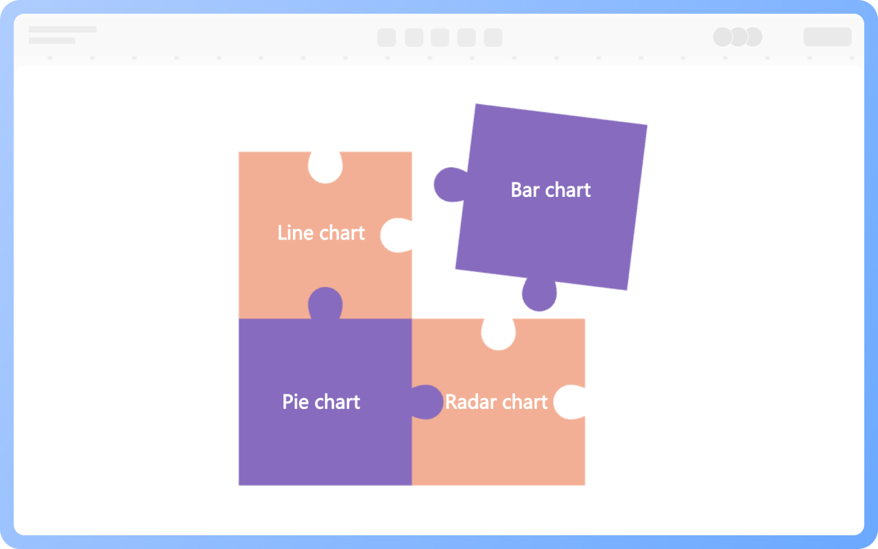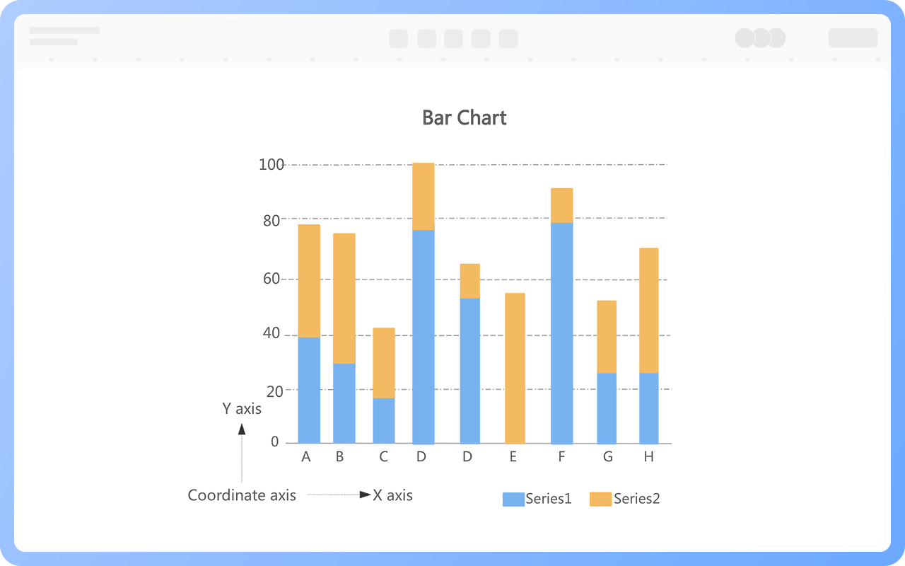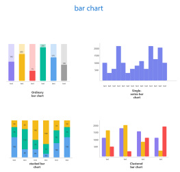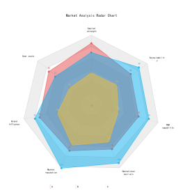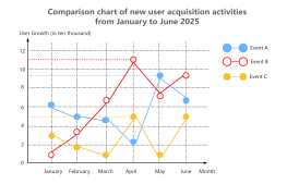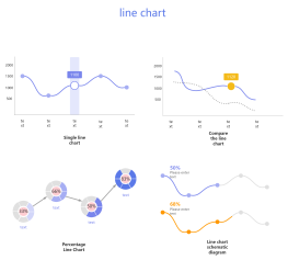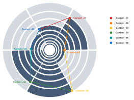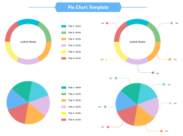


Common comparison charts include line charts, pie charts, bar charts, and radar charts. We need to choose the appropriate type based on the characteristics and application scenario of each chart.
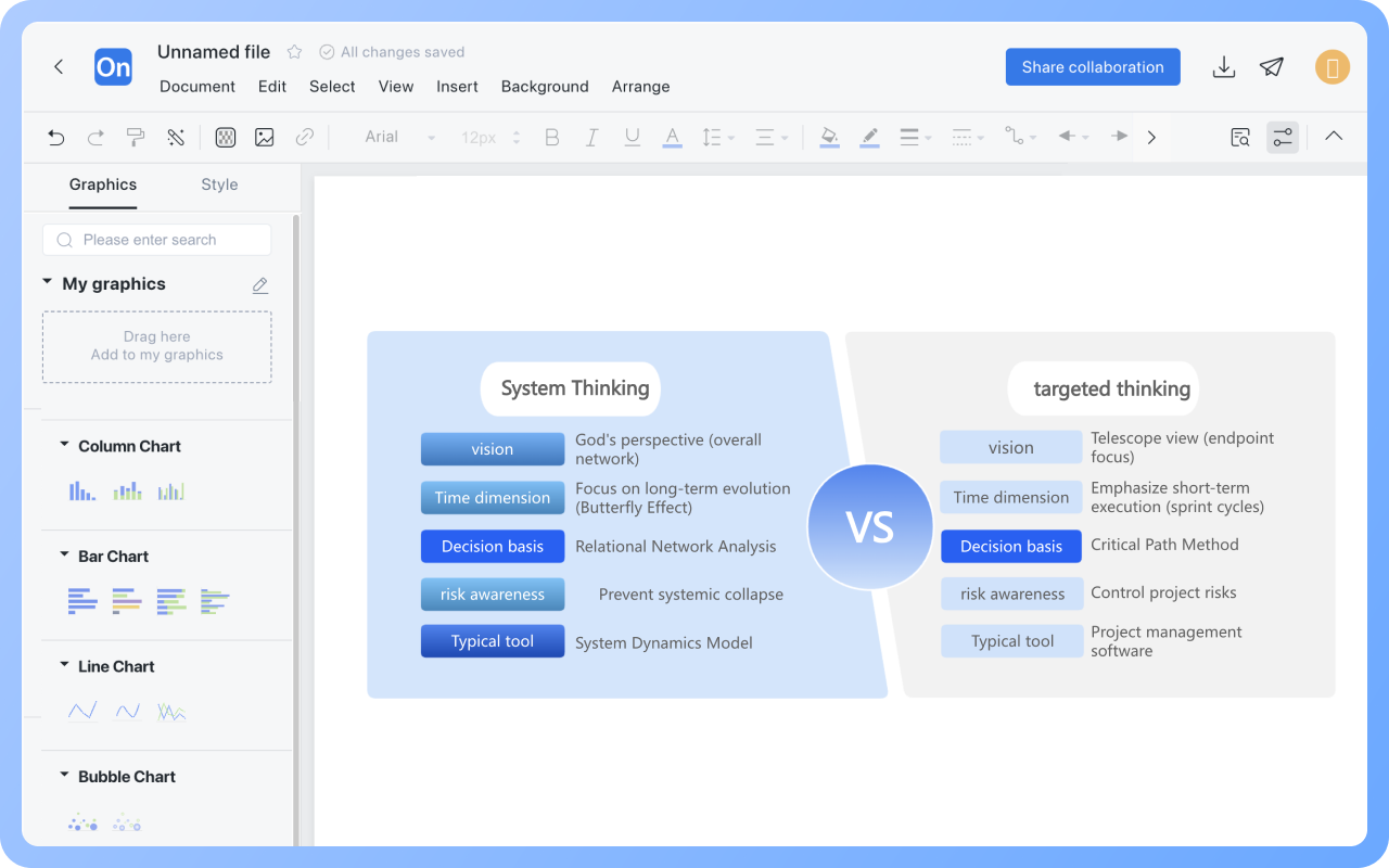
ProcessOn supports the creation of various comparison charts. You can directly drag and drop line chart, bar chart, pie chart, and other comparison chart templates into the canvas, enter the category name and data values in the input boxes, and the system will automatically calculate the proportions and generate a basic comparison chart. It also supports creating personalized comparison charts; you can freely combine graphics by dragging and dropping, intuitively adjust the proportions, and use various color schemes to quickly create comparison charts.
The template community also offers a wealth of comparison chart templates for your reference and use.
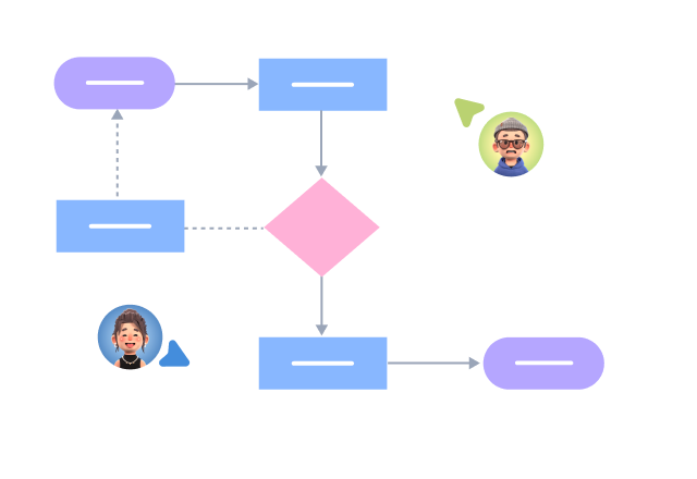
Process Type
Graphical expression
Mind Type
Structured expression
Note Type
Efficient expression
Treemap
Bracket Diagram
Default Mode