Process Type
Graphical expression
Mind Type
Structured expression
Note Type
Efficient expression
Treemap
Bracket Diagram

Default Mode





The daily work of operations and maintenance requires a series of technical means and management processes to monitor, troubleshoot, optimize performance, plan capacity, manage changes and ensure security of IT infrastructure (including servers, network devices, storage systems, operating systems, middleware, databases, application services, etc.). Its core objective is to ensure that the IT system supports business operations stably, efficiently, securely and scalably.
Operations and maintenance work involves a large amount of complex information: the physical location and network connection of servers, the layered architecture and call relationships of the system, standardized procedures for troubleshooting, and the dependencies of asset configurations... If this information is described only in words, it will be both lengthy and prone to ambiguity. The value of charts lies in structuring, visualizing, and standardizing complex information , enabling operations and maintenance personnel, development teams, and management to communicate efficiently using the same visual language.
Here are three types of charts that are indispensable in operations and maintenance work :
Definition and Uses
Network topology diagrams are the most basic and important type of diagram in the field of network operations and maintenance. Using nodes and links, they visually represent the physical connections and logical relationships between various devices in the network (servers, switches, routers, firewalls, load balancers, etc.). Topology diagrams help operations and maintenance personnel quickly grasp the "traffic map" of the entire network—where data enters, which nodes it passes through, and where it ultimately arrives.
core elements
A professional network topology diagram should include the following elements:
Device Node : Each network device is represented by an icon or rectangle, usually labeled with key information such as device name, IP address, and model.
Link connection : The connection between devices represents a network connection, and can be labeled with bandwidth, link type (fiber/cable/wireless), and status (normal/interrupted).
Hierarchical grouping : Devices are grouped according to dimensions such as data center, rack, VPC (Virtual Private Cloud), and availability zone to reflect the hierarchical structure of the network.
Status indicators : Use colors or markers to indicate the current health status of the device/link (green for normal, yellow for warning, red for fault, gray for offline).
Traffic direction : Use arrows to indicate the direction of data flow to help understand the request forwarding path.
Typical application scenarios
Scenario 1: Data Center Network Topology
Data center topology is the most classic application scenario for network topology diagrams, used to show the complete layout of all network devices within a single data center or server room. It covers the entire link from the internet gateway, perimeter firewall, core switches, aggregation switches, access switches to the servers in the racks. The core value of data center topology lies in its ability to allow maintenance personnel to troubleshoot along the topology links step by step when network jitter or outages occur—whether the outage started at the ISP's gateway, a core switch malfunction, or a particular access switch crashing—precisely locating the specific physical device or link.
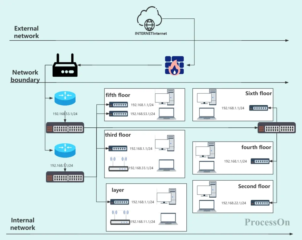
Company computer room network topology diagram
Scenario 2: Microservice Network Topology
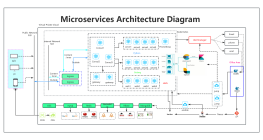
In microservice architectures, the number of service instances can easily reach hundreds, and these instances are dynamically created and destroyed, making traditional device-level topologies insufficient. Microservice network topologies use services as nodes (rather than physical devices) to represent the network call relationships between services, including: HTTP/gRPC call paths between services, API gateway routing rules, service registration and discovery mechanisms (such as Nacos/Eureka/Consul), producer and consumer relationships in message queues (Kafka/RocketMQ), and traffic forwarding paths from Ingress to Service to Pod in a Kubernetes cluster.
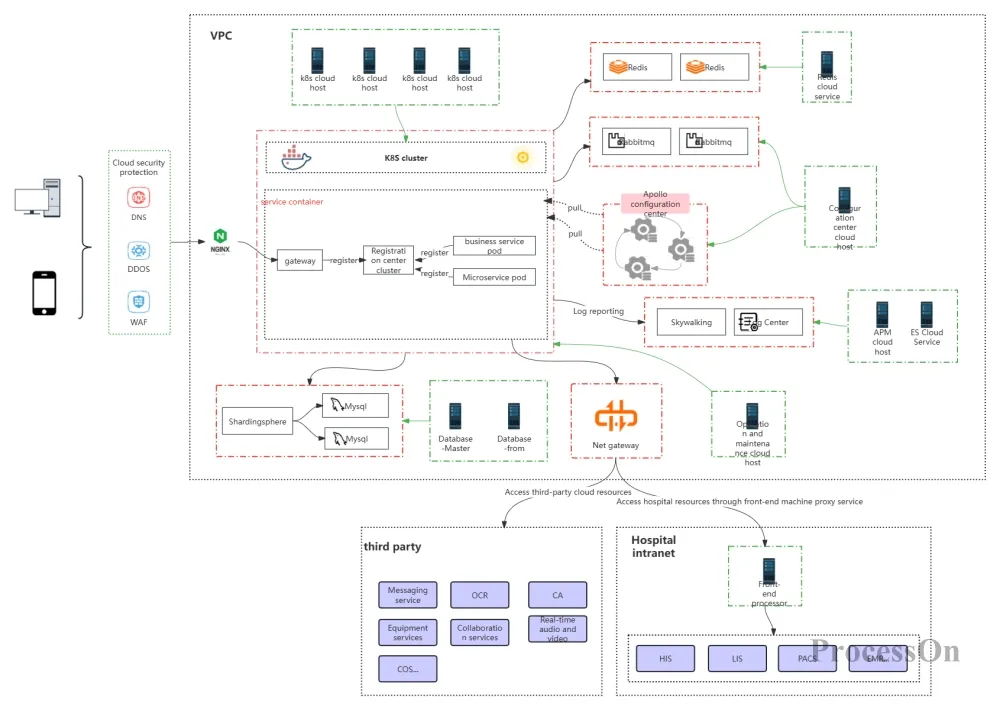
Microservice network topology diagram
Definition and Uses
A system architecture diagram is used to illustrate the overall structure of an IT system, including the calling relationships between application services, data flow paths, the deployment locations of technical components (such as caches, message queues, and databases), and the interaction methods between the system and external interfaces. It helps operations and maintenance personnel and development teams understand from a macro perspective "what parts make up the system and how they collaborate."
Typical application scenarios
Scenario 1: Application System Architecture Design and Review
When building new systems or undertaking major architectural refactoring, the application architecture view is a core deliverable and discussion topic in technical review meetings. The operations team uses the architecture diagram to evaluate the rationality and maintainability of the solution—for example, identifying single point of failure risks (whether there is a single instance deployment), assessing scalability (whether there are architectural bottlenecks when scaling up in the future), and evaluating dependency complexity (high risk of failure propagation when the call chain is too long).
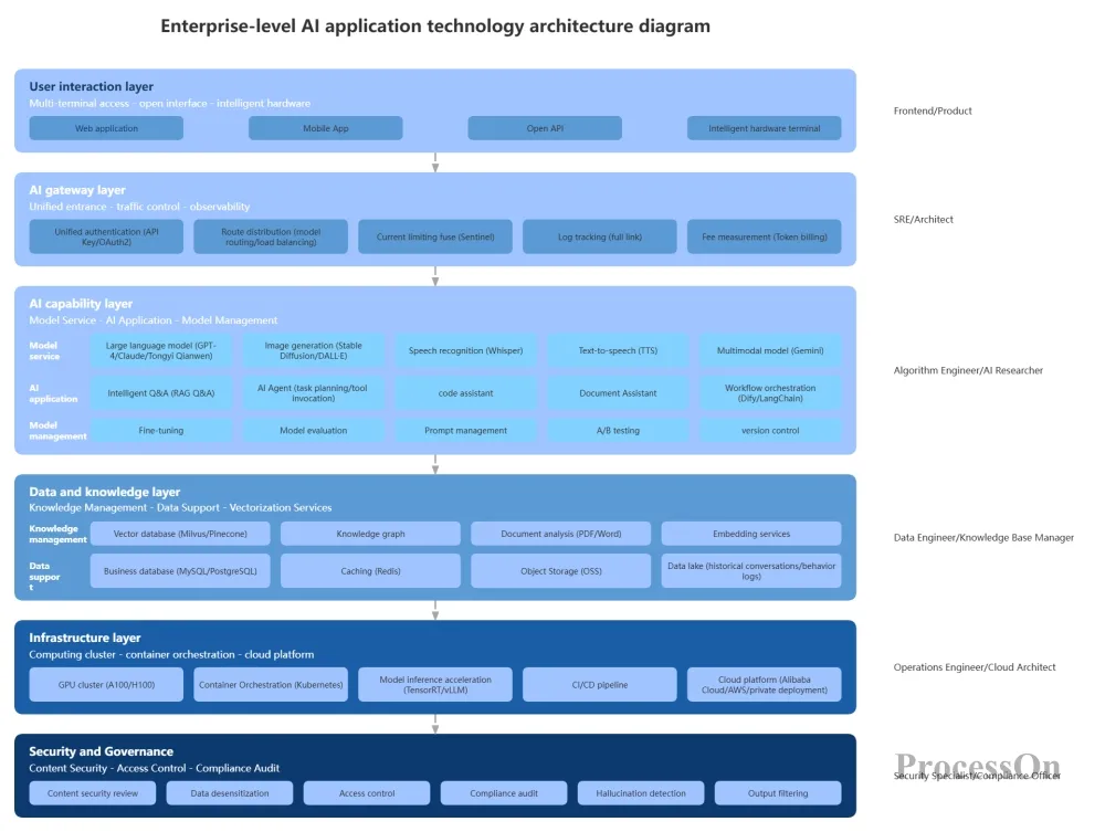
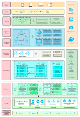
AI Application Architecture Diagram
Scenario 2: Deployment Architecture and Expansion Planning
Deployment architecture diagrams are one of the core bases for daily operations and maintenance work. When business growth requires scaling, deployment architecture diagrams clearly show the current instance distribution, availability zones, and resource specifications of each service, helping operations and maintenance personnel accurately determine: which service needs scaling, how many instances to scale, in which availability zone to add nodes, and what impact this will have on the scheduling strategy of the existing cluster. In containerized environments, deployment architecture diagrams are also used to plan Kubernetes cluster strategies such as Node affinity, Pod anti-affinity, and resource quotas.
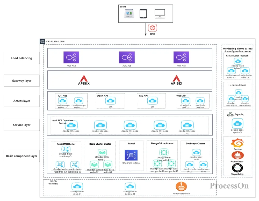
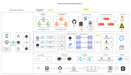
Operation and maintenance deployment architecture diagram
Scenario 3: Disaster Recovery Architecture and Disaster Recovery Drills
A disaster recovery architecture view is a core tool for ensuring system high availability. Based on the disaster recovery architecture diagram, the operations team develops disaster recovery plans (DRPs), schedules regular disaster recovery switchover drills, and verifies the effectiveness of data synchronization links, the feasibility of the switchover process, and the reliability of the fallback plan. The disaster recovery architecture view also serves as a visual aid for reporting system high availability capabilities to management—the diagram clearly shows whether the system possesses disaster recovery capabilities such as local active-active deployment and off-site disaster recovery.
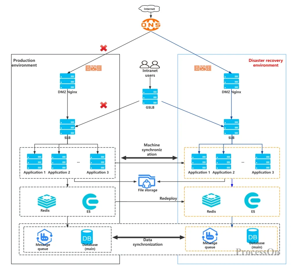
Cloud disaster recovery architecture diagram
Definition and Uses
Operations and maintenance flowcharts are tools that graphically represent standardized operations and maintenance processes. They break down a complete operations and maintenance process into several steps, clearly defining the executor, judgment conditions, inputs and outputs, and exception branches for each step. This ensures that operations and maintenance work does not rely on personal experience but follows a unified and reproducible standardized process.
Flowchart Symbol Standards
Standard flowcharts use a unified symbolic language: rounded rectangles represent "start/end", rectangles represent "processing/operation steps", diamonds represent "judgment/decision nodes", parallelograms represent "input/output", and arrows indicate the direction of flow. Using standardized symbols ensures seamless readability even across teams.
Typical application scenarios
Fault drills and debriefing: In fault drills, flowcharts serve as the "standard answer" to check whether the execution is standardized; in fault debriefing, the flowcharts are used to analyze which step deviated .
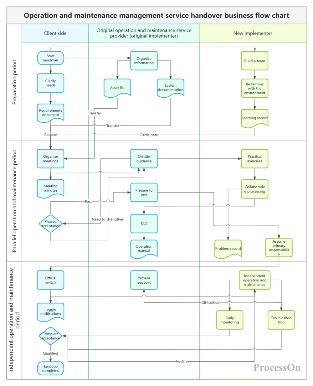
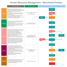
Operation and Maintenance System Service Flowchart
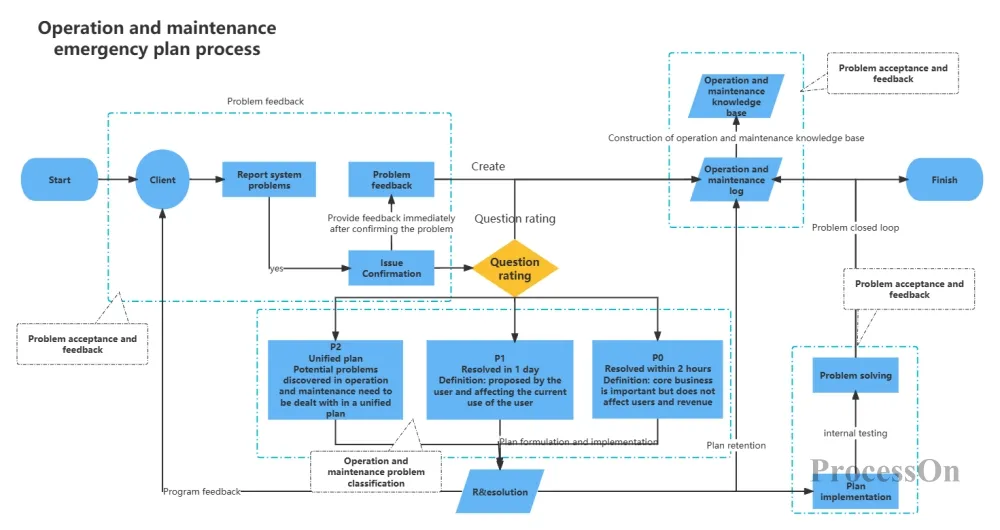
IT Software Operations and Maintenance Management - Operations and Maintenance Response Process
When many people first start creating visualizations, they want to cram all the data into a single chart: CPU, memory, disk, IO, bandwidth, Pod status, thread pool... As a result, the panel has to be scrolled through 8 pages, and in the end, they are too lazy to even open it .
Correct approach : Each chart should focus on one core indicator or one specific issue. It's better to have multiple charts than to cram information into a single chart.
Operational metrics should not be presented in a flat, straightforward manner; they need to be categorized by level .
Infrastructure Layer : Node Resources and Service Status – For Frontline Operations Engineers
Application Layer : Interface Time Consumption and Exception Count – For SREs and Developers
Business layer : Payment success rate, conversion rate – for managers and business stakeholders
Excellent charts not only display data, but also convey information:
The colors should be meaningful: green for normal, orange for warning, and red for alarm .
Set thresholds: Clearly mark the normal range and alarm thresholds on the chart .
Anomaly labeling: When a problem occurs in the system, there should be a clear label on the chart, rather than a "smooth line" .
Operational charts are not static documents that last for a year after being drawn once. As systems change, architectures change, and monitoring metrics change, charts must be updated accordingly. Using online charting tools (such as ProcessOn) allows for modification at any time and real-time synchronization, ensuring that everyone on the team sees the latest version.
ProcessOn, as a professional online charting and collaboration platform, provides operations and maintenance personnel with a one-stop charting solution:
Extensive Template Library : The ProcessOn template community offers a large number of operation and maintenance scenario templates, including operation and maintenance service guarantee system architecture diagrams, IT operation and maintenance architecture diagrams, operation and maintenance system service flowcharts (swimlane diagrams), security operation and maintenance mind maps, etc. These templates cover the complete operation and maintenance chain, including monitoring and inspection, emergency response, fault review, and iterative optimization .
Supports multiple types of diagrams : Whether it's network topology diagrams, deployment architecture diagrams, swimlane flowcharts, ER diagrams, or mind maps, ProcessOn can easily complete them.
Team Collaboration : Supports real-time online collaborative editing by multiple users. The operations and maintenance team can jointly maintain the same architecture diagram or flowchart, ensuring information synchronization. The architecture diagram supports full lifecycle governance records, allowing for one-click viewing and comparison of architecture evolution.
One-click reuse : After finding a suitable template, clone it with one click, and you can use it by directly modifying the content, which greatly saves the time of drawing from scratch.
Q1 : What tools are best for drawing operation and maintenance topology diagrams?
A: When choosing a tool, the main considerations are team collaboration needs and required level of expertise. ProcessOn's drag-and-drop interface and extensive icon library are sufficient for everyday needs . If the system's built-in icon library doesn't meet your requirements, you can also upload local icons.
Q2 : What key elements should an operations and maintenance flowchart include?
A: A complete operation and maintenance flowchart should include: ① Start and end points (triggering conditions and ending states); ② Execution roles for each stage (who performs the task); ③ Decision nodes (judgment conditions, such as "is it a routine failure or a complex failure?") ; ④ Inputs and outputs (what each stage requires and what it produces); ⑤ Anomaly handling paths (alternative solutions when a stage fails). Using swimlane diagrams can clearly distinguish the responsibilities of different roles .
Q3 : How often are the operation and maintenance charts updated ?
A: Different types of charts have different update frequencies: monitoring dashboards update in real-time or near real-time (seconds to minutes); trend reports are summarized daily/weekly/monthly; topology diagrams and architecture diagrams are updated when infrastructure changes occur (such as adding servers, adjusting networks, migrating to the cloud, etc.); flowcharts are updated when processes are optimized or organizations are restructured. It is recommended to establish a "version management" mechanism for charts to record the time and reason for each update.
Q4 : How can I make operation and maintenance charts understandable to non-technical personnel?
A: The key is translation , not simplification . ① Use business language instead of technical jargon (e.g., "user login success rate" instead of "authentication service QPS"); ② Use colors to convey status information (green = good, yellow = warning, red = failure); ③ Add necessary annotations and threshold labels to the charts ; ④ Provide management with an "overview view," focusing on business metrics rather than underlying technical metrics . ProcessOn's charts support adding text annotations and explanations to help readers in different roles understand the meaning of the charts.
Q5 : Can ProcessOn's operation and maintenance templates be used directly?
A: Yes. All the operation and maintenance templates in the ProcessOn template community support "one-click cloning." After cloning, all graphics, text, and connections can be freely edited and modified. You can adjust the content according to your company's actual situation—modify device names, replace icons, add or remove nodes, and adjust process steps—and generate a professional enterprise-level operation and maintenance diagram in minutes, without having to start from scratch .