Process Type
Graphical expression
Mind Type
Structured expression
Note Type
Efficient expression
Treemap
Bracket Diagram
Default Mode


In the field of data analysis and visualization, we often need to show "flow" relationships—for example, the source of funds, the stages they go through, and their final destination; or how energy is transformed from primary energy into end-consumer energy; or the user's behavioral path from entering a website to final conversion. These complex relationships of distribution, convergence, and transfer are difficult to clearly express using ordinary bar charts or pie charts. This is where the Sankey Diagram comes in handy.
This article will systematically explain the definition, origin, core characteristics, and application scenarios of Sankey diagrams . We will also introduce how to quickly create professional Sankey diagrams using online charting tools such as ProcessOn , making data flow clear at a glance.
A Sankey diagram is a specific type of flowchart used to visualize the flow of flow, energy, or quantity. It consists of a series of strips of varying widths flowing from left to right (or from top to bottom), with the width of the lines directly representing the magnitude of the flow. Through this visual metaphor, users can intuitively see the distribution, transfer, and loss of resources at various stages.
The Sankey diagram is named after Matthew Henry Phineas Riall Sankey, an Irish-born British engineer. In 1898, Sankey first used this energy flow diagram in a paper on the energy efficiency of steam engines to illustrate how the energy input from coal was ultimately converted into useful work and dissipated heat. Therefore, this diagram is also known as the "Sankey energy flow diagram."
Later, the applications of Sankey diagrams extended far beyond the field of thermodynamics, and were widely used in many fields such as economics, logistics, transportation, biology, environmental science, and network analysis.
The width of the flow is proportional to the value: the thickness of each streamline represents the amount of flow, and an observer can see at a glance which links have a large flow and which links have a large loss.
Directionality: Typically, the stages of the process are indicated from left to right, with arrows indicating the direction of flow.
Node: A point along the flow path, which can be the source, intermediate link, or final destination.
Conservation: The total flow into a node should equal the total flow out of the node (unless there is a source or sink inside the node), which reflects the principle of conservation of energy or matter.
The most classic application. It illustrates the process of a power plant's energy input (coal, natural gas, nuclear energy, renewable energy) and output, including electricity, heat, and losses. For example, the Sankey Map of World Energy Flows, published annually by the International Energy Agency (IEA), visually displays the global energy supply and consumption patterns.
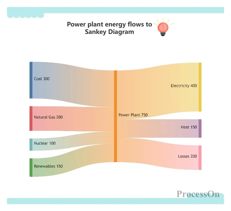
Energy flow from power plants to Sankey diagram
Tracking fund flows: from fiscal revenue (taxes, national debt) to departmental expenditures (defense, education, healthcare), and then to specific projects. Commonly used in financial analysis by government departments or enterprises.
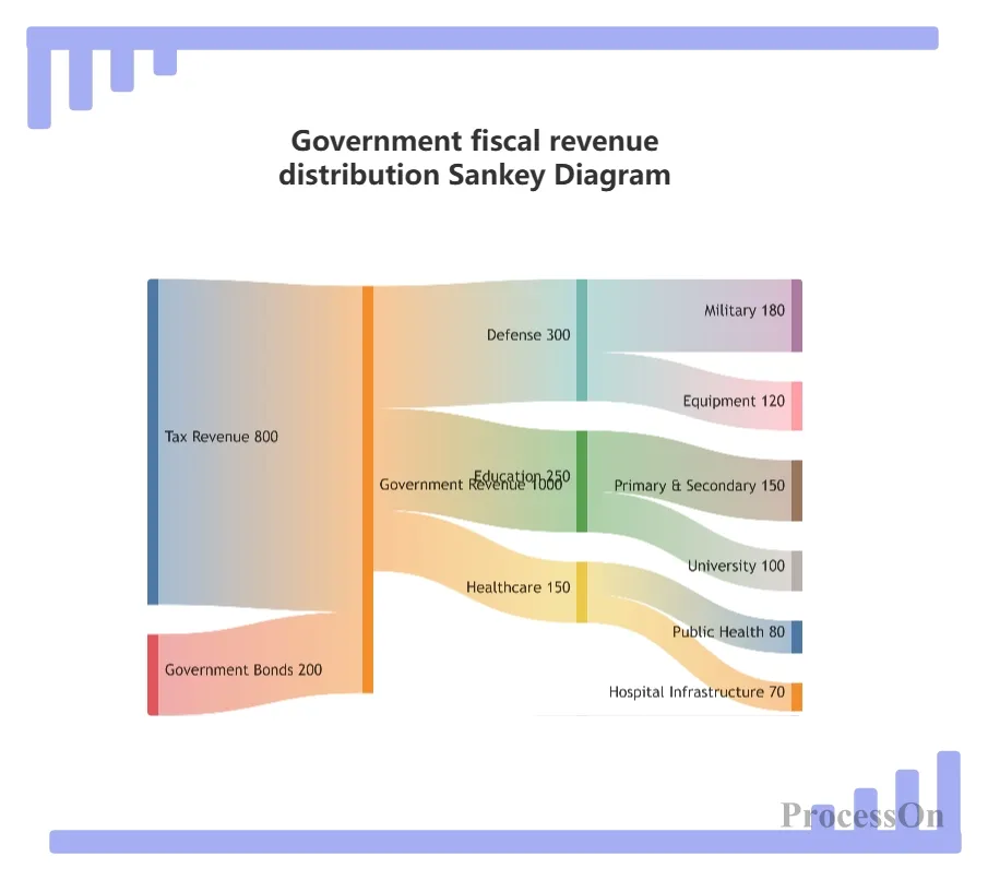
Sankey diagram of government fiscal revenue distribution
Website traffic analysis: Traffic sources (search engines, social media, direct access) → Landing page behavior → Conversion goals (registration, purchase, download). This Sankey diagram can help optimize your marketing channel mix.
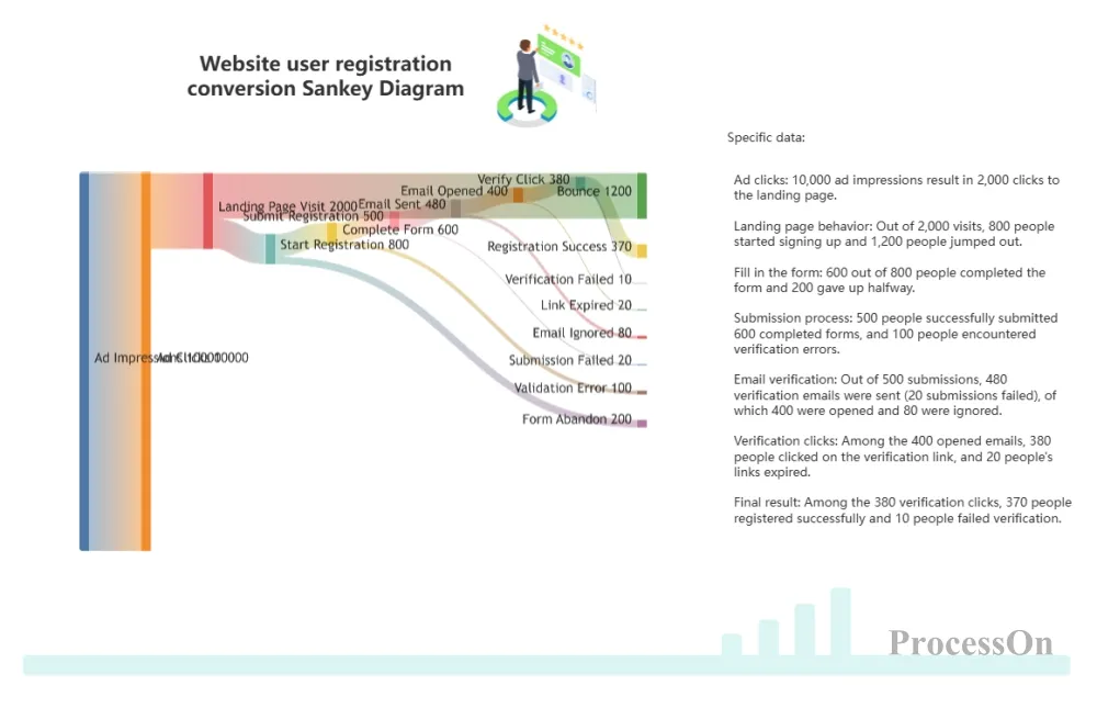
Sankey diagram of website user registration conversion
Raw material origin → Production plant → Regional warehouse → Retail store → Consumer. A Sankey diagram can show inventory losses or efficiency at each stage.
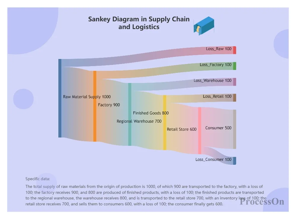
Sankey diagram of supply chain and logistics
Carbon footprint, water footprint, nitrogen cycle, etc. For example, showing the flow of nitrogen fertilizer in farmland: absorbed by crops, seeping into groundwater, volatilizing into the atmosphere, etc.
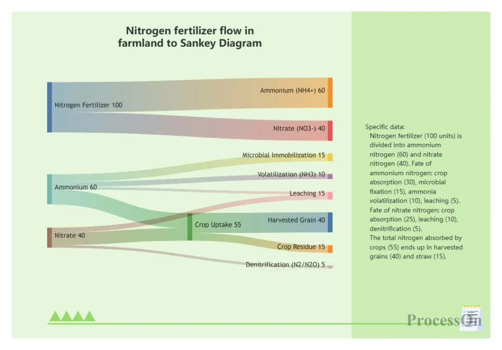
Nitrogen fertilizer flow to mulberry trees in farmland
Sankey diagrams require three basic types of data:
Node list: The names of the nodes in each stage (e.g., coal, oil, natural gas, power plant, industry, residential, commerce).
Link list: the starting node, ending node, and flow rate of each flow.
Optional node grouping: Sometimes it is necessary to group nodes by stage to improve readability.
Go to your ProcessOn profile page and create a new flowchart. Click "Insert" → "Mermaid Drawing" in the top toolbar, and enter the Sankey diagram code in the Mermaid code editor on the right, or upload a file in txt, markdown, or other formats.
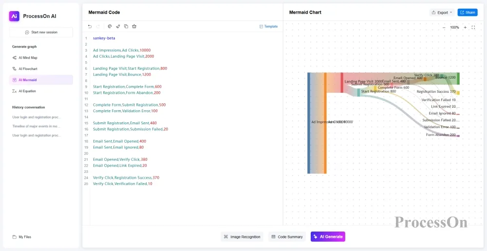
Clicking the "Edit" button above the Sankey diagram allows you to directly modify the Mermaid code on the right, or drag and drop graphics from the left-hand graphics library to add titles and legends. Once the Sankey diagram is complete, you can export it as PNG, JPG, PDF, or SVG formats.
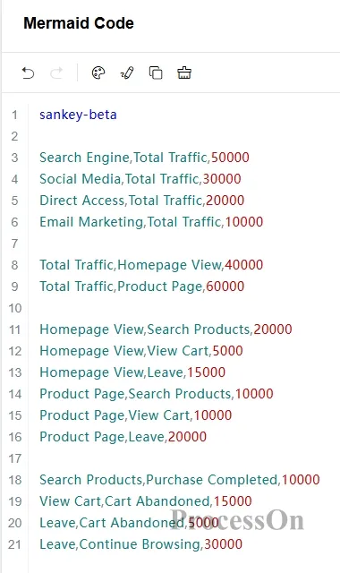
Suppose an e-commerce website wants to analyze the user conversion path from visit to purchase using a Sankey diagram. The data is as follows:
Traffic sources: Search engines (50,000), social media (30,000), direct visits (20,000), email marketing (10,000).
Landing page behavior: Browse the homepage (40000), or go directly to the product page (60000).
Next steps: Search for products (30000), view shopping cart (15000), exit (35000).
Final: Complete purchase (10000), Abandon shopping cart (20000), Continue browsing (30000).
We can enter the following in the ProcessOn Mermaid edit box:
Final display result:
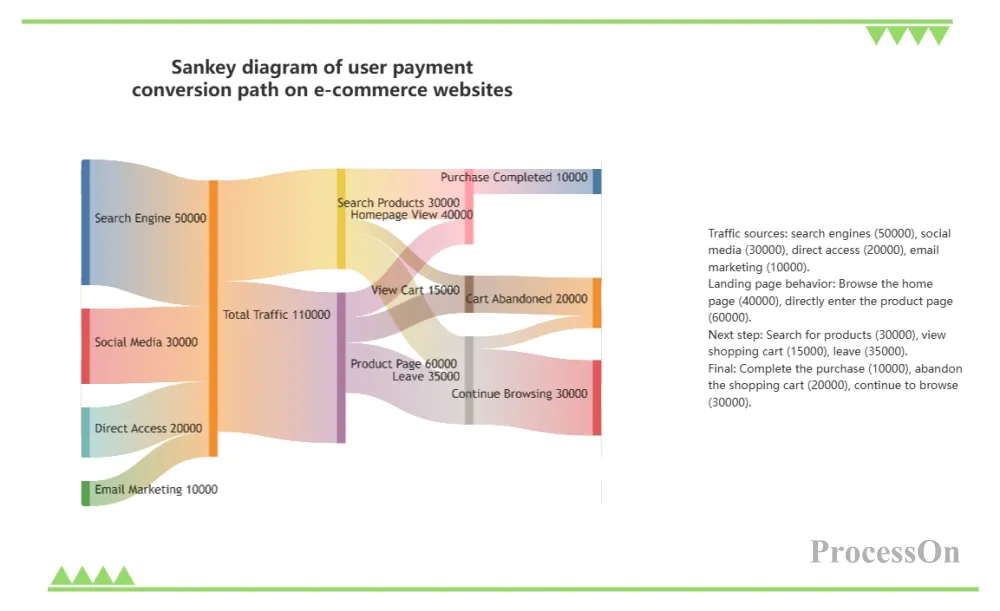
Sankey diagram of user paid conversion on e-commerce websites
Despite its power, the Sankey diagram also has its drawbacks:
Too many nodes can create a cluttered look: with more than 30 nodes, the lines become intertwined and difficult to read. Solution: Group by stage and use an interactive Sankey diagram (hover over the path to highlight).
Not good at representing time series: Sankey plots are static and cannot show changes in flow over time. For dynamic representation, multiple plots or animations can be created.
The problem of proportional perception: The human eye is less sensitive to differences in width than to differences in length, so numerical labels must be added.
Sankey diagrams, with their ability to intuitively represent the allocation and transfer of traffic, have become a powerful tool for cross-disciplinary professionals such as data analysts, engineers, product managers, and finance personnel. From energy audits to user growth, from fiscal budgets to supply chain optimization, they can help us quickly identify structural problems.
The choice of tools is also crucial. For users without a technical background, ProcessOn offers a no-coding solution for creating Sankey diagrams, with built-in templates and convenient export functions, making chart creation easy and efficient. Try creating your first Sankey diagram on ProcessOn now—whether analyzing your company's annual budget or outlining your online marketing funnel, a single chart can let your data speak for itself.