Process Type
Graphical expression
Mind Type
Structured expression
Note Type
Efficient expression
Treemap
Bracket Diagram

Default Mode





In backend development, code solves the "how" problem, while charts solve the "what" and "why" problems.
Diagrams are a "system perspective mirror" for backend developers—they make invisible calls visible, unclear architectures explainable, and unremembered relationships searchable. This article starts with the pain points unique to backend development and outlines six types of diagrams that truly solve problems—each diagram corresponds to a real dilemma in backend development.
In the era of monolithic architecture, the system structure was very simple—one application, one database, and the dependencies were clear at a glance. But in microservice architecture, the number of services expands from a few to dozens or even hundreds, and the calling relationships between services are woven into a web that no one can see clearly.
Over 67% of enterprises face problems such as confusing service dependencies and opaque deployment chains after adopting microservices. A typical e-commerce system may have order services, payment services, inventory services, user services, logistics services, messaging services, etc. You know that A calls B, but does A indirectly depend on C? If B goes down, how many upstream services will be affected? These questions cannot be answered simply by "looking at the code".
A microservice topology diagram visualizes the dependency structure of a microservice system through nodes (services) and edges (call relationships). It is not a static architecture diagram, but an observability tool that can dynamically reflect the real-time call frequency, latency distribution, and health status between services.
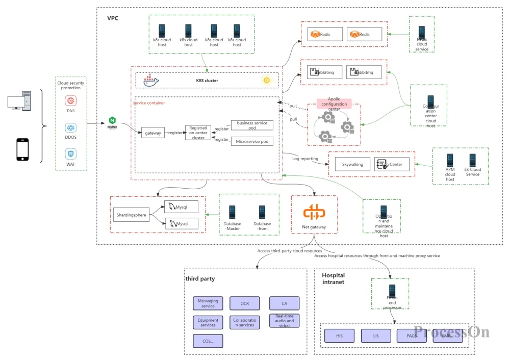
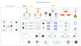
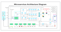
Microservice network topology diagram
A good microservice topology diagram can answer three core questions:
Who depends on whom? — A quick glance reveals the upstream and downstream relationships of all services.
Who's holding us back? — Service nodes with high latency or high error rates are automatically highlighted.
Who suffers the most impact if they fail? — Identify critical nodes and single points of failure risk in the system.
Scenario 1: Root Cause Analysis. When a large number of system timeouts occur, the traditional troubleshooting method involves checking logs for each machine and monitoring for each service. With a microservice topology diagram, you see: traffic enters from the API gateway → passes through the order service → calls the payment service → the payment service calls the third-party payment channel—and the node for the third-party payment channel is displayed in red (abnormal). The root cause can be located in 3 seconds, not 3 hours.
Scenario 2: Circular Dependency Detection. Service A calls Service B, Service B calls Service C, and Service C calls Service A again—this is difficult to detect at the code level, but on the topology diagram, a circular arrow structure is immediately apparent.
Scenario 3: Capacity Planning. The traffic volume of each node on the topology diagram is represented by the thickness of the lines, indicating which service is the traffic hub and which service needs to be prioritized for expansion, which is visually presented directly.
Group services by business domain or layer to avoid flattening all nodes.
Service status is indicated by color (green = normal, yellow = warning, red = fault).
The thickness of the line indicates the frequency of the call, and the color of the line indicates the level of latency.
Distinguish between synchronous calls (solid lines) and asynchronous messages (dashed lines).
The most difficult problem to debug in backend development is often not "this code is wrong", but "which link in the entire call chain is wrong".
A user's order request may traverse the following stages: Frontend → API Gateway → Order Service → Payment Service (calling a third party) → Inventory Service → Message Queue → Logistics Service → Database. If any of these seven stages encounters a problem—timeout, error return, or data inconsistency—the end user will only see a vague "System error, please try again later."
What's more complicated is that these calls might be synchronous (waiting for a return) or asynchronous (sending a message and then ignoring it); there might be retry mechanisms or timeout circuit breakers. Without drawing the complete call sequence, you simply cannot determine "who to contact for this bug."
Sequence diagrams, framed by a vertical timeline and horizontal participants, clearly illustrate the chronological message passing process between multiple systems. They are the best tool for backend interface alignment, troubleshooting distributed issues, and designing asynchronous processes.
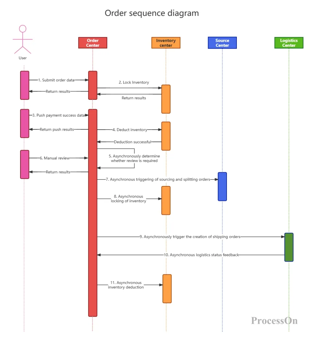
Scenario 1: The complete timeline of the payment process. User initiates payment → Order service creates order (status: pending payment) → Payment service is called → Payment service calls third-party payment channel → Third party returns payment result → Payment service calls back to order service → Order service updates order status → Order service sends "payment successful" message to MQ → Inventory service consumes message and deducts inventory → Logistics service creates shipping order. The initiator, receiver, message content, and timeline relationships for each step are all visualized.
Scenario 2: Saga Pattern for Distributed Transactions. The Saga pattern breaks down long transactions into multiple local transactions, each with corresponding compensation operations. The sequence diagram clearly shows: Order creation → Inventory deduction → Payment deduction → (If payment fails) → Inventory compensation → Order cancellation. Successful and failed paths are represented in the sequence diagram using alt and opt fragments respectively.
Participants are arranged from left to right in the order of invocation, with the initiator on the far left.
Synchronous messages use solid arrows, and return messages use dashed arrows.
Different scenarios are represented using the alt (conditional branch) and opt (optional branch) fragments.
Label each message with its execution time for easier performance analysis.
Front-end code deployment is relatively simple—just package it and upload it to a CDN. However, back-end deployment is a complex systems engineering project involving containers, clusters, networks, storage, and configuration.
How many Pods does your Spring Boot application run on? How much memory is allocated to each Pod? Is the database a master-slave architecture or a cluster? Is Redis deployed on the same machine as the application? How many layers of load balancing are in front of the API gateway? No one can remember all the details if you just describe them verbally. Worse still, the deployment structures of development, testing, pre-release, and production environments are often different—the root cause of "it works fine in the testing environment, but crashes in production" often lies in these deployment differences.
The deployment diagram illustrates the physical deployment structure of the system—where the software components are distributed across hardware/container nodes and how the nodes communicate with each other. It serves as a bridge between "code design" and "system operation," making the process of "how code becomes an online service" clearly visible.
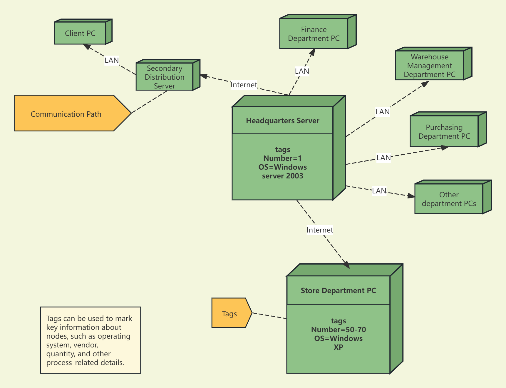
Scenario 1: Containerized Deployment Architecture. Client request → Kubernetes Ingress (traffic entry point) → Kubernetes Service (service discovery and load balancing) → Pod cluster (running service instances) → Persistent storage (PV/PVC). The deployment diagram shows the number of replicas, resource quotas, and network policies for each component.
Scenario 2: Hybrid Cloud Deployment. Core business operations are deployed in a private cloud (due to data sovereignty requirements), while elastic computing resources are deployed in a public cloud (to handle sudden traffic surges). Cross-cloud communication is decoupled asynchronously through message queues. The deployment diagram clearly shows which services are on-premises, which are on-premises, and how cross-cloud traffic flows.
Nodes are represented by cubes (physical machines/virtual machines/containers), and internal components are represented by rectangles.
The operating system, runtime environment, and resource configuration of the labeled nodes
The communication path is labeled with the protocol (HTTP/gRPC/Redis protocol) and port.
Different colors are used to distinguish different environments.
Data is the foundation of backend development. If the table structure is designed incorrectly, all subsequent code will be built on that flawed foundation. However, database design presents an inherent challenge: business stakeholders describe their requirements in business language, while developers design table structures in database language—this requires a translation process.
A more practical problem is that when a system involves multiple services and multiple databases, the data models for each service are scattered across different code repositories. No one can see the "whole picture" from a single diagram. New employees often spend weeks going through the code piece by piece to figure out "what fields the order table has, and how the user table and the order table are related."
Without ER diagrams, the data model exists only in the code, not in the team's consensus.
ER diagrams (Entity-Relationship Diagrams) are used to design database structures, defining entities (tables), attributes (fields), and the relationships between entities. They serve as a standard translation tool from "business requirements" to "database tables" and a visual representation of a team's consensus on the data model.
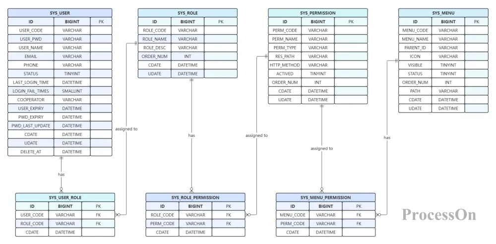
Scenario 1 : Data Model Design for a New Feature. The product team proposed adding a coupon feature. The backend developers first designed new tables using an ER diagram—a coupon table, a user coupon redemption record table, and an order coupon usage table. After drawing the diagram, they discovered a redundant relationship between the "user coupon redemption record" and "order coupon usage" tables. This redundancy was eliminated during the diagram drawing phase, rather than being discovered halfway through the code development.
Scenario 2 : Database Change Impact Analysis. A plan is to add a field to the order table, but it's unclear which upstream and downstream services will be affected. An ER diagram clearly shows which services use the order table and which tables it's associated with—the scope of the change's impact is directly presented on the diagram, significantly reducing assessment costs.
Entities are represented by rectangles, relationships by rhombuses, and attributes by ellipses—maintaining a standard notation system.
Label the cardinality (1:1, 1:N, M:N) on the connection lines between entities and relations to avoid ambiguous labeling.
Drawing is done in modules based on business domains to avoid information overload in a single image.
Label the primary key (PK) and foreign key (FK).
There is a common but hidden problem in backend development: if you modify a table in service A, the cache in service B suddenly becomes invalid; if you add a field to the order service, the data in the report service becomes misaligned.
The root of these problems lies in the fact that data is never static—it constantly flows between multiple services, multiple databases, and multiple caching layers. However, most developers only understand the small segment of the data path they are responsible for and lack a global perspective on the entire data lifecycle.
When data issues arise (inconsistency, loss, high latency), you don't know which path to follow. You understand the structure of each table, but you don't know how the data travels from its starting point to its destination.
A Data Flow Diagram (DFD) illustrates the path of data as it is transferred, transformed, and stored among the components of a system. It answers three core questions: Where does the data come from, through whom does it pass, and where does it ultimately go? It is not a static data model, but rather a dynamic data journey.
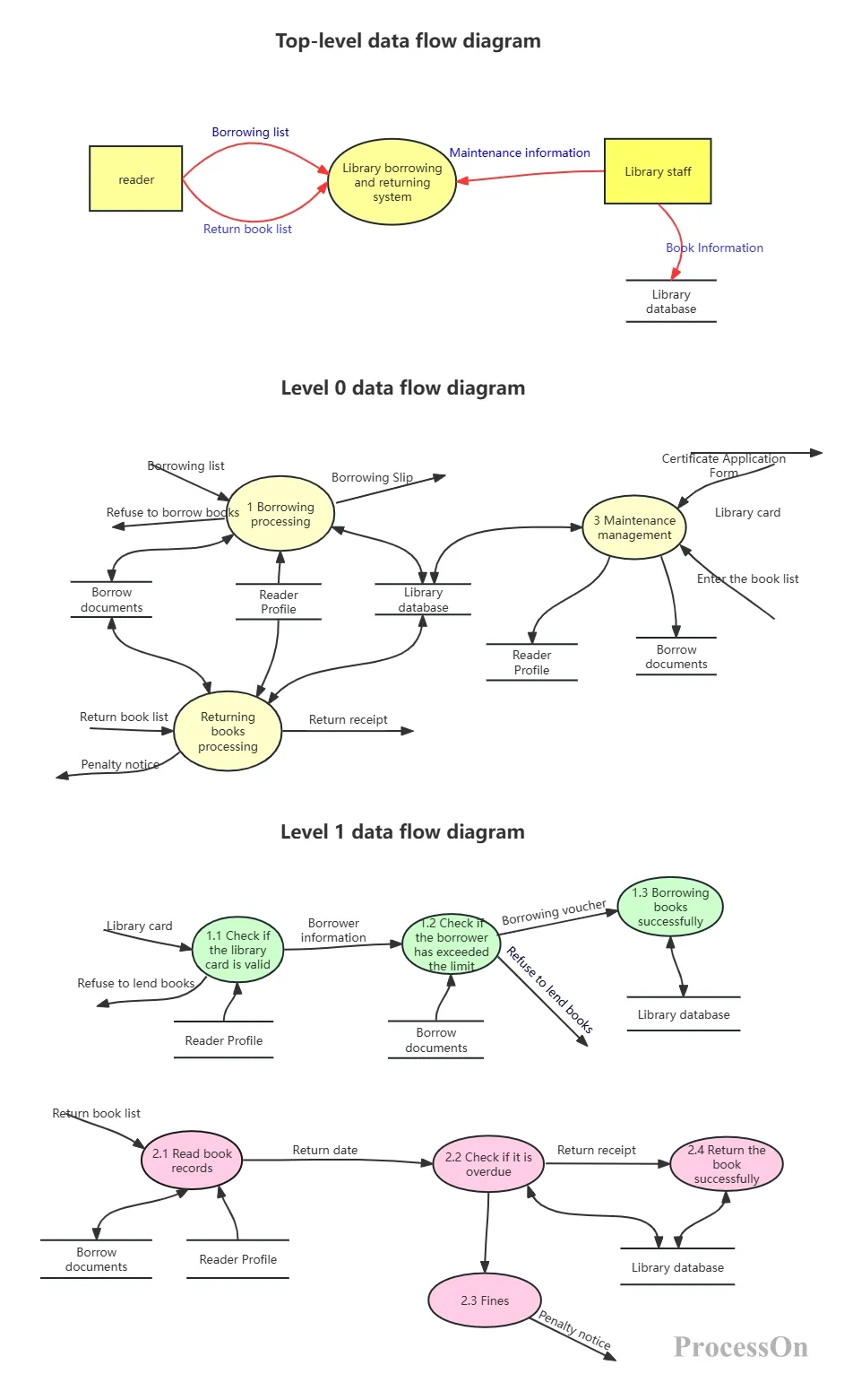
Book borrowing and returning system_data flow diagram
Scenario 1 : Data Flow Graph Optimization of Interface Design. After introducing a data flow graph into its order processing workflow, an e-commerce platform discovered that user identity information was being repeatedly decrypted across three services, leading to an 80-millisecond increase in average response time. After optimization, centralized processing through a unified authentication gateway resulted in a 19% performance improvement. The value of a data flow graph lies in revealing "invisible redundancy."
Scenario 2 : Data Consistency Check. A financial product discovered a discrepancy between user balances and order amounts. Tracing the data using a data flow diagram revealed that the "event tracing" resulting from account changes flowed through four services, with the third service losing an attribute during data transformation. The data flow diagram transformed the investigation from a "needle in a haystack" to a "guided search."
Use circles or rounded rectangles to represent "processing steps," and rectangles to represent "external entities."
Use open rectangles to represent "data storage" (database/file/cache).
Arrows indicate the direction of data flow and label the data content (such as "order information" or "payment result").
Layered rendering—the high-level (Context Diagram) displays system-level data flow, while the low-level (Level 1/2) displays module-level data flow.
Backend systems are becoming increasingly complex—the number of microservices is increasing, the types of middleware are diverse, and cloud environment configurations vary. When a system has dozens of services, a dozen or so middleware components, and is deployed across multiple availability zones, no one can fully describe what the system looks like in words.
This predicament can trigger a series of chain reactions: newcomers can only understand 30% of the content in solution discussion meetings; when a failure occurs, it is impossible to determine whether the current problem belongs to "business logic problem" or "infrastructure problem"; during technology selection discussions, everyone has a completely different definition of the system boundary.
An architecture diagram is an "overall map" of a system, showing how many layers the system has, what each layer does, where the key modules are located, and what technologies have been chosen. It doesn't serve a specific scenario (such as troubleshooting or database design), but rather answers the most fundamental question: What does this system look like?
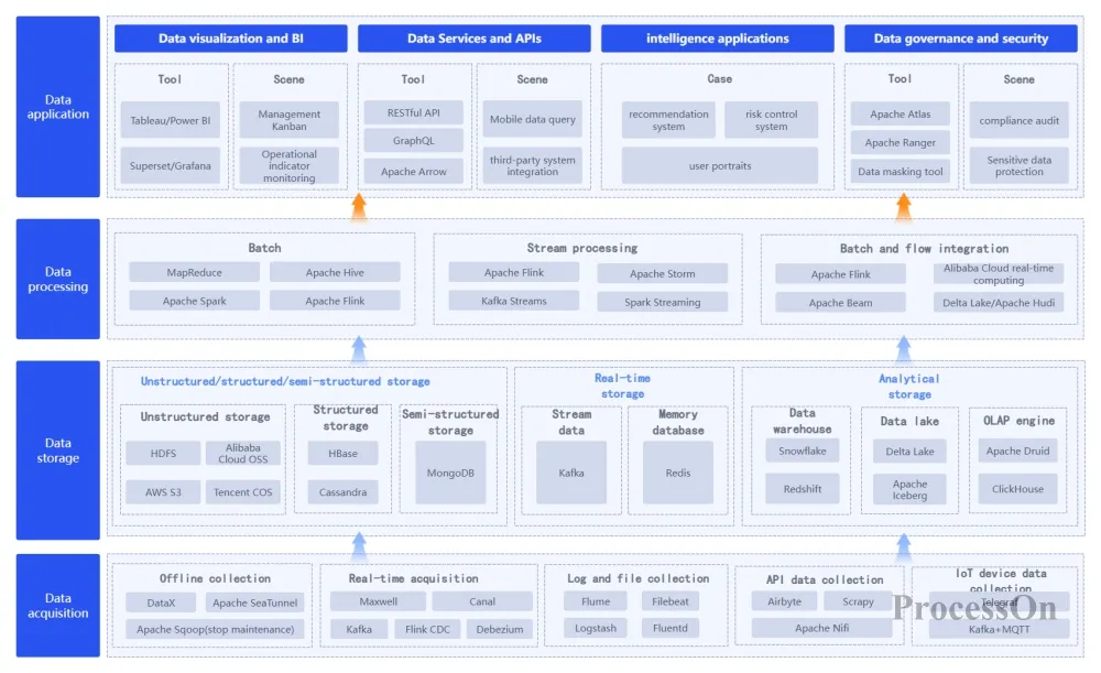
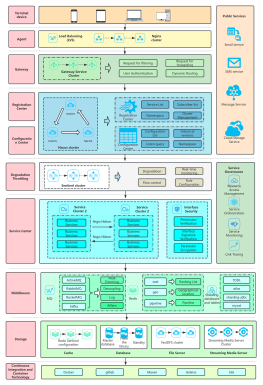
Big Data Product System Architecture Diagram
A good architecture diagram should allow the reader to understand the overall structure of the system within 30 seconds and locate the module they are interested in within 2 minutes.
Scenario 1: Technical Solution Review. An architecture diagram is the core material for a review meeting. When you label the layered structure of "Access Layer → Business Layer → Middleware Layer → Data Layer" and the technology stack of each layer on the diagram, reviewers can intuitively assess the rationality of the solution, rather than relying on your description.
Scenario 2 : Module Boundary Definition. When the boundary between the order service and the payment service is ambiguous, the clear module division and arrow directions on the architecture diagram (which side is allowed to call which side) directly provide the answer.
Layering is the core of an architecture diagram—each layer has a single responsibility and clear boundaries.
The direction of the arrows indicates the direction of data flow or call; consistency is key to avoid confusion.
Do not cram all technical details (such as port numbers and configuration file paths) into a single architecture diagram.
Highlight key technology choices, such as "Spring Cloud", "Kubernetes", and "Redis Cluster".
The six chart types above cover core scenarios in backend development, from architecture design to database modeling, and from service governance to deployment and maintenance. Knowing "what to draw" is the first step, but choosing the right tools is equally crucial.
ProcessOn, as a professional online charting and collaboration platform, provides backend developers with a one-stop charting solution:
Extensive Template Library: The ProcessOn template community provides a variety of frequently used backend chart templates, such as microservice architecture diagrams, deployment architecture diagrams, ER diagrams, sequence diagrams, and data flow diagrams, covering the complete scenarios from system architecture to data design .
Multiple chart types supported: ProcessOn supports professional drawing of service topology diagrams, time sequence diagrams, deployment diagrams, ER diagrams, data flow diagrams, and architecture diagrams .
AI-generated diagrams: Simply enter a text description to generate flowcharts, sequence diagrams, architecture diagrams, etc. with one click, greatly reducing the barrier to diagram creation .
Team collaboration: Supports real-time online collaboration among multiple users. Backend teams can jointly maintain architecture diagrams and technical documents, and each modification automatically saves historical versions .
Q1: Which types of charts should backend developers prioritize mastering?
A: Based on the actual pain points of backend development, it is recommended to prioritize mastering: service topology diagrams (to resolve the confusion of microservice dependencies), sequence diagrams (to clarify distributed call chains), ER diagrams (the engineering language of database design), and architecture diagrams (system overview). These four types of diagrams directly correspond to the four most common dilemmas in backend development—unclear service dependencies, unclear call chains, misaligned data models, and an incomplete overall system view.
Q2: What is the difference between a sequence diagram and a flowchart?
A: Flowcharts focus on the control flow within a single system—input → processing → decision → output—addressing the question of "how this function/module executes internally." Sequence diagrams focus on the message passing order between multiple systems—who sent what to whom first, and who replied with what—addressing the question of "which link in a distributed call went wrong." Both are needed in backend development—flowcharts for business logic and sequence diagrams for distributed calls.
Q3: What is the difference between a microservice topology diagram and an architecture diagram?
A: An architecture diagram is a static product of the design phase—it shows what the system "should" look like, emphasizing layering, modules, and technology selection. A microservice topology diagram is a dynamic product of the runtime phase—it shows how the system "actually" calls itself, emphasizing real-time dependencies, traffic distribution, and health status. An architecture diagram is a "design blueprint," while a topology diagram is a "running electrocardiogram."
Q4: Is the ER diagram still useful in a microservice architecture?
A: It's even more useful. Microservice architecture advocates that "each service has its own independent database"—this means that the data model is no longer concentrated in one large graph, but is distributed across multiple service ER diagrams. The value of the ER diagram changes from "drawing one large graph" to "drawing multiple smaller graphs and clarifying the data boundaries between them." Each service's ER diagram defines the service's data sovereignty scope and is the core basis for service decomposition.
Q5: What is the difference between a data flow diagram and an ER diagram?
A: ER diagrams focus on "static structure"—what do data tables look like, what fields are there, and how are tables related? They answer the question, "What does the data look like?" Data flow diagrams focus on "dynamic flow"—where does the data come from, what does it pass through, and where does it go? They answer the question, "How does the data move?" The two are complementary—ER diagrams are tools for designing your database, while data flow diagrams are tools for troubleshooting data problems and performing data governance.
Q6: Can ProcessOn generate professional backend charts?
A: Yes. ProcessOn supports frequently used diagram types in backend development, such as service topology diagrams, sequence diagrams, deployment diagrams, ER diagrams, data flow diagrams, and architecture diagrams. The template community provides ready-made templates for microservice architecture diagrams, deployment architecture diagrams, ER diagrams, etc., supporting one-click AI generation and online team collaboration.
 Following the tutorial to try
Free to use ProcessOn
Following the tutorial to try
Free to use ProcessOn