
Market share of each city district
0 Report
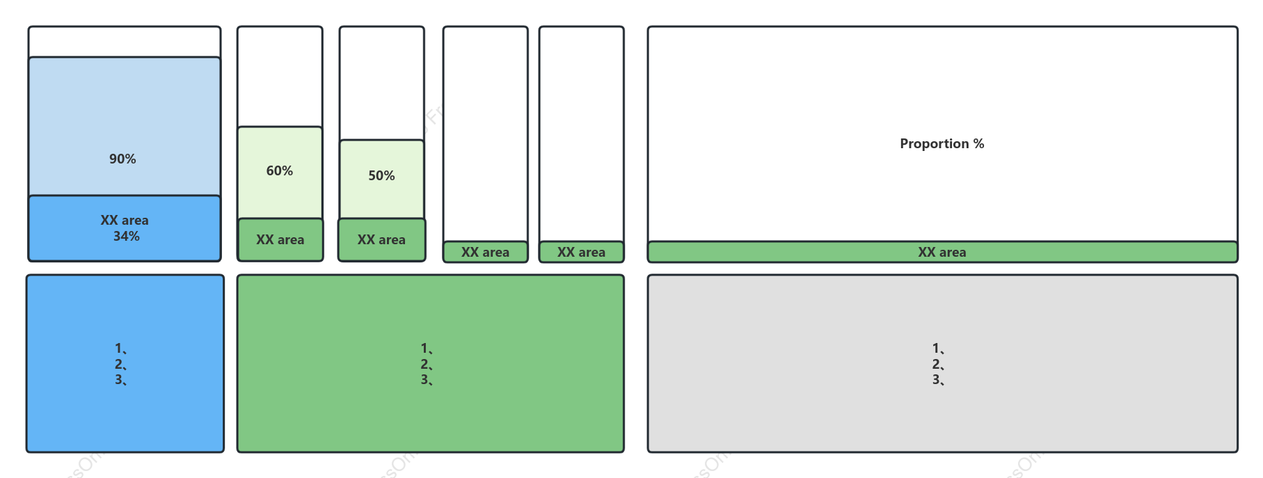
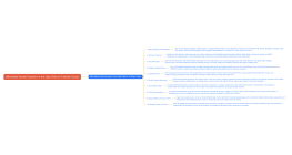
This flowchart illustrates the market share distribution across various city districts, providing a clear breakdown of the percentage share held by each area. Key figures include a dominant 90% share in certain districts, while others vary with significant proportions such as 60% and 34%. The diagram effectively highlights the comparative market dominance and distribution within these districts, offering valuable insights into regional market dynamics. This visual representation is designed to assist in understanding the competitive landscape and strategic planning for market engagement across different city areas.
Related Recommendations
Other works by the author
Outline/Content
See more
90% +
50%
1、2、3、
90%
60%
XX area
Proportion %
XX area 34%


Collect
Collect

0 Comments
Next Page